9,000+ users in three months · 500,000+ picks · #14 Top Free Sports Apps · featured in TechCrunch
Pickmoto was my first major product design project after I started my career in print design at National Geographic — and the one where I made the jump from visual designer to product designer. I co-founded the company and led design across four releases of a mobile-first sports-prediction game built on a single idea: skip the rosters and the stats homework and just pick the winner — with a crowdsourced scoring twist that made bold, contrarian picks worth more than the chalk.
It grew almost entirely through the product — invites, pools, and head-to-head challenges — from the original NFL launch through iPad, NBA, a March Madness Tournament Edition (15,000 downloads in two weeks, a million picks), and a 3.0 platform redesign. Featured on TechCrunch, GamesBeat, and Mobile Sports Report. The lasting lesson: people didn't want a prediction app — they wanted competition and bragging rights. We were early, not wrong.
The first directory service without numbers · product, brand, and pitch — all of it
The phone number had been the primary interface for reaching a business for over a hundred years. MobilePages was built on the bet that it was time to replace it — letting anyone reach a business, product, or person by name, subject, or SKU instead of a string of digits nobody remembers. I designed the entire product: the mobile platform, two-way texting and calling flows, geo-mapped real-time analytics, and a white-label API — and built the brand and every piece of investor-facing collateral from scratch. Early customers included Barrett-Jackson, the California Association of Realtors, and KLA Tencor.
Inside the product
A walk through the product I designed end to end — from the first sketches to the shipped app. It opens with where it started, then follows how MobilePages introduced itself, how people found listings, what a listing actually did, and how anyone could publish one.
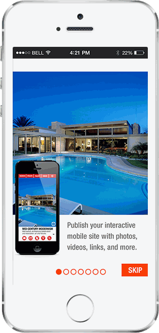
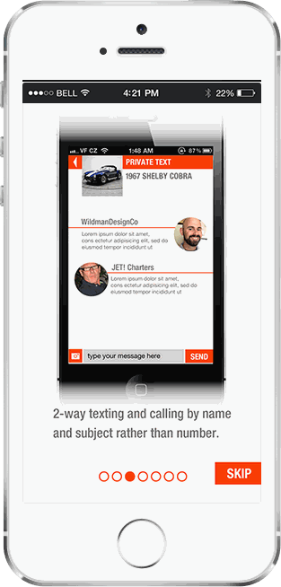
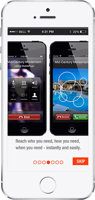
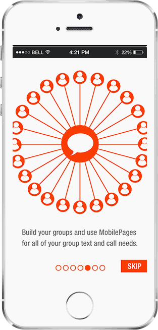
How the app introduces itself. A first-run splash and a seven-screen tour lay out the whole idea in a few taps: publish an interactive mobile listing from your phone, text and call people by name or subject instead of a number, build groups for group messaging and calls, list yourself in the MobilePage411 directory, and share anywhere. The narration mattered — the product only clicks once someone realizes it's replacing the phone number itself.


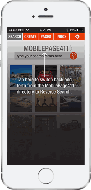
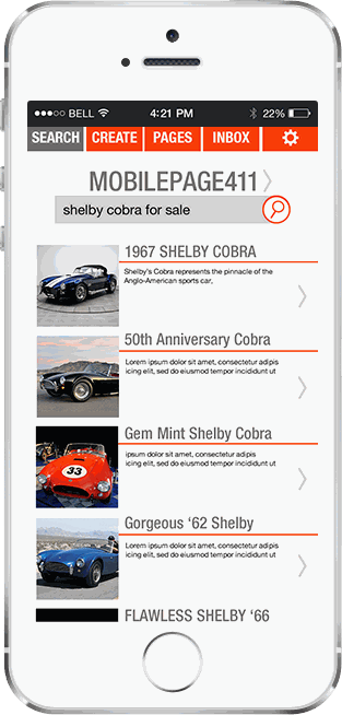
MobilePage411 — the directory without phone numbers. Someone searches or browses by name, subject, or SKU — or flips to reverse search to keep a category open and collect new listings as they appear — then opens a result. This is the demand side of the model: being found here is the reason anyone creates a MobilePage.


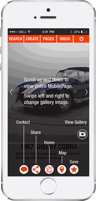
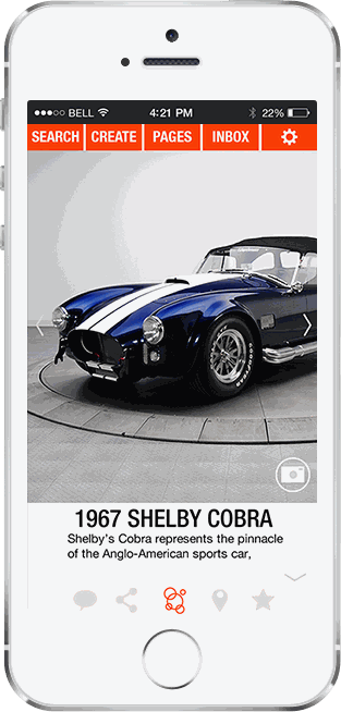
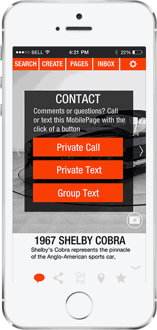
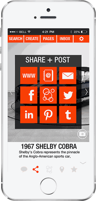
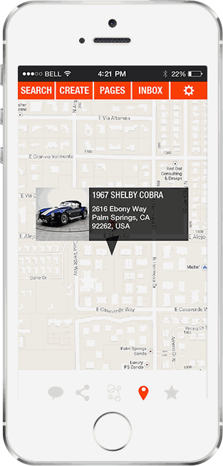
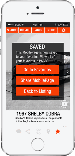
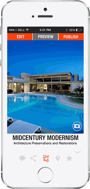
The listing itself — a media-rich mobile page you scroll through, every action one tap away. From here you reach the owner directly (private call, private text, or group text — by subject, never a raw number), share the page across web and social, map its location, or save it to your favorites. This is where the pitch pays off: contact happens by name, and no number is ever exposed.
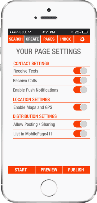
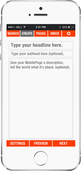
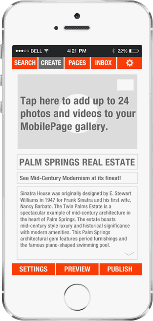
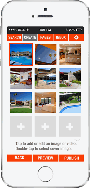
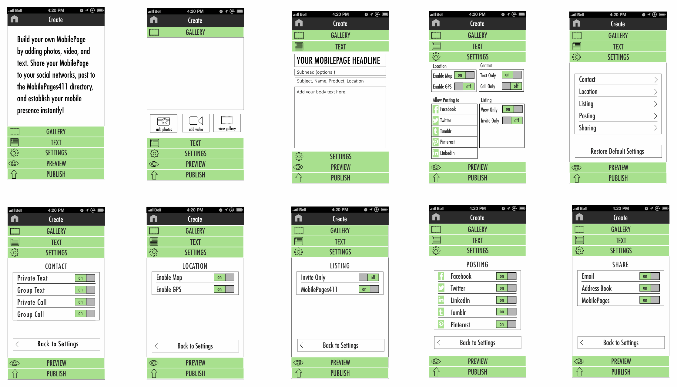
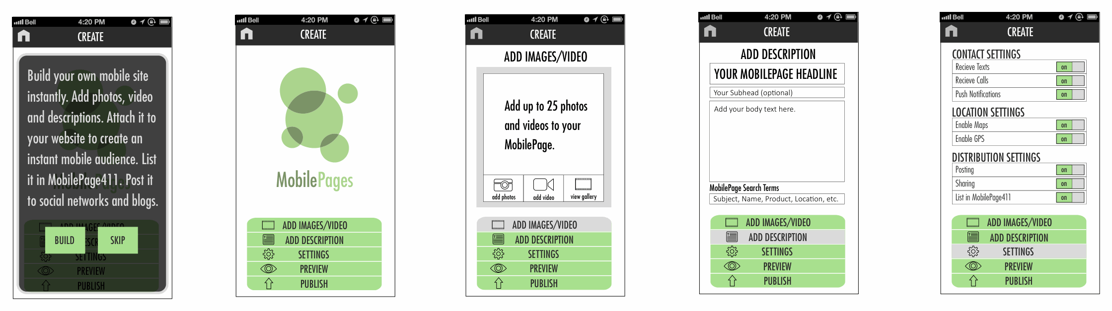
Building a listing, start to finish. Set who can reach you and how — calls, texts, push, maps, and whether it's public in MobilePage411 or private to a group — then write a headline, fill a photo-and-video gallery, preview, and publish. Live in the directory in seconds, with no domain, SEO, or app build required — the core promise of the product.


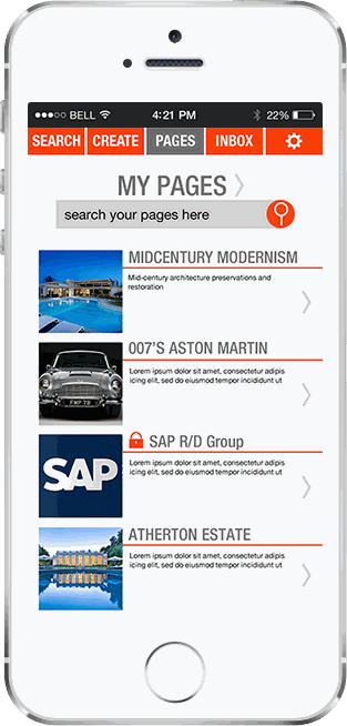
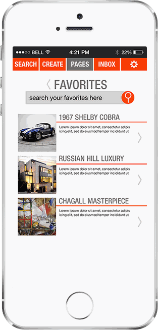
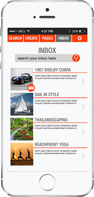
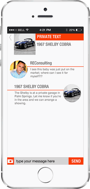
Your side of the app — managing what you've published and the conversations it starts. My Pages lists the listings you've created, Favorites holds the ones you've saved, and the Inbox threads together the two-way texts each MobilePage generates — every message tied to a subject or listing, never to a phone number.
Where it started. When I joined, MobilePages was a functional but unusable product — built before it had been designed. The patented tech worked and the idea was real (reach anyone by name or subject instead of a number), but no one had made it usable yet. This is the paper trail from there to the shipped app: the interface I inherited, the rebrand, and the wireframes and flows that sit underneath everything in the other tabs.
The interface I inherited
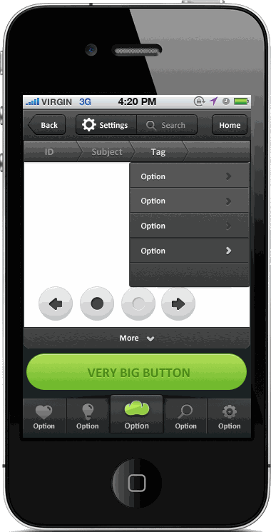
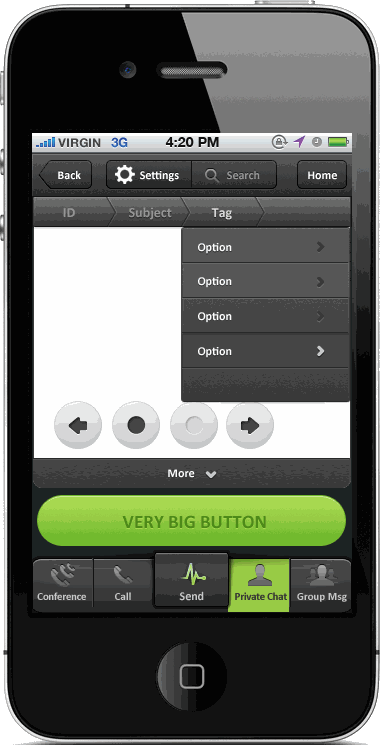
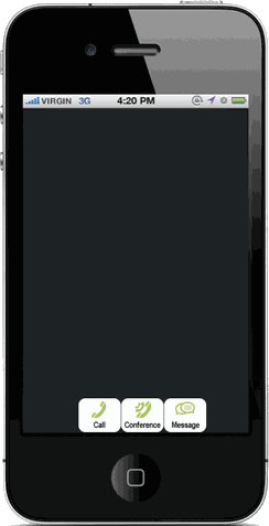
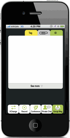
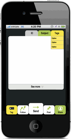
The UI as it came to me, still carrying its original brand: a placeholder “Very Big Button,” experimental tab bars (Conference / Call / Private Chat / Group Msg), ID / Subject / Tags rows — screen glare and all. These are the explorations everything in the other tabs was rebuilt from.
Rebranding it
The identity evolved alongside the product. The inherited mark was a soft green two-tone wordmark with bubbles rising out of it; I pushed it toward a bolder, more confident direction — outlined bubbles and a heavier orange wordmark — as the brand matured.


Wireframes & flows
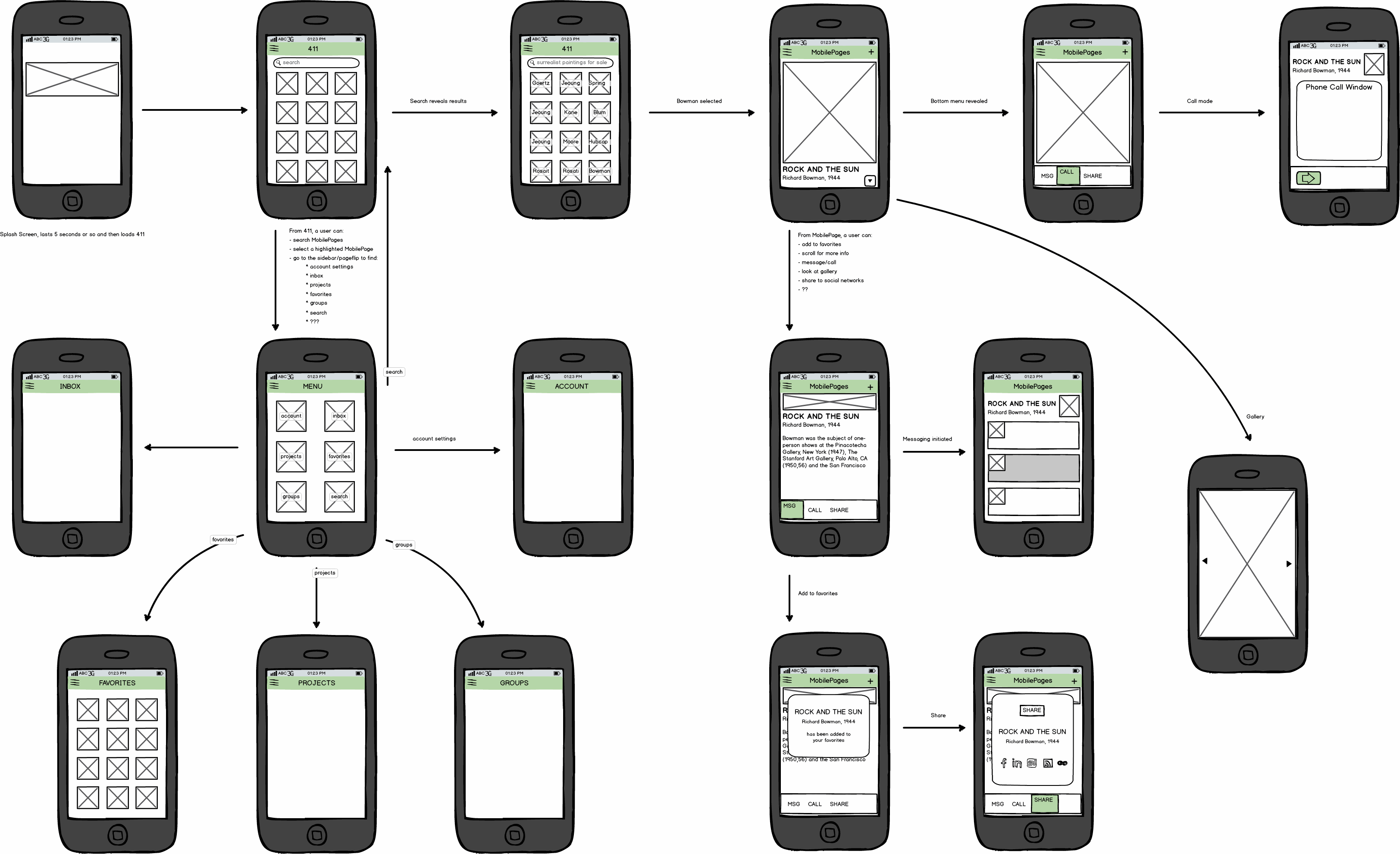
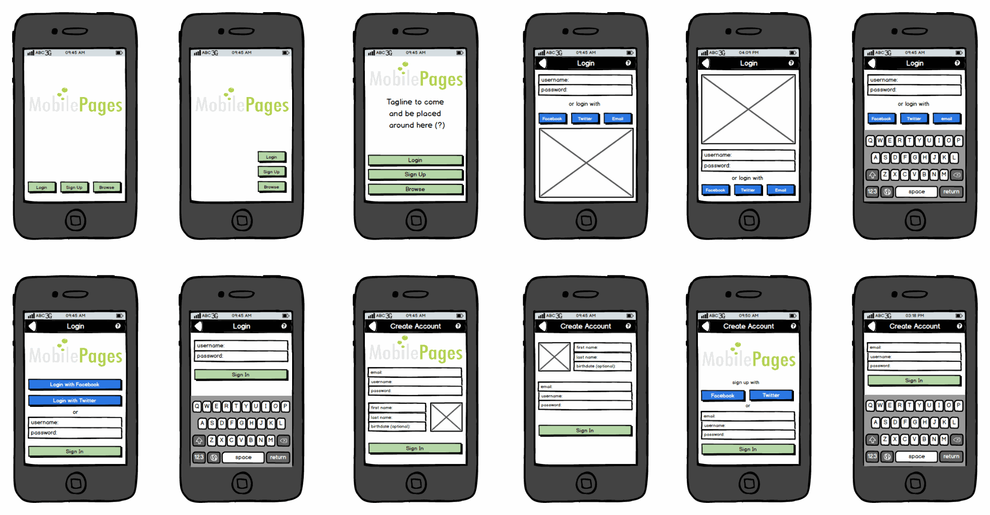
Underneath the shipped screens: I mapped the whole app as a flow first — splash to the MobilePage411 directory, into a listing, out to call, message, and share, plus the menu to account, inbox, and groups — then wireframed each screen in detail. That included the account flow (login and sign-up) and the full create-a-listing sequence, which I iterated from a rough pass toward something close to what shipped.
First platform to unify restaurant ordering, entertainment, and payment on the table
The table had always been underused real estate. Tanjarine — a TouchTunes subsidiary — was the bet that it could become the primary interface for the dining experience. I led design across three connected surfaces: a 10" Android tablet for guests to order, play, and pay; a 5" server handheld for real-time table management; and a web admin giving operators visibility into every order, menu interaction, and conversion rate. Designing across all three simultaneously meant establishing a unified design language that served three completely different users — guest, server, and manager — without compromise. I managed the design team from the platform's founding through launch, setting the standards and handoff processes the team would build on.
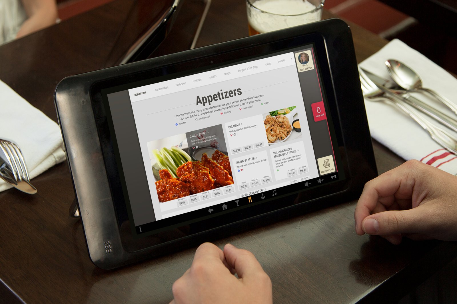
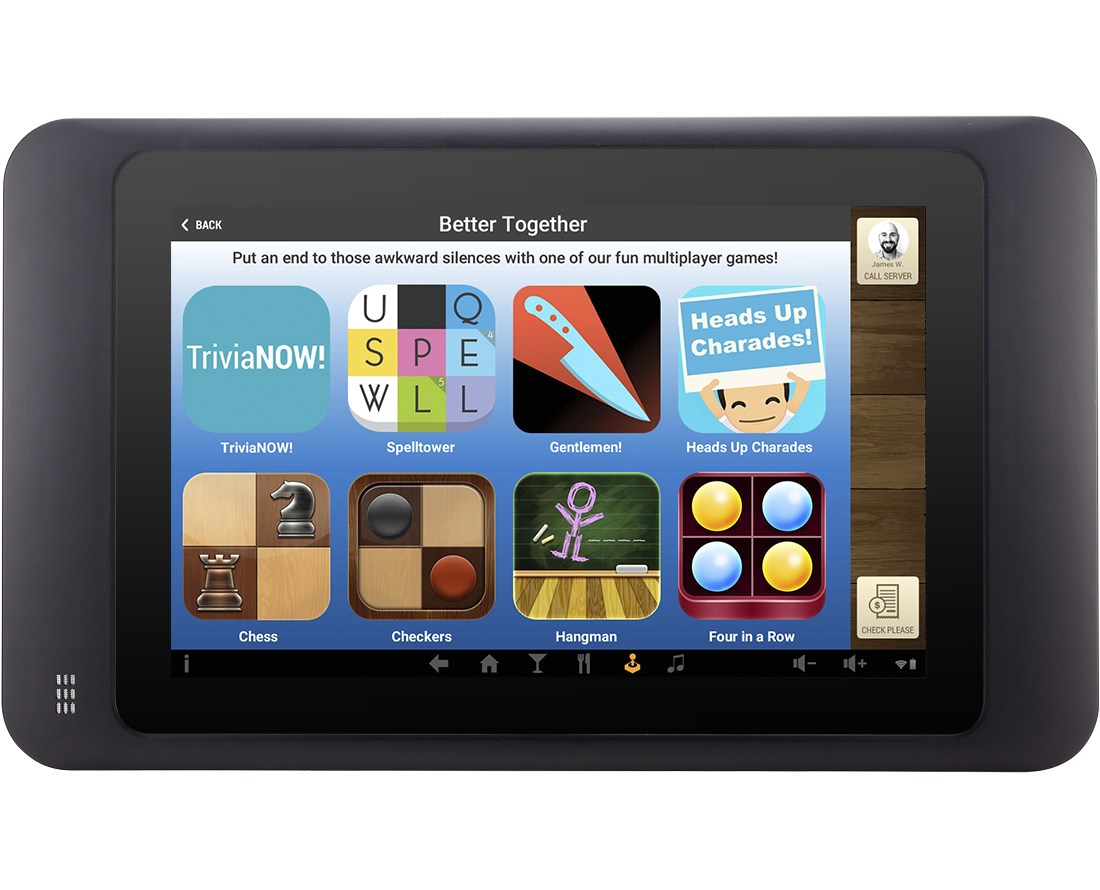
The guest-facing surface — a 10″ Android tablet on every table. It had two jobs that pulled in different directions: let a table order and pay without flagging down a server, and keep them entertained while they wait and eat. The audience was the whole table — families with restless kids, groups killing time before the food lands — so the same screen had to feel effortless for a parent ordering and fun for a nine-year-old between courses.
One table, three jobs
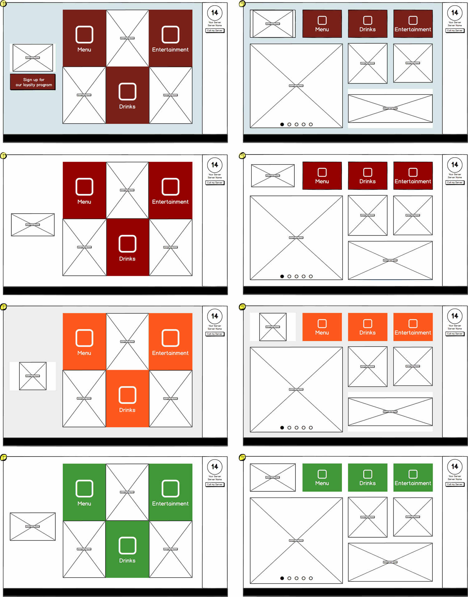
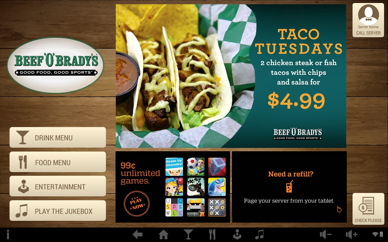
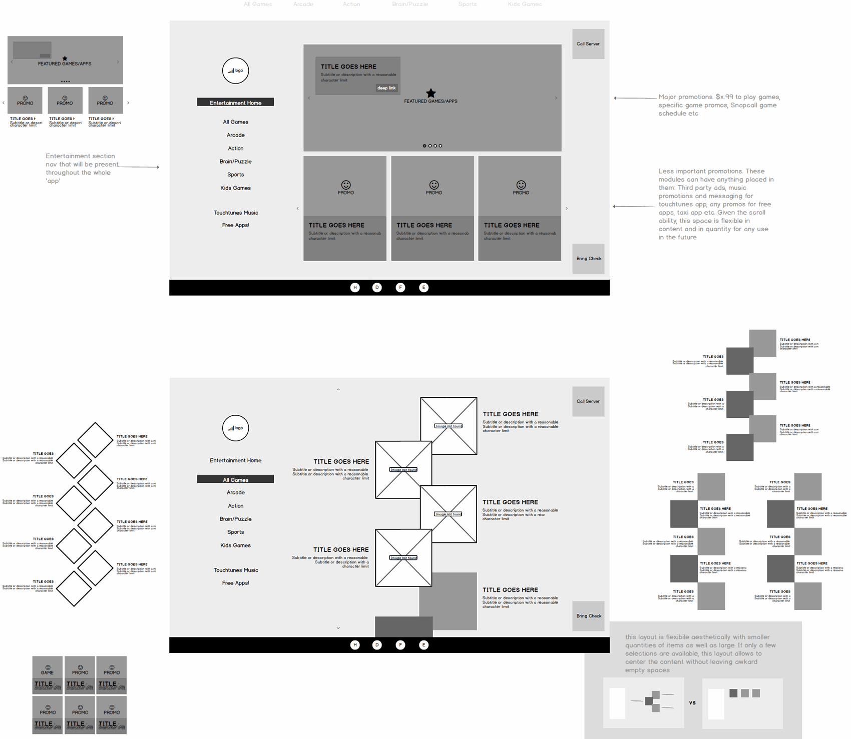
The table is shared, borrowed real estate, so the home screen had to hand a guest everything without clutter: the food and drink menus, entertainment, the jukebox, and — one tap away — “call my server” and “check please.” I explored it as a grid of equal tiles versus a featured-content home built around a promotion the venue controls, then settled on a launcher that leads with a branded promo and keeps ordering, playing, and paying always in reach.
Ordering
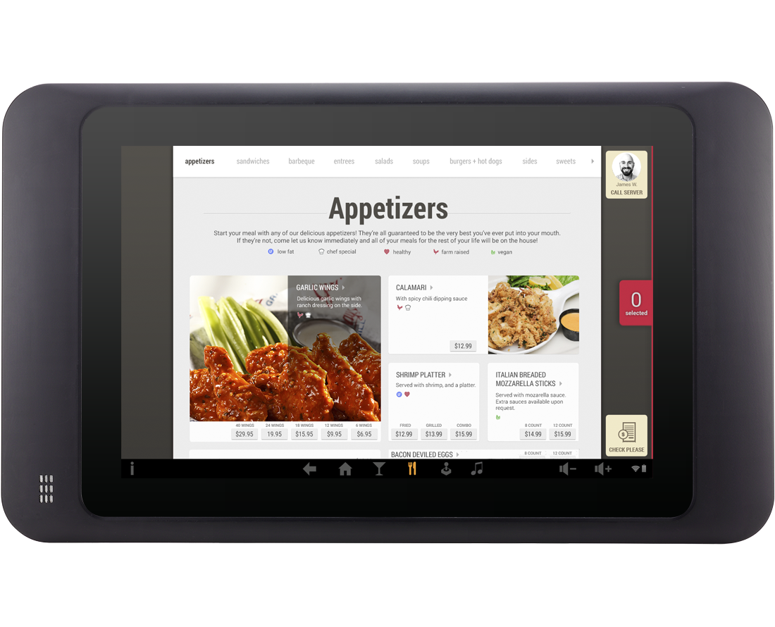
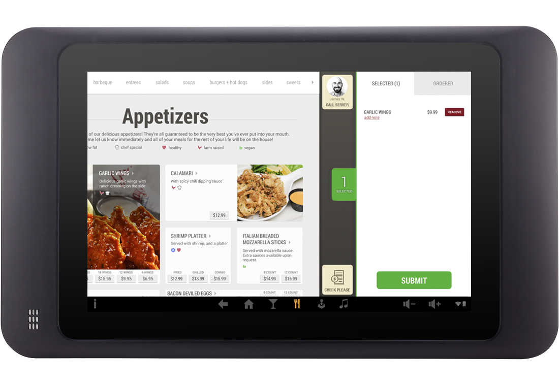
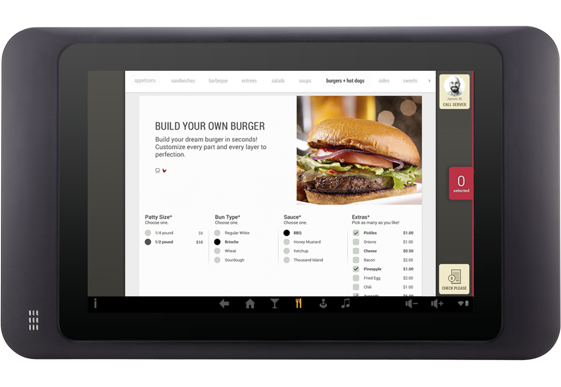
Browse the menu by category, open an item to see it full-bleed, add it to a running cart, and submit — the order goes straight to the kitchen. Customization got its own flow: Build Your Own lets a guest assemble a burger part by part — the consumer-facing side of the same Build-Your-Own-Item I built into the web admin. No waiting, no misheard orders.
Entertainment
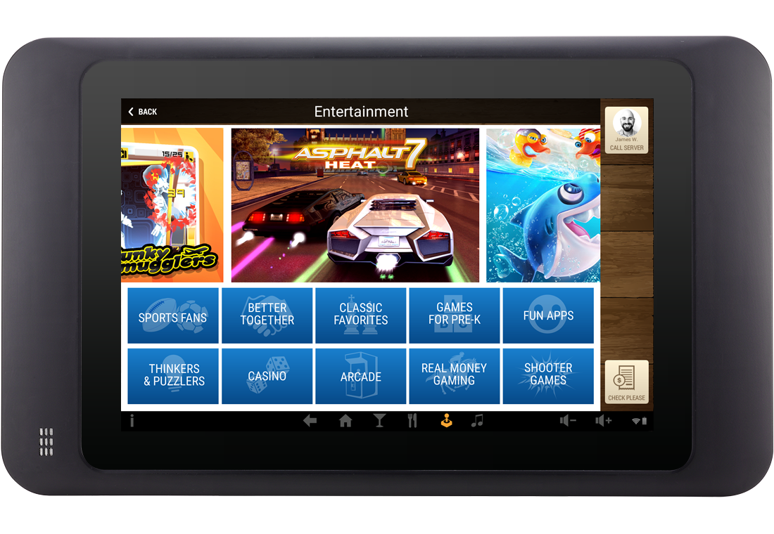
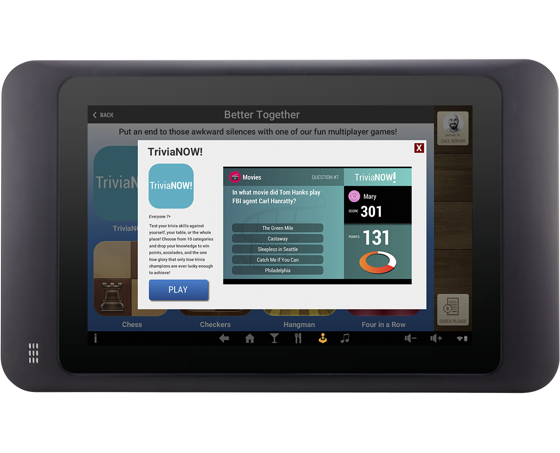
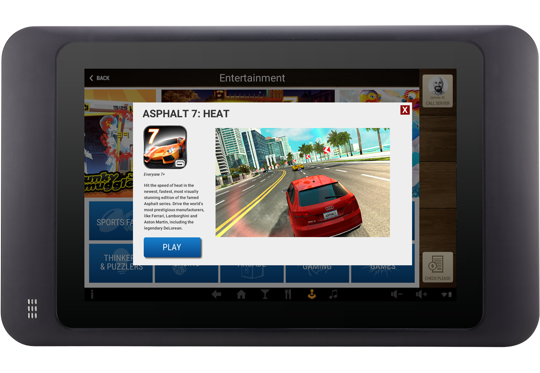
The other half of the table: keep people engaged between courses. Games are organized into browsable categories — Better Together multiplayer (trivia, Heads Up, chess), kids' games, arcade, puzzlers — each opening to a detail view that launches the game. I built the page as flexible promo zones the business could program: featured games, “99¢ unlimited play,” and room for third-party or TouchTunes promos as the catalog grew.
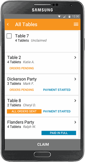
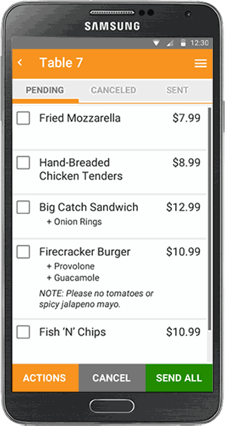
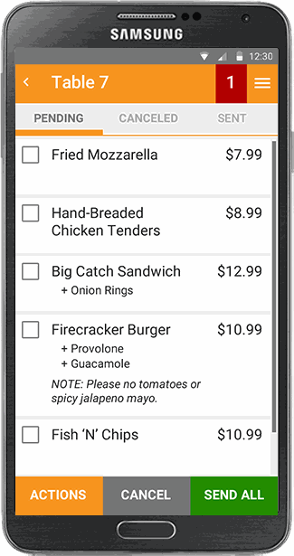
The 5″ server handheld got the deepest rework of the three surfaces — a working-but-brittle 3.0 rebuilt into a fast, forgiving 4.0. Here's who it was for, what was broken, and how it got fixed.
Who it was for
We designed for the server on the floor at speed — picture a busy night-shift worker on a basic phone, juggling a section with no patience for friction, fast and assertive because the job demands it. That user framed every decision: big touch targets, unmistakable status, forgiving actions, and no alarm fatigue — a tool she could trust at a glance, one-handed, in a dim and noisy room.
The problem · 3.0
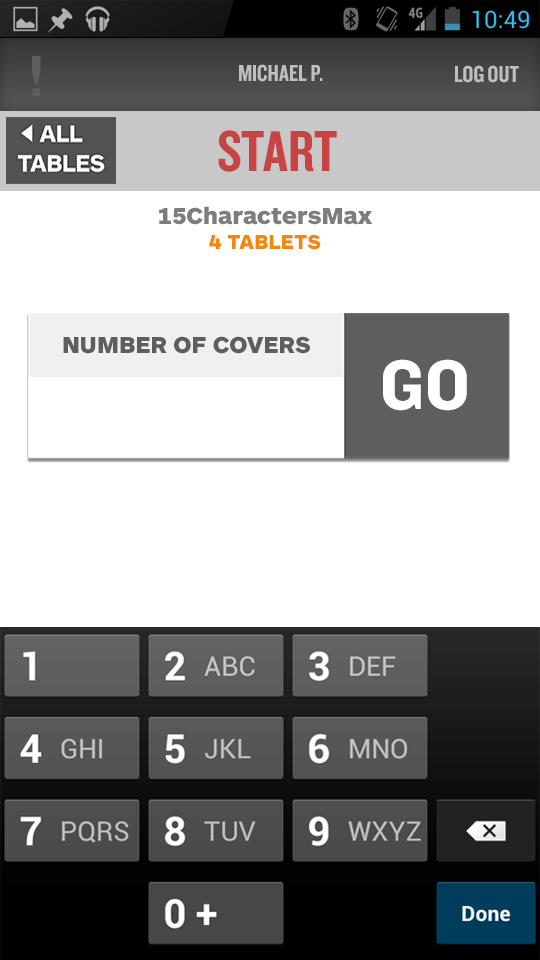
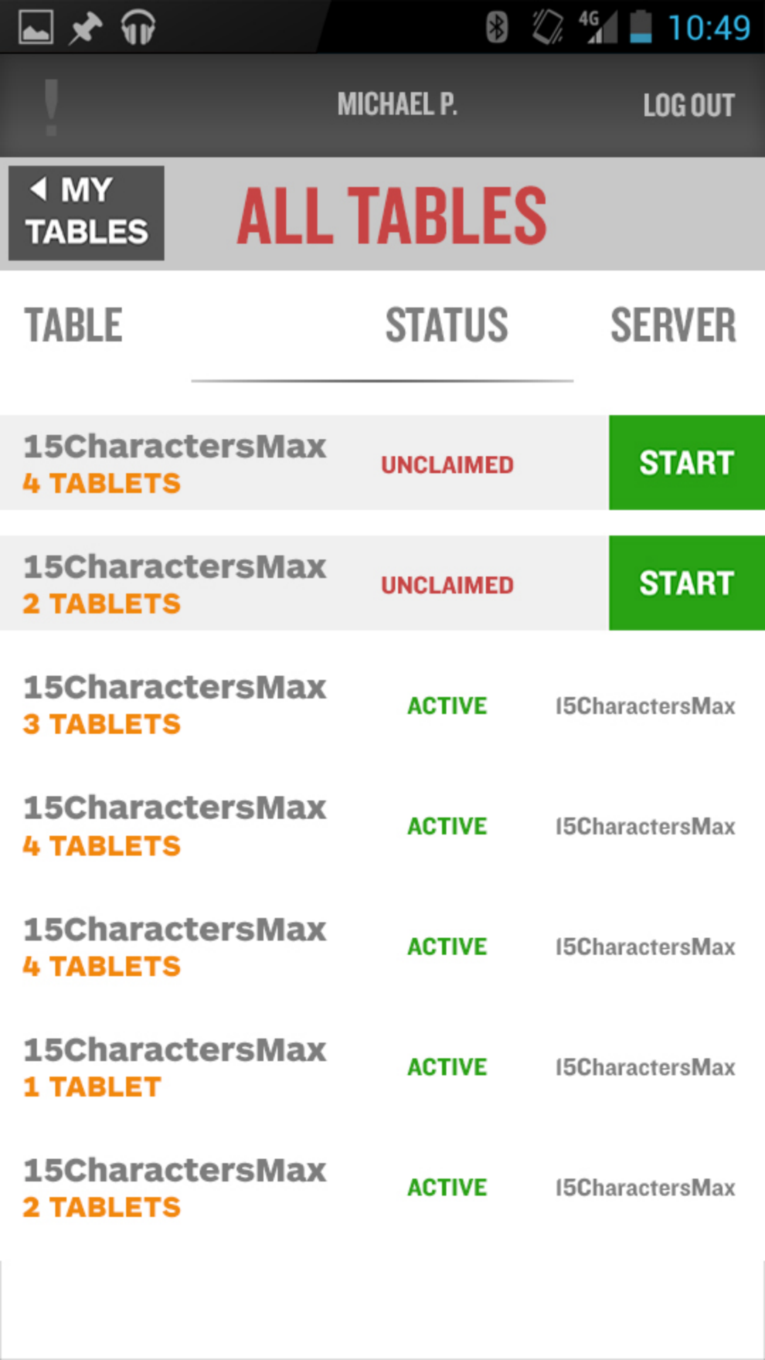
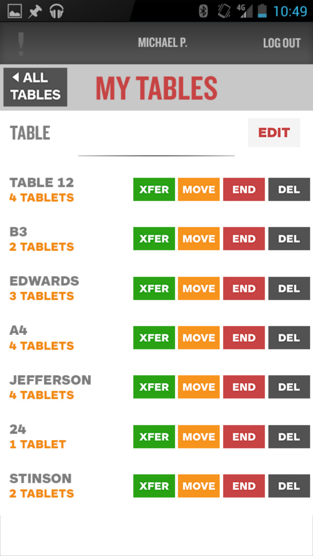
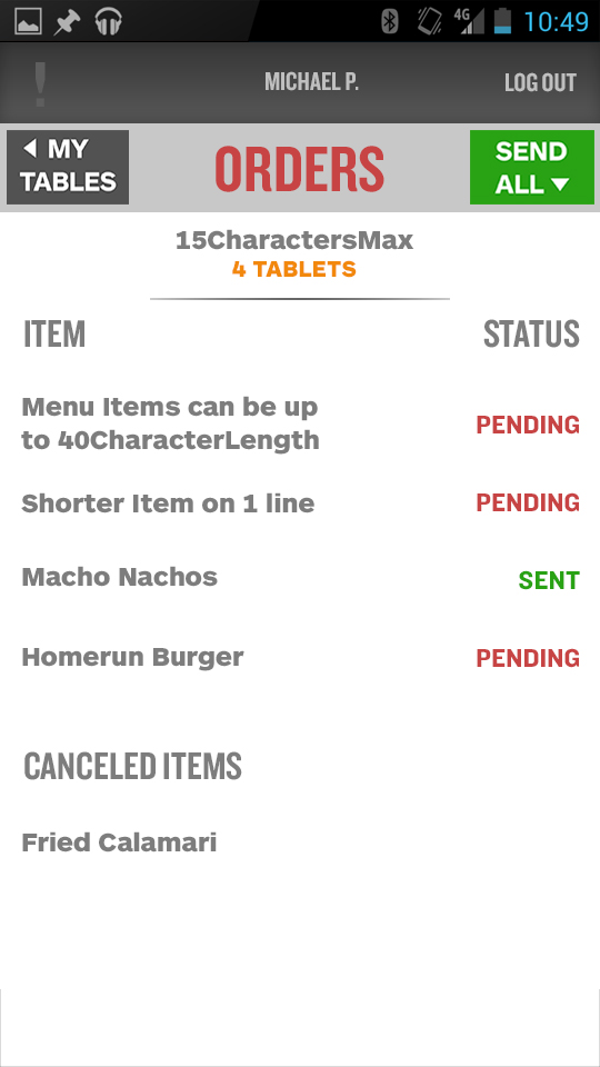
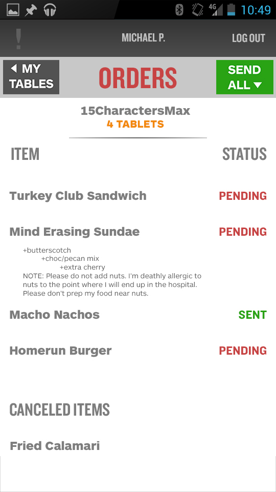
The handheld I inherited technically worked, but fought its user at every step:
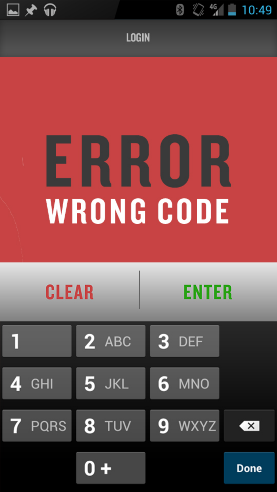
- Two keyboards stacked at once — on login, and again to enter covers or move a table — with the raw server ID shown unmasked and an oversized “GO” dwarfing its tiny input.
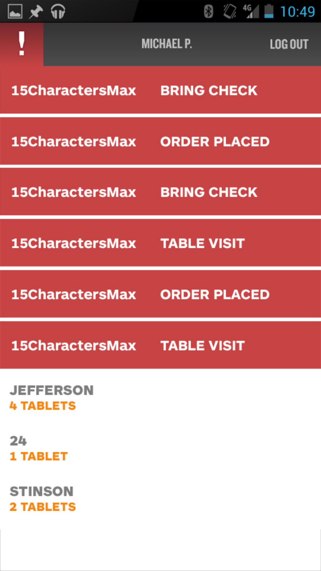
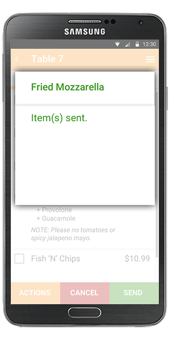
- Full-screen red takeovers for everything — a mistyped PIN, a routine “order placed,” a payment outage — all identical, so nothing stood out and the whole app was blocked.
- Crammed, tiny action buttons (XFER / MOVE / END / DEL) with destructive actions one fat-finger away from routine ones.
- Dense, placeholder-filled tables (“15CharactersMax”) with status buried in low-contrast text.
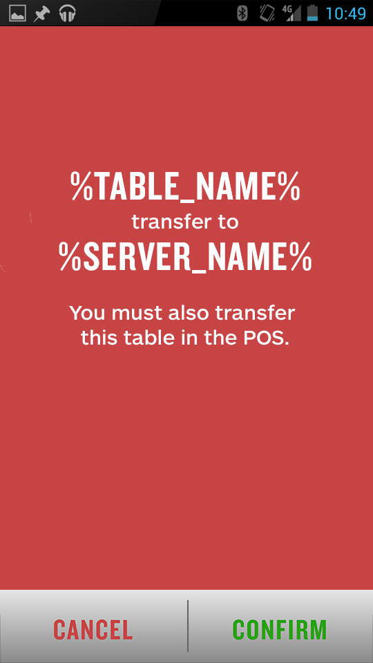
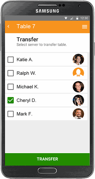
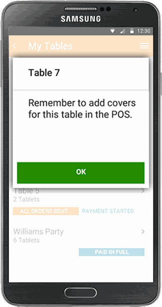
- Actions that didn't finish — even a table transfer told the server to “also transfer this table in the POS,” doubling the work.

Wireframes & flows
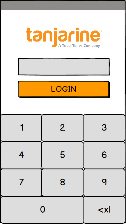
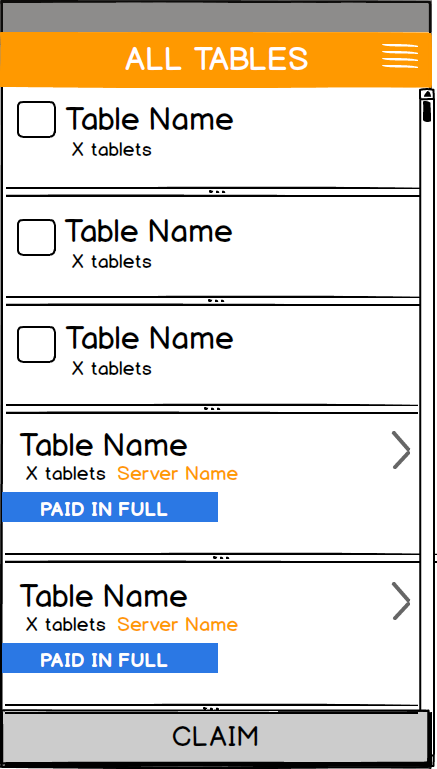
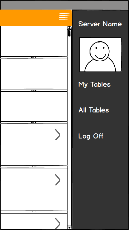
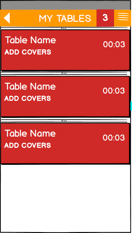
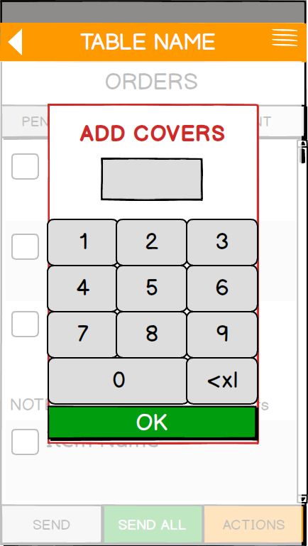
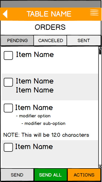
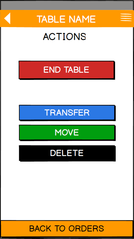
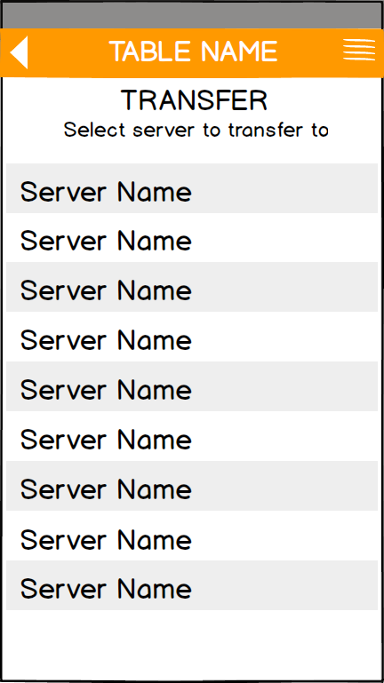
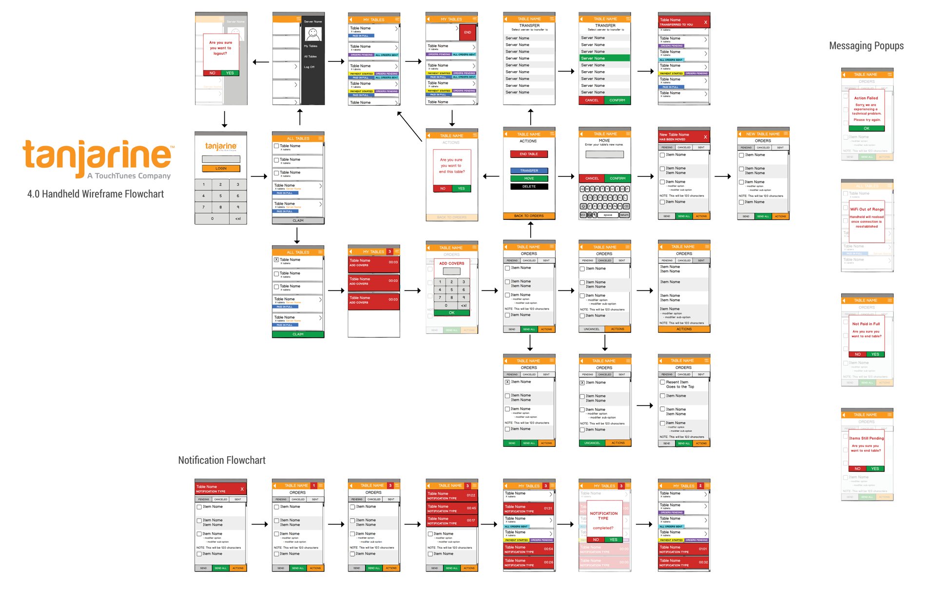
I wireframed every screen and state first, then wired them together into the flow below — so the structure was settled before any pixels were.
The redesign · 4.0
Every 3.0 problem got a direct answer:
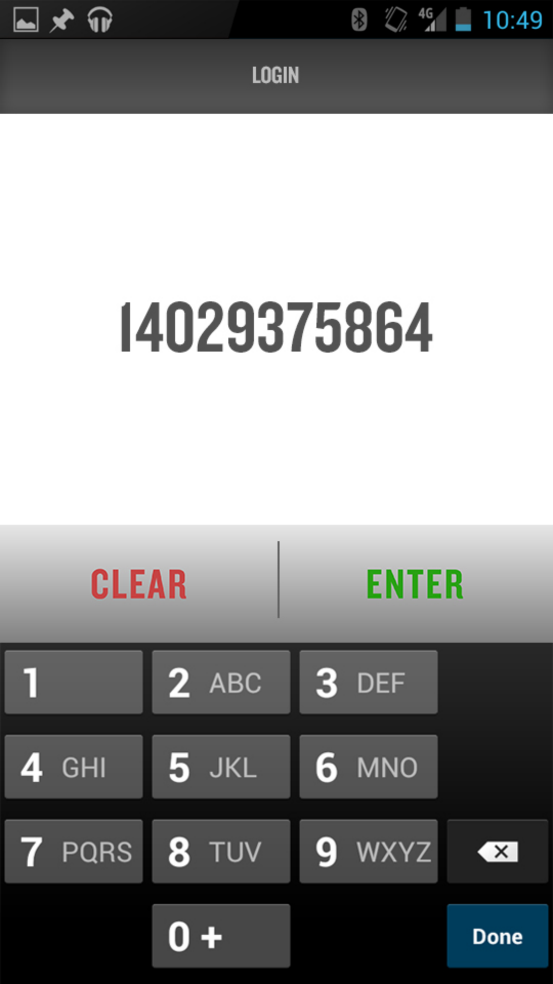
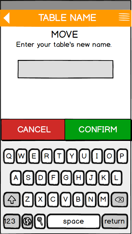
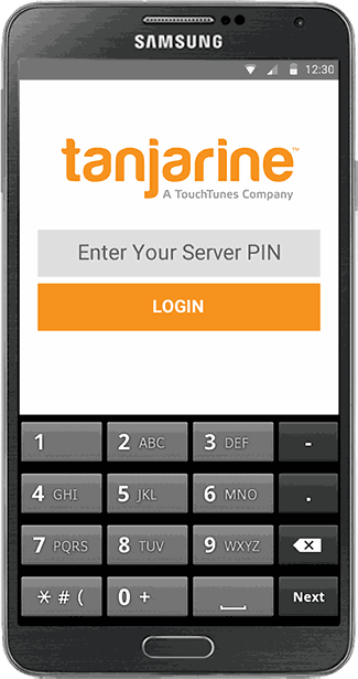
- Login — the two stacked keyboards and exposed ID became a single numeric keypad with the PIN masked; a wrong entry is now a small inline “Invalid PIN” message, not a full-screen red alarm.
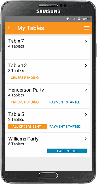
- Status at a glance — dense, placeholder-filled tables became a spaced list where each table's state is a color-coded tag (orders pending, all orders sent, paid in full), readable in a single look across the section.
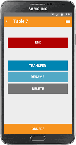
- Actions — the crammed XFER/MOVE/END/DEL row became big, full-width, color-coded buttons (End / Transfer / Rename / Delete), well spaced, with a distinct color reserved for the destructive one.
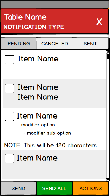
- Alerts & errors — the wall of identical red banners and full-screen takeovers became contained, dismissible cards, ranked by type, with Yes/No recovery — so the app stays usable and severity is finally legible.
The operator back-office — the tool for onboarding and running venues at scale. It was defined by a detailed product spec as a system to onboard 500+ venues in 2014 and manage thousands in 2015, covering venue setup and the full eMenu. My job was to turn that spec into something a non-technical restaurant manager could actually use. Each section below pairs what I designed with what the spec asked for.
Where it started
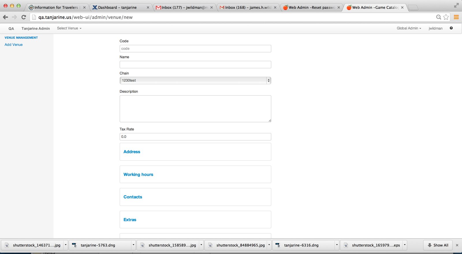
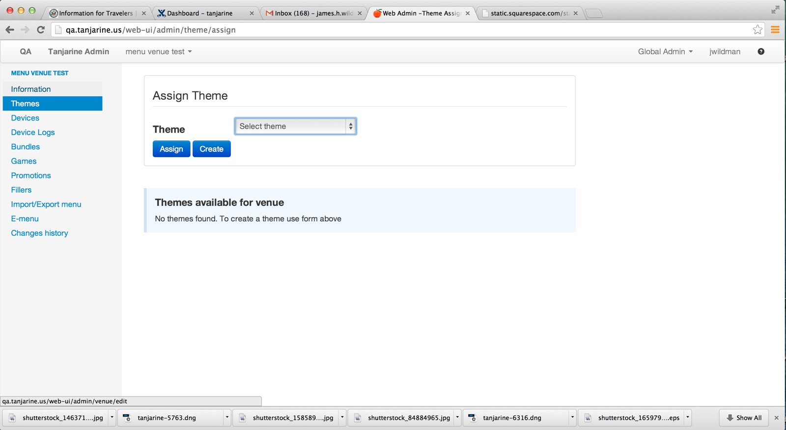
What I inherited was a developer's tool, not a product: unstyled stacked forms, a bare venue menu, and a publishing flow where managers had to assemble “bundles” and track cryptic filenames to push a menu live. The spec's opening goal was blunt — make this “intuitive, easy to use and powerful” enough to onboard hundreds of venues cost-effectively.
Mapping the system
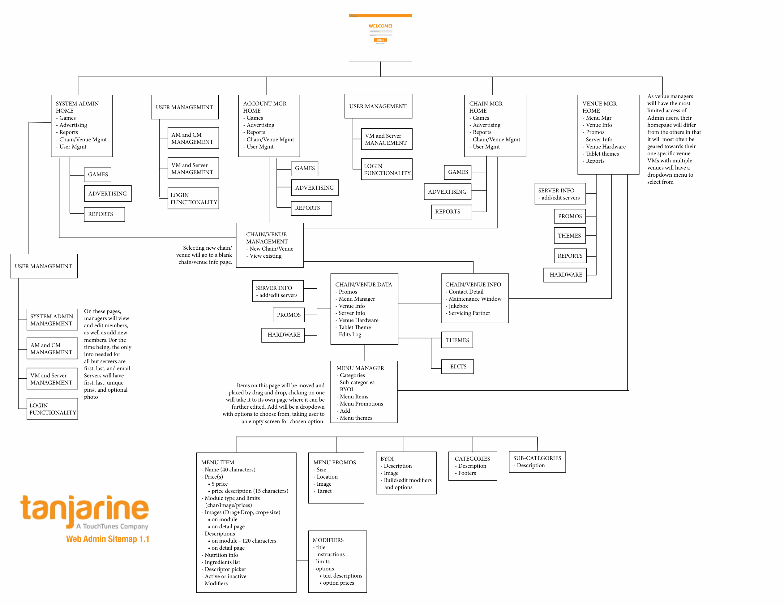
The spec defined five user types with nested permissions — Servers, Venue Managers, Chain Managers, Account Managers, and System Admins — each seeing only what they're allowed to touch, across a chain → venue → menu hierarchy. I mapped the whole thing as a sitemap first: role-based home pages that branch into venue data, the Menu Manager, hardware, and reports, so every screen had a clear place and audience before I designed a pixel.
Provisioning a venue
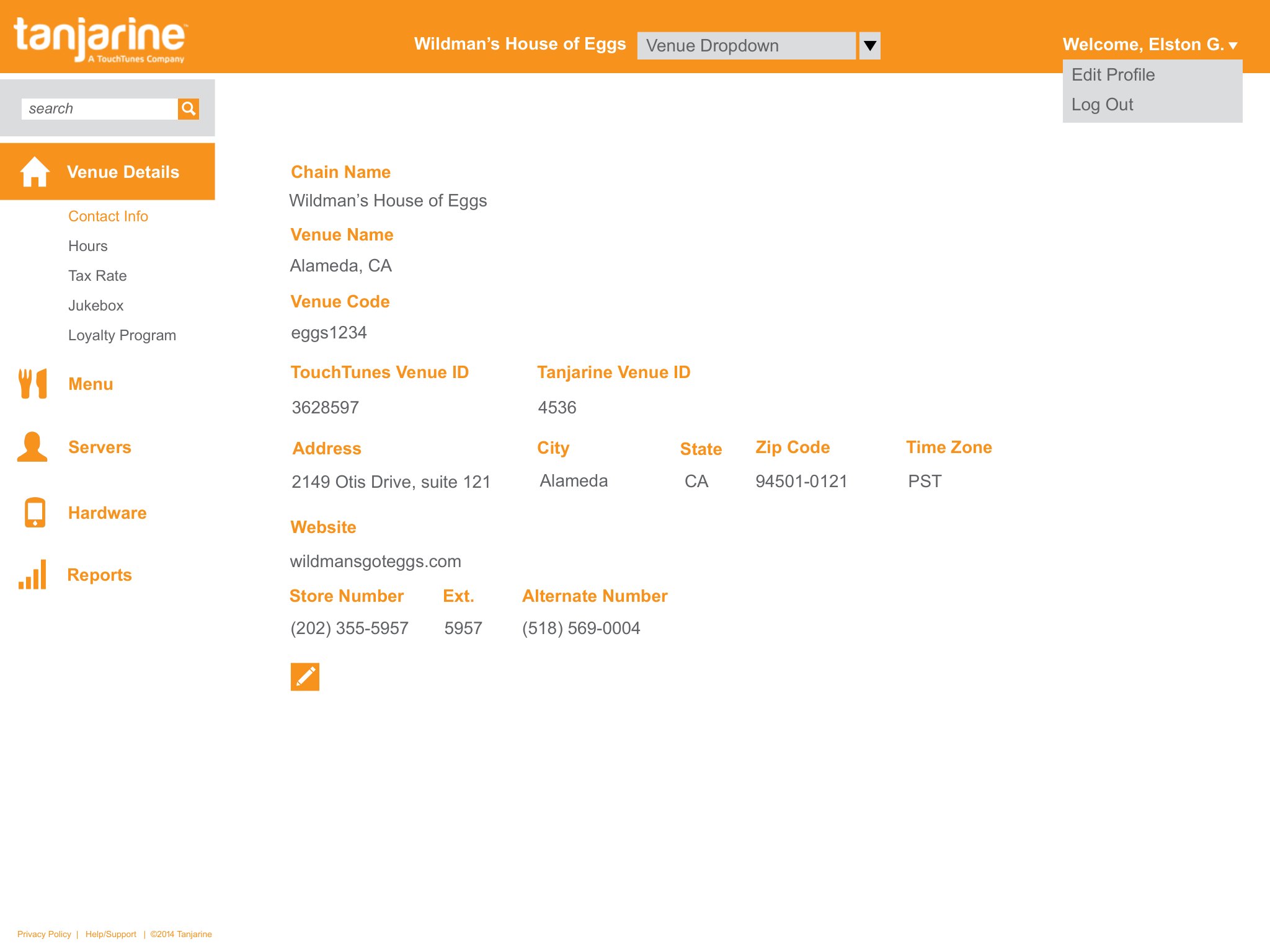
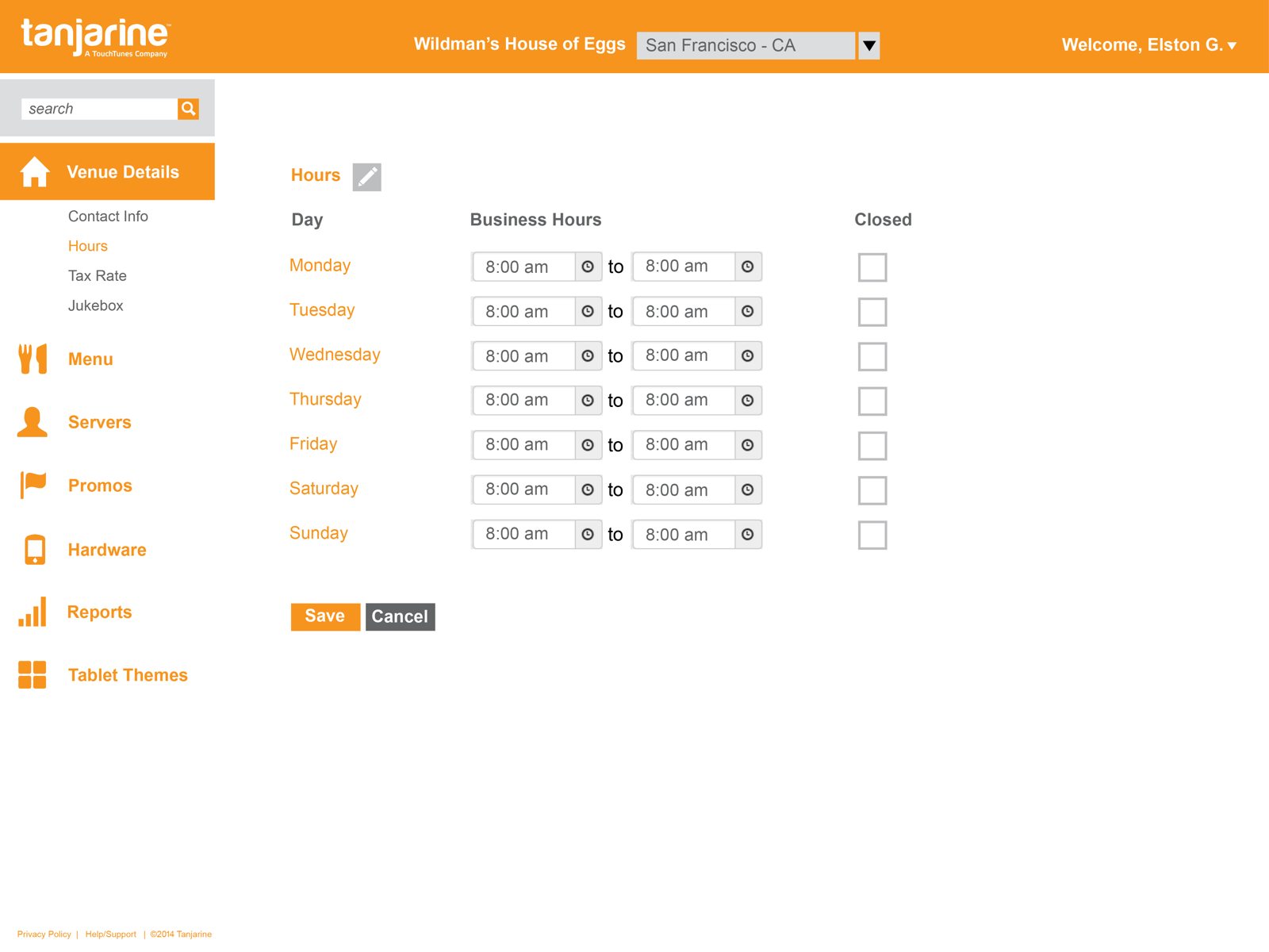
Setup had to be fast — the spec required only six fields to stand up a new venue, with everything else added later. The venue record then holds the full contact block, TouchTunes/Tanjarine IDs, tax rate, jukebox credit rules, and per-day hours, each field editable only by the roles the spec specified (some manager-editable, some Account-Manager-only).
The menu — and the modifier problem
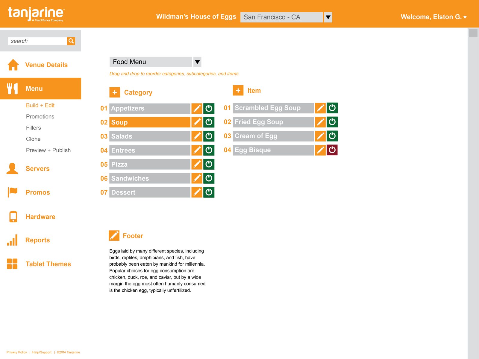
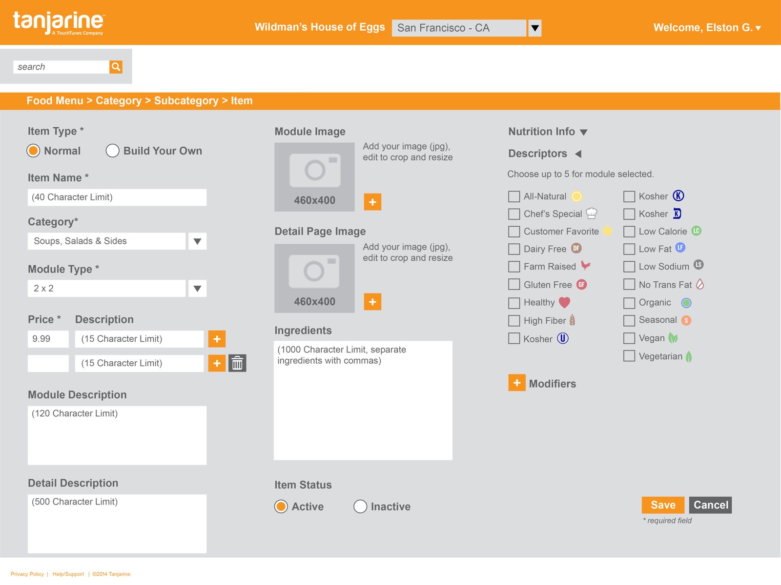
This was the hard part. The menu requirements were enormous: drag-and-drop categories and sub-categories, a hybrid “Build-Your-Own-Item” type, 40-character item names, multiple prices, module-size limits, short (120-char) and long descriptions, nutrition tables, and up to five descriptor icons per item. I put it behind one item builder that reveals complexity only as it's needed.
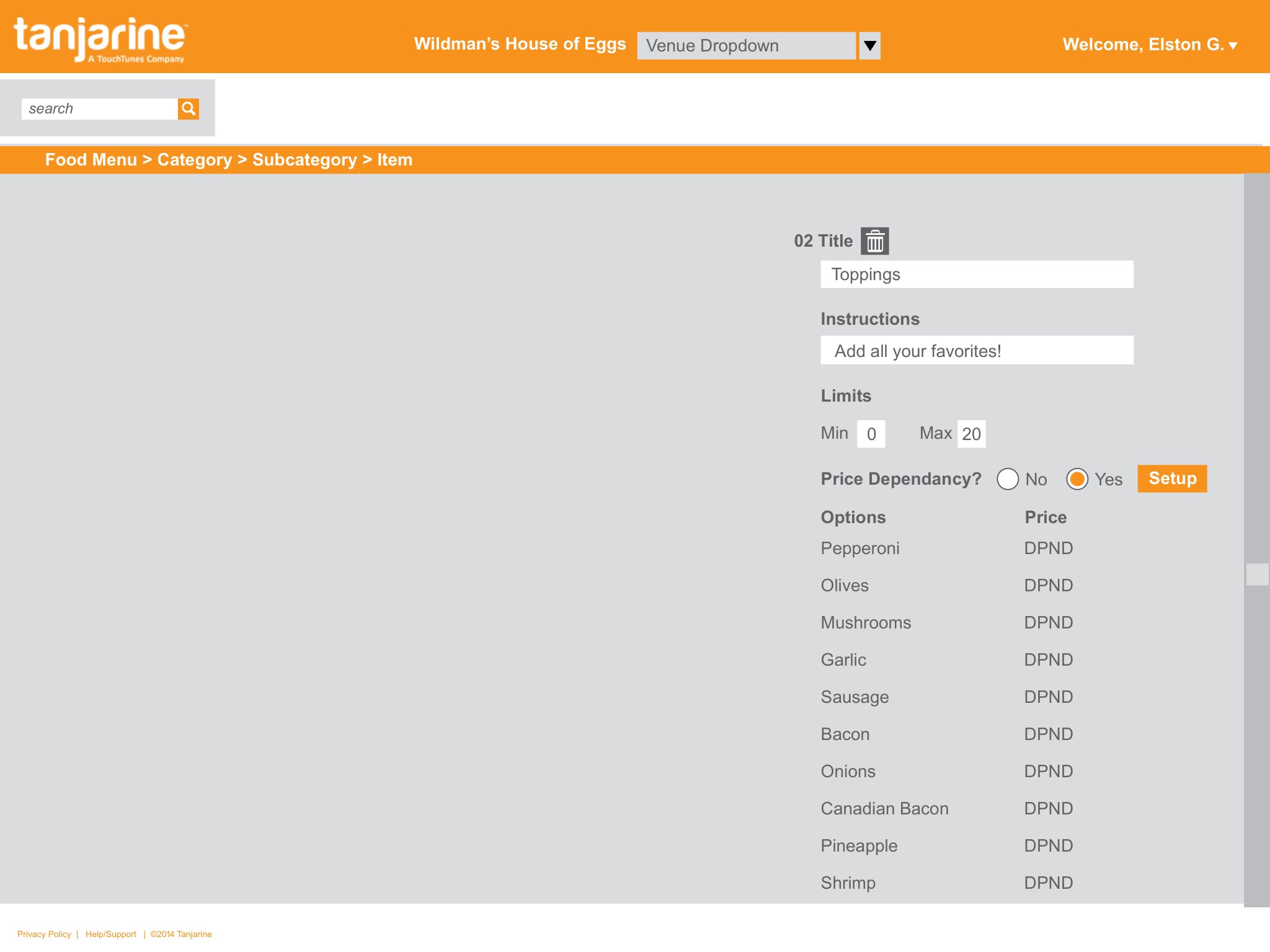
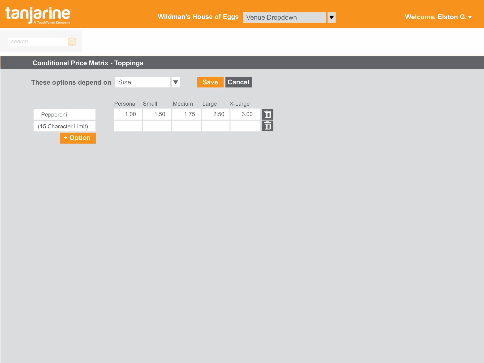
The worst of it was modifiers: up to 20 per item, each with up to 20 options, nested two levels deep — and an option's price can depend on something else entirely (a topping that costs more on a large pizza than on a personal one). I gave that its own builder with a price-dependency toggle; when it's on, a Conditional Price Matrix lets a manager set every option's price against a size in a simple grid — no spreadsheets, no engineer.
Staff
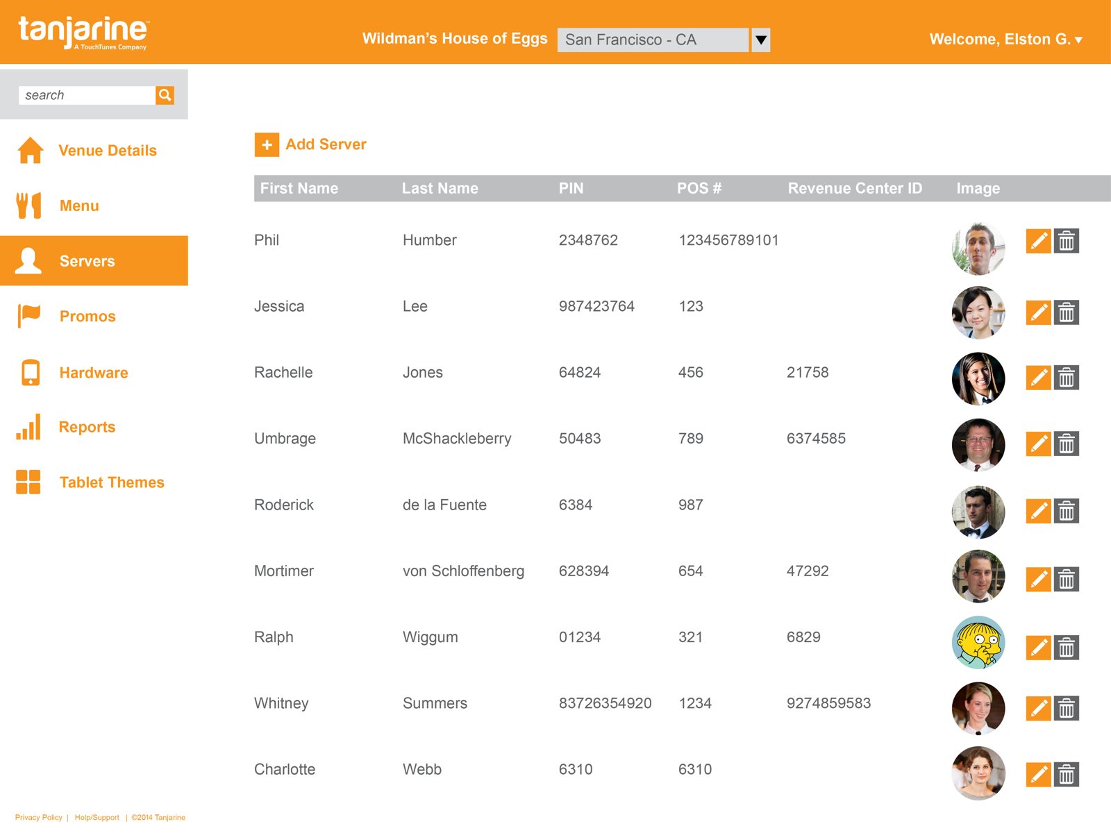
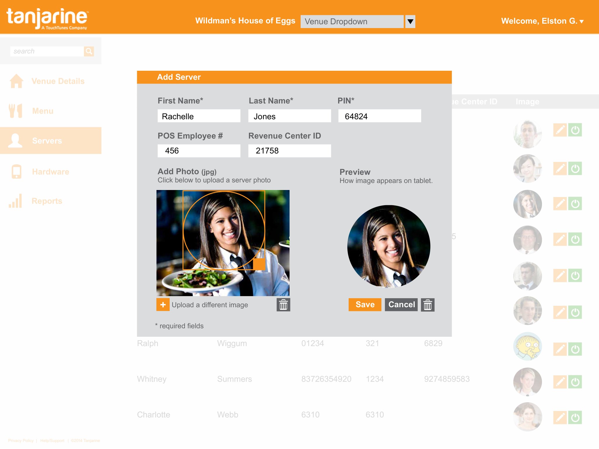
Per the spec, managers add servers with a first name, last name, and a PIN that must be unique within the venue — plus an optional photo that populates the “Your Server Is” card patrons see on the tablet, with a live preview of exactly how it'll crop. Servers never log into the Web Admin; their PIN is only for the handheld and tablets.
Hardware
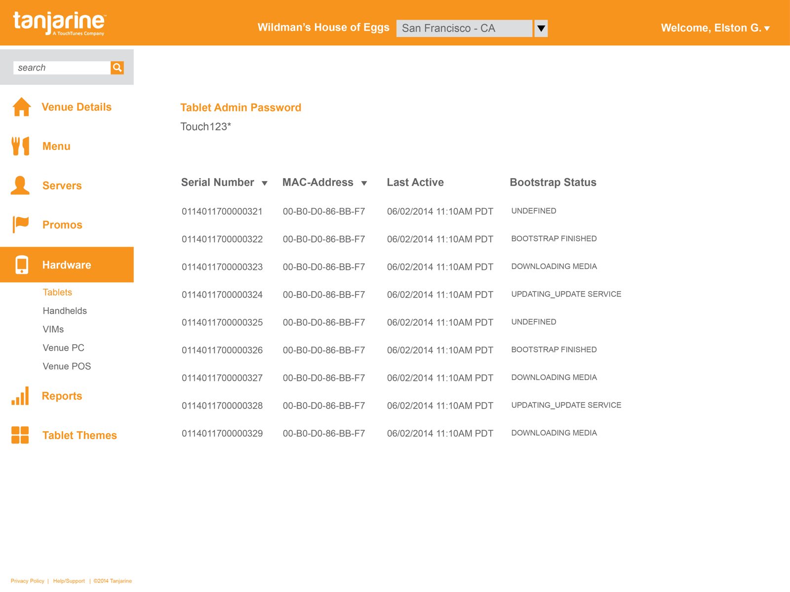
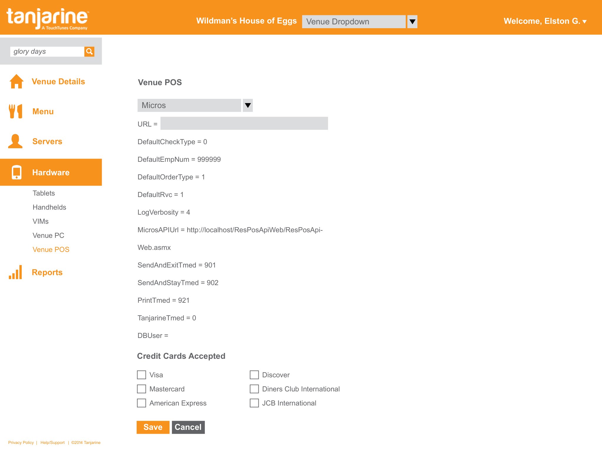
Each venue's devices are provisioned and tracked here — tablets, handhelds, VIMs, and the venue PC by MAC address, software version, and bootstrap status — alongside the POS integration config the spec flagged as needed for ordering. It's the bridge between the software and the physical floor.
Reports & feedback
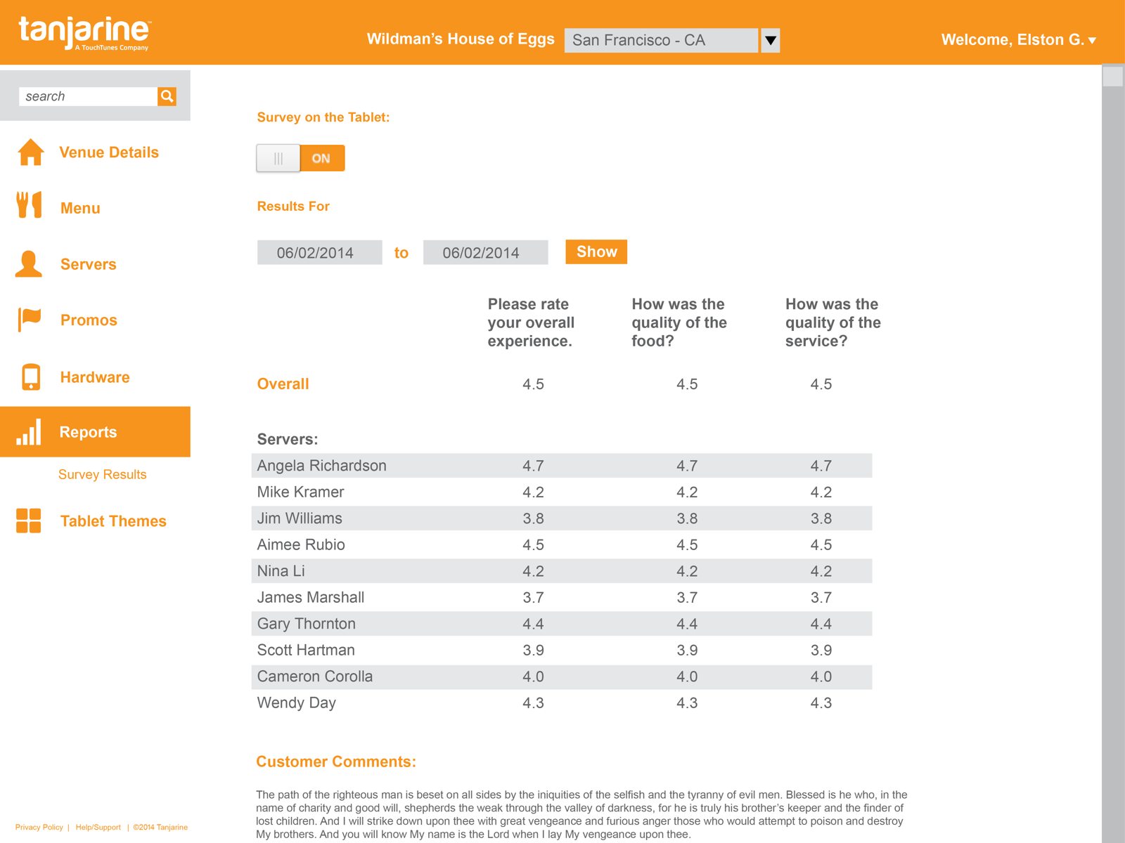
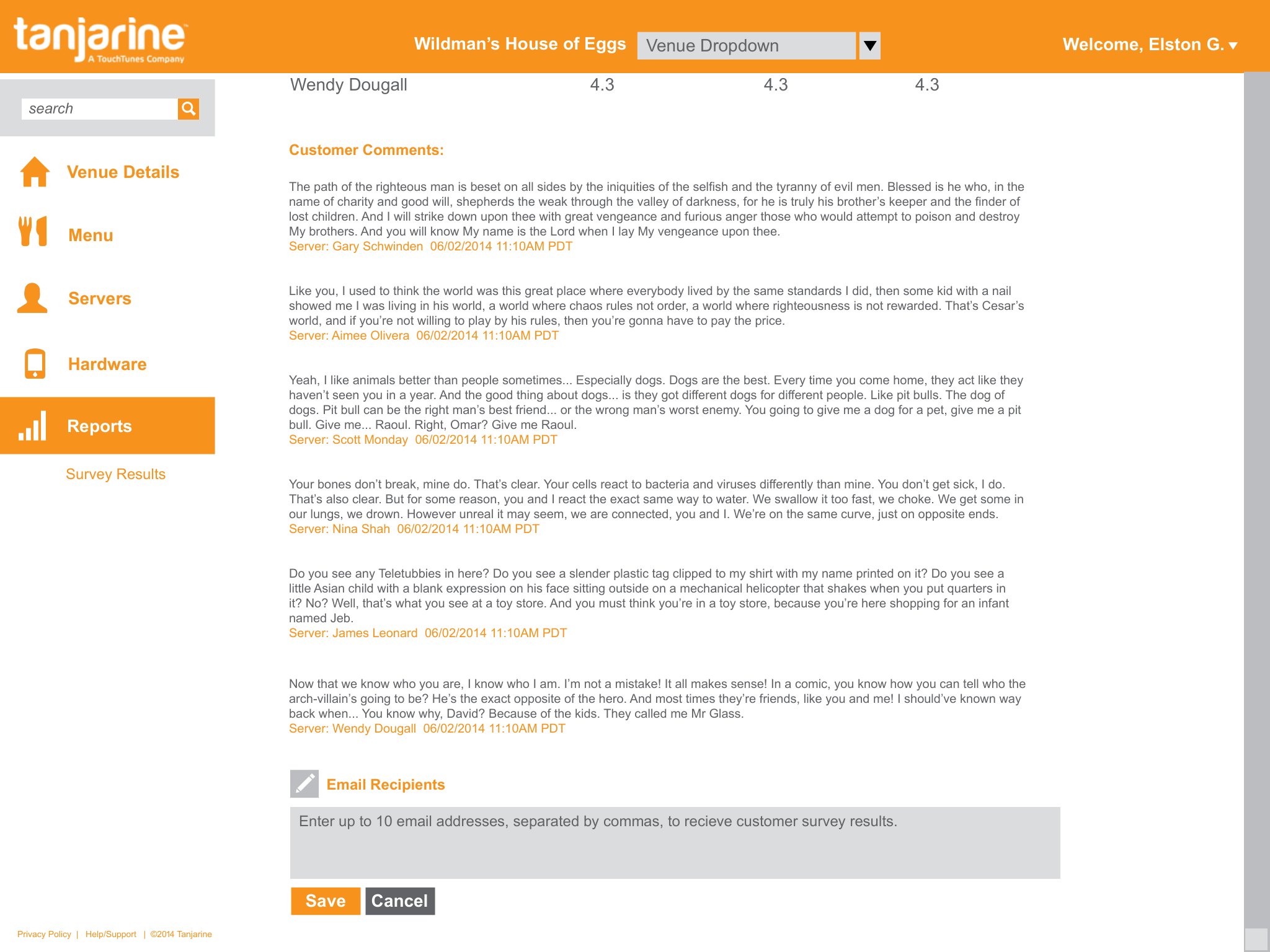
The spec scoped reporting at venue, chain, and Account-Manager levels — covers, order totals, cancellations, table-turn times — surfaced to the right role. Survey Results close the loop with customer comments tied to the server on duty, exportable to whoever needs to read them.
Prepaid company cards a small-business owner could actually control
Small business owners don't think about expense policy — they think about the employee who used the company card somewhere they shouldn't have. Bento was built around that reality: a Mastercard prepaid card system that let owners set spend limits, restrict merchant categories, and control active days per card without needing a finance background to do it. I joined at angel stage and inherited a product that worked but whose interface had drifted; rebuilding it was the first job. From there I extended it in two directions: a QuickBooks integration, so a business's spending landed in its books without anyone re-typing it, and a mobile app for the employees carrying the cards, to document each purchase with tags, a note, and a receipt in the moment.
I joined at angel stage and inherited a working product whose interface had drifted — inconsistent enough to be hard to scan, and quietly confusing in the ways that matter most in a tool people trust with money. I started by auditing it screen by screen, writing down what was broken and why, then rebuilt it around a single consistent system. What follows is what the audit found and how the redesign answered it.
A consistent system
The deepest problems weren't on any single screen — they were the absence of a system. The same blue meant two different things at once: a highlight, and a clickable link. There was almost no difference in type weight, so nothing guided the eye. The color palette had sprawled into a dozen near-identical shades. And page titles, content alignment, and the running available-balance each sat somewhere different on every screen, so the eye had to re-orient with every click.
I set one rule set for the whole app: blue reserved for links only; a light-and-regular type pairing to create hierarchy and air; a consolidated palette of two tiers, four colors each; and a standardized page structure so titles, content, and balance always land in the same place.
Dashboard
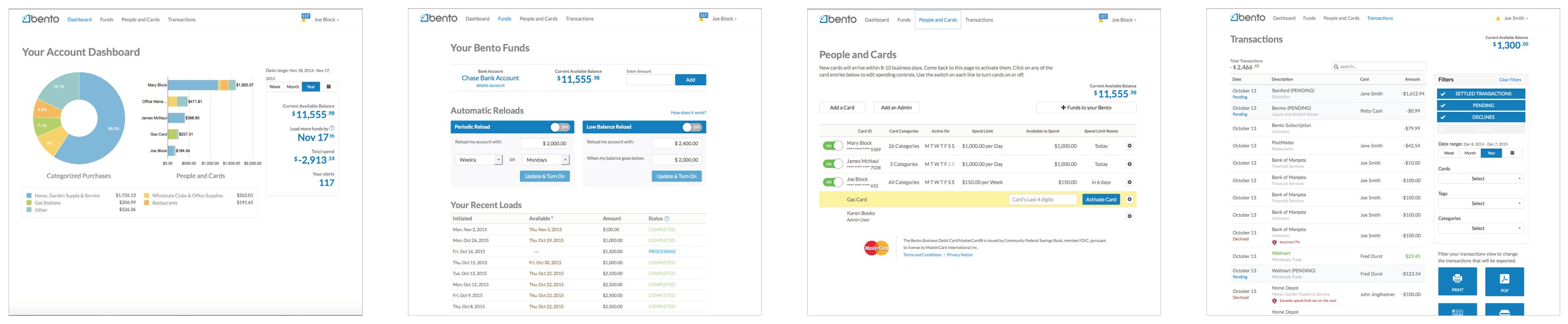
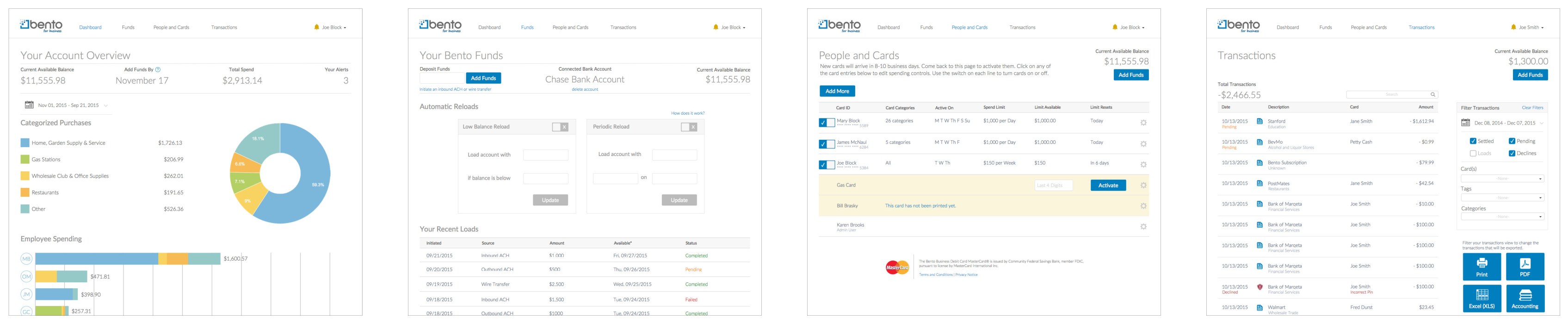
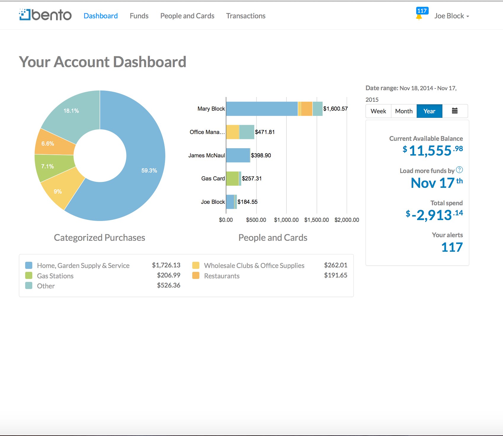
What was broken. The account dashboard had no hierarchy to guide anyone through it. The legend that explained the pie and bar charts sat below them, so you couldn't read the charts until you'd scrolled past them; section titles also sat below their own content; and a bar graph labelled “People and Cards” shared its exact name with a completely unrelated page in the navigation.
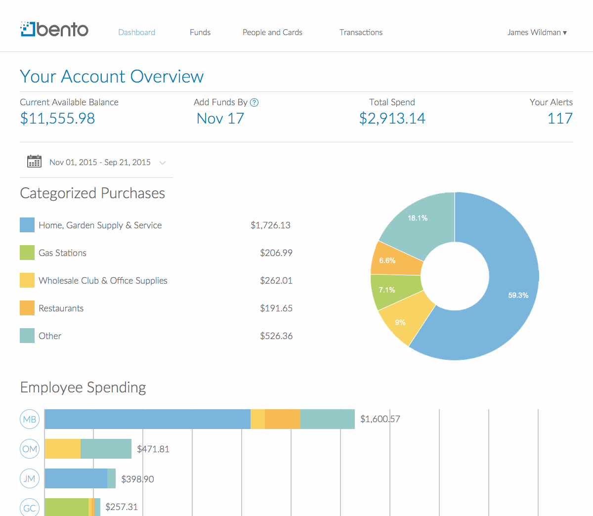
What I did. Rebuilt it top-down — the most important account numbers first, the legend before its charts, titles above their sections. The graph became “Employee Spending” to end the name collision, and long card names collapsed to initials that expand on rollover, an approach borrowed from iOS and Dropbox.
Funds
What was broken. Adding funds — the entire reason to visit the page — was buried beneath the reload settings. And status was color-coded in ways no one could read: brown dates, a green too light to see, and a blue that looked like a link but wasn't.
What I did. Fund-loading now leads the page; the periodic and low-balance reloads are compartmentalized in quiet hairline boxes; and load status uses one legible code — green for complete, orange for processing, red for failed.
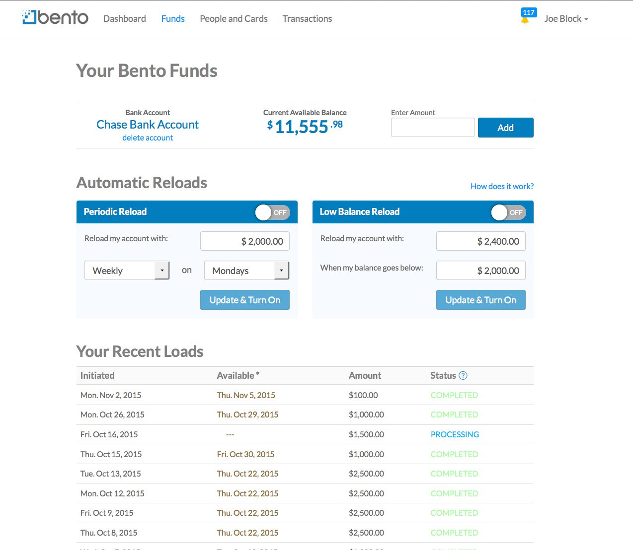
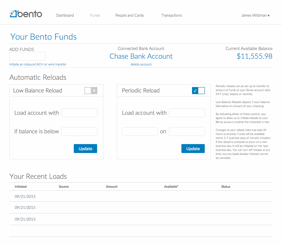
Automatic reloads, in motion. The reload flow that keeps an account from running dry — set an amount and a low-balance trigger, and Bento tops itself up. Here it is end to end:
People & Cards
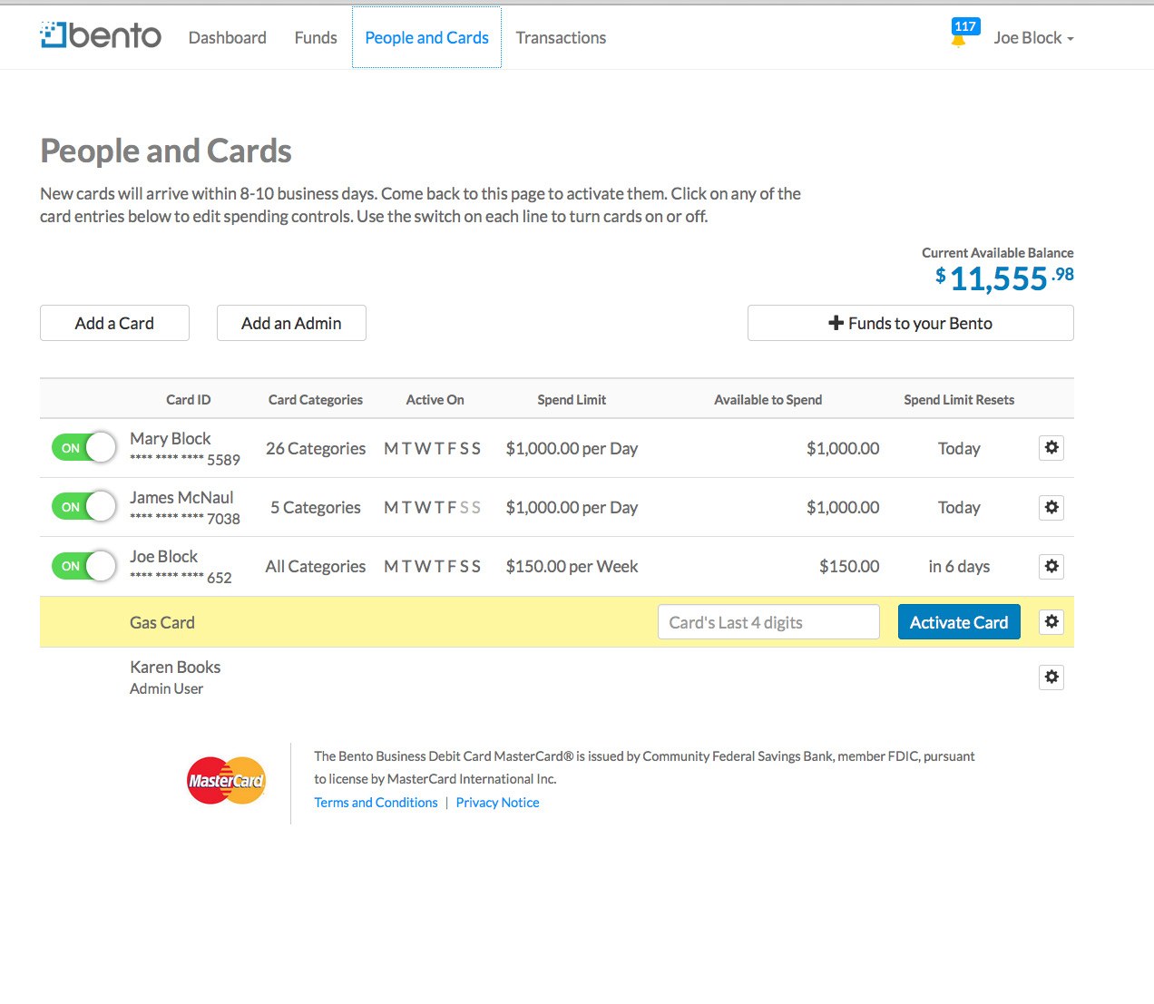
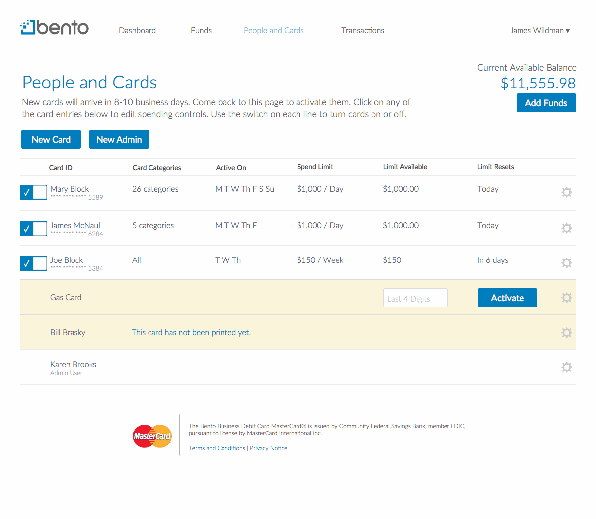
What was broken. Buttons abandoned the app's established style here; “Add a Card” and “Add an Admin” did essentially the same thing; and every card listed all seven days of the week with the inactive ones greyed out — making you stop and decode which days a card actually worked.
What I did. Buttons back to one consistent style; the two add-actions consolidated into a single “Add More” dropdown (utility card, employee card, or admin); and only the active days shown, so a card's schedule reads at a glance.
Transactions
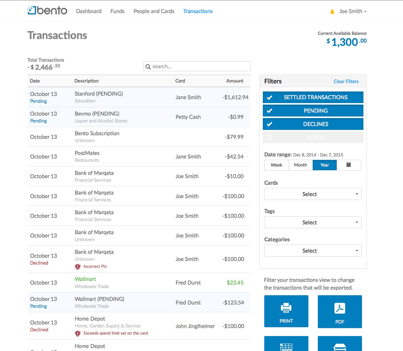
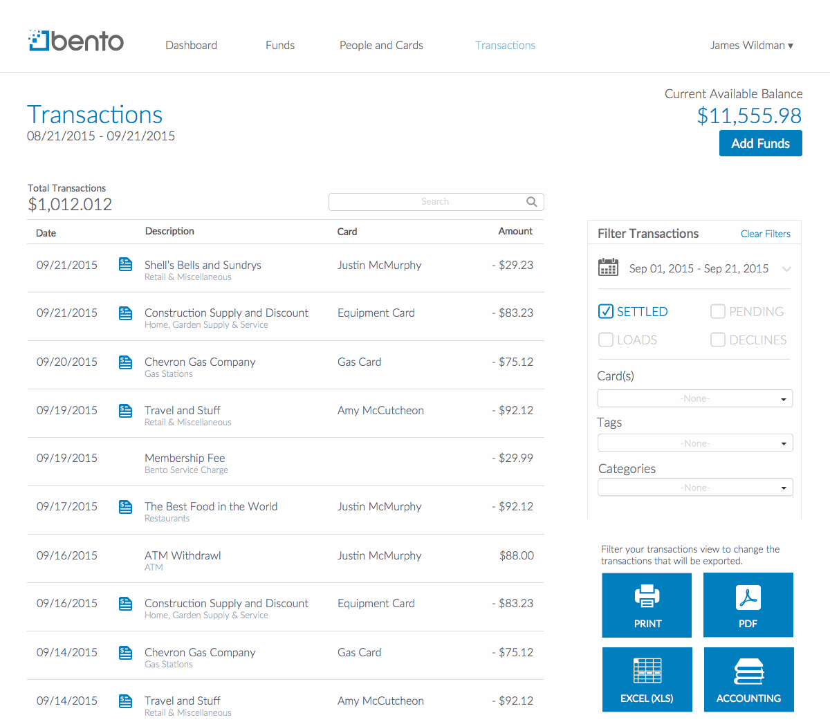
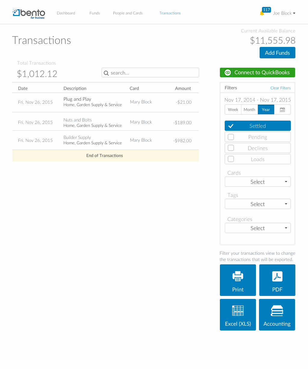
What was broken. Rows jumped height whenever a card declined; “Filters” was the loudest thing on the page, heavier than the data itself; and the filters were white-on-grey and unreadable until you selected one, at which point it turned blue and looked like a button.
What I did. Rows hold a uniform height, with a decline reason tucked beneath the card rather than the description; filters became two tidy columns of checkboxes; and the date picker and export buttons were brought in line with the rest of the site.
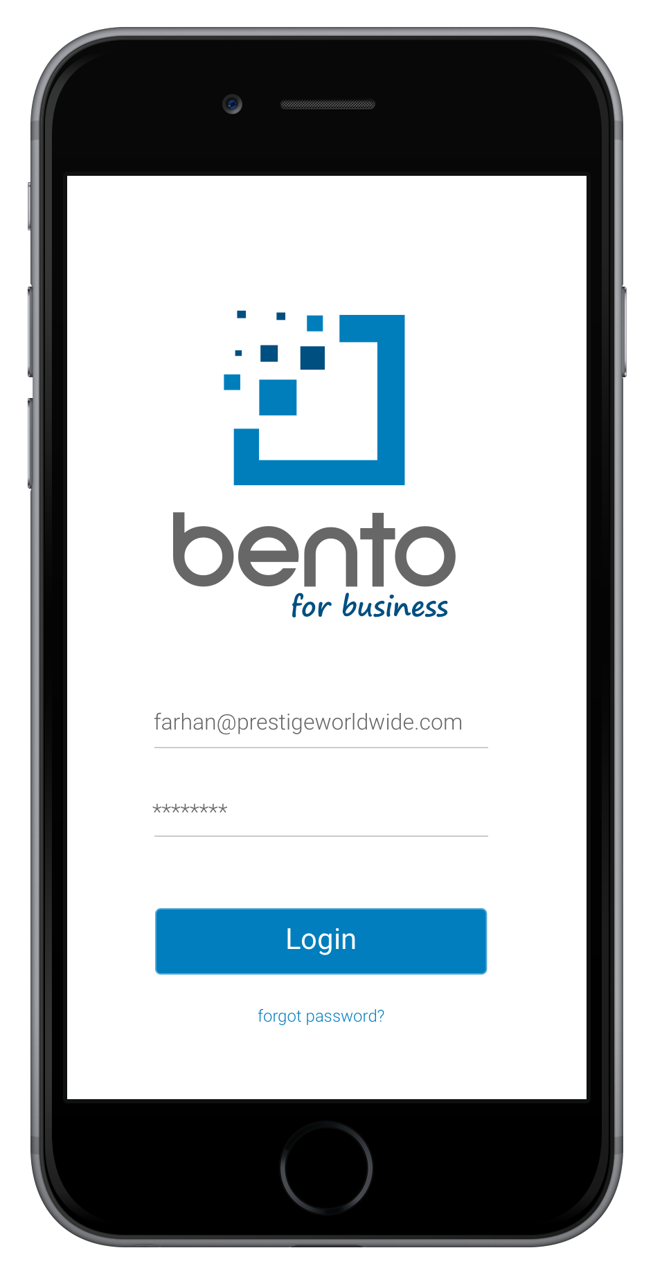
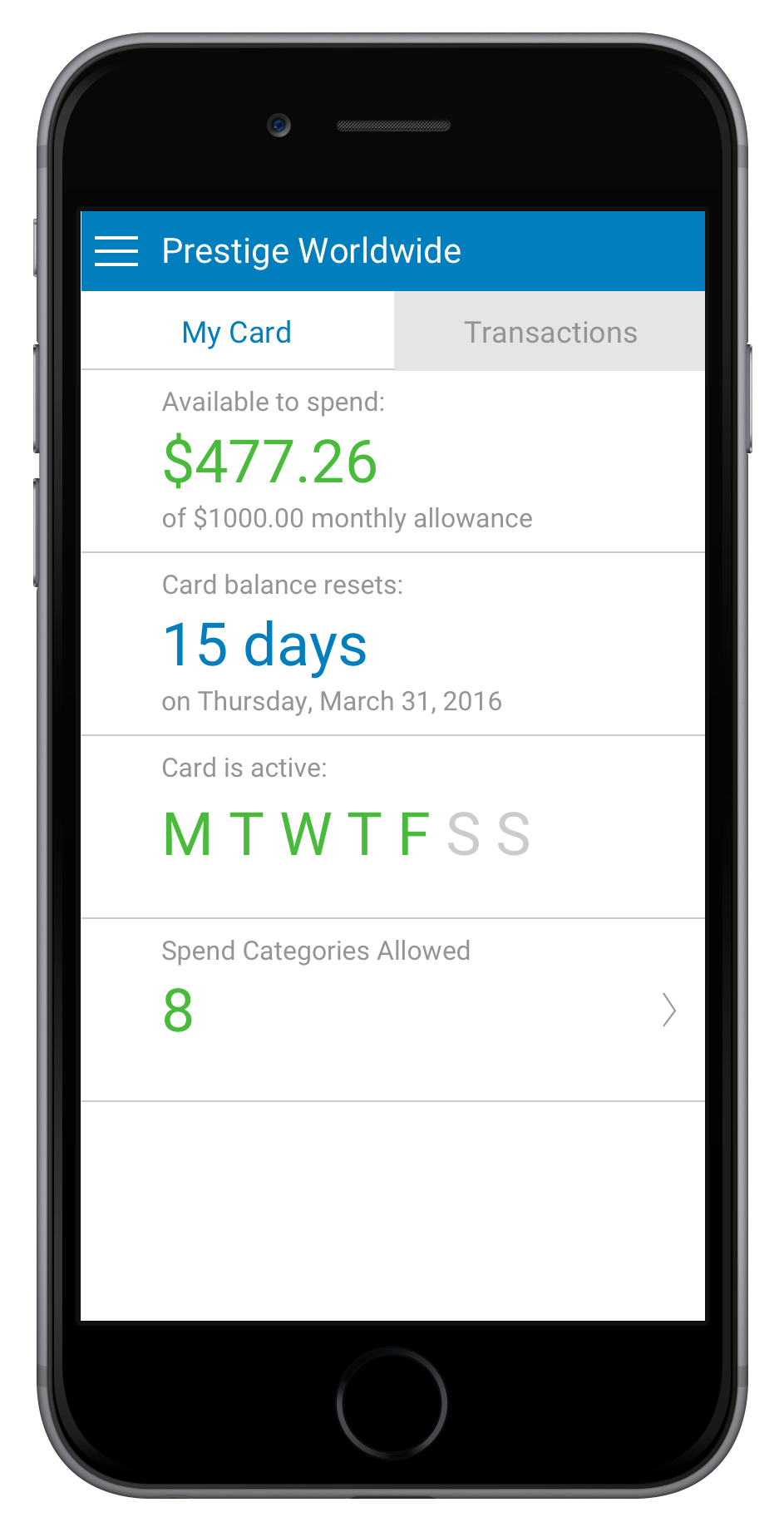
The employee's side of Bento. The owner sets the controls on the web — the spend limit, the approved categories, which days the card works — but the person actually holding the card is the employee, and the business still needs every purchase accounted for. This app is theirs: check the card, spend within the rules, and document each transaction in the moment, so the books stay clean without anyone chasing receipts later.
The card in their pocket
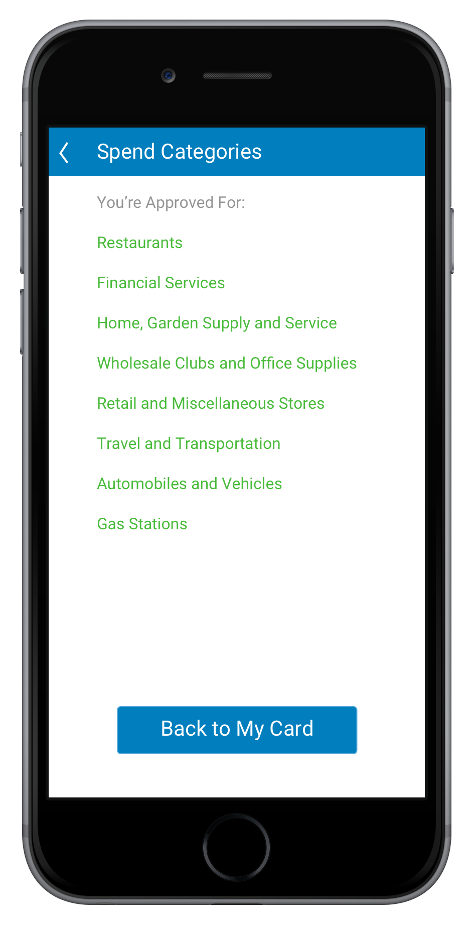
After signing in, an employee sees exactly what they're working with: how much of the monthly allowance is left, when it resets, which days the card is active, and the spend categories the owner approved. It's the same set of controls configured on the web, made legible to the person doing the spending.
Documenting a purchase
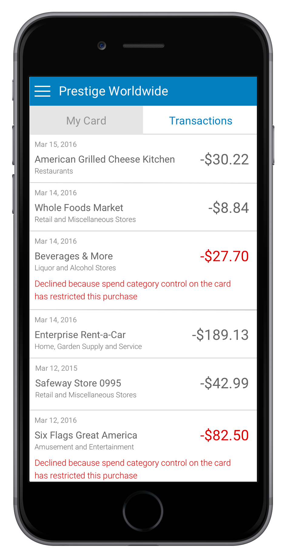
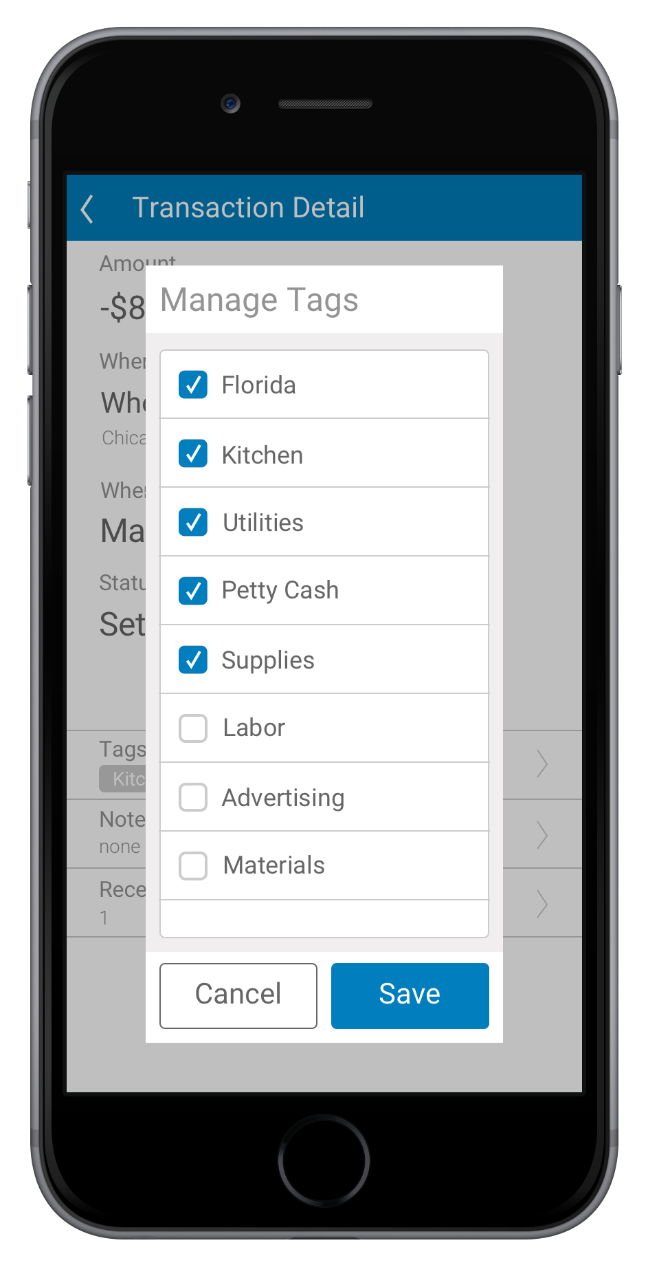
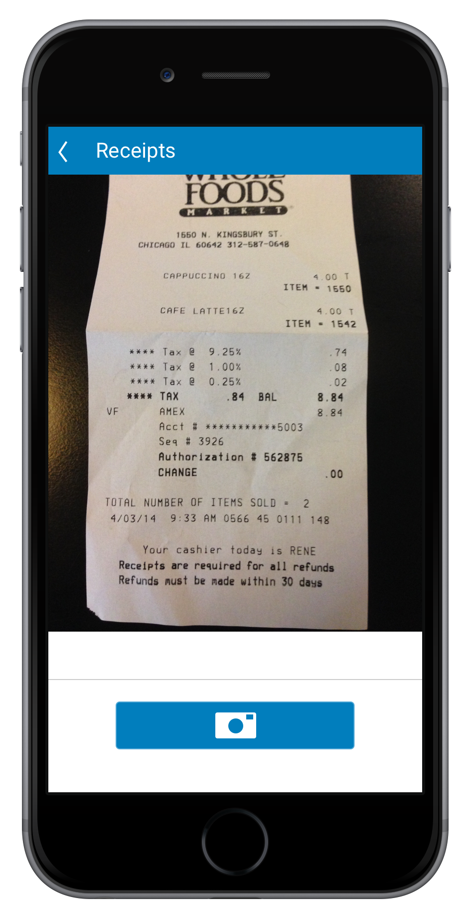
Every transaction lands in a feed. Open one and it starts bare — amount, merchant, date — with three things to add: category tags, a note, and a photo of the receipt. A few taps later it's fully documented (here, tagged Kitchen, Florida, and Utilities with a receipt attached) — exactly what makes the company's books reconcilable at month's end.
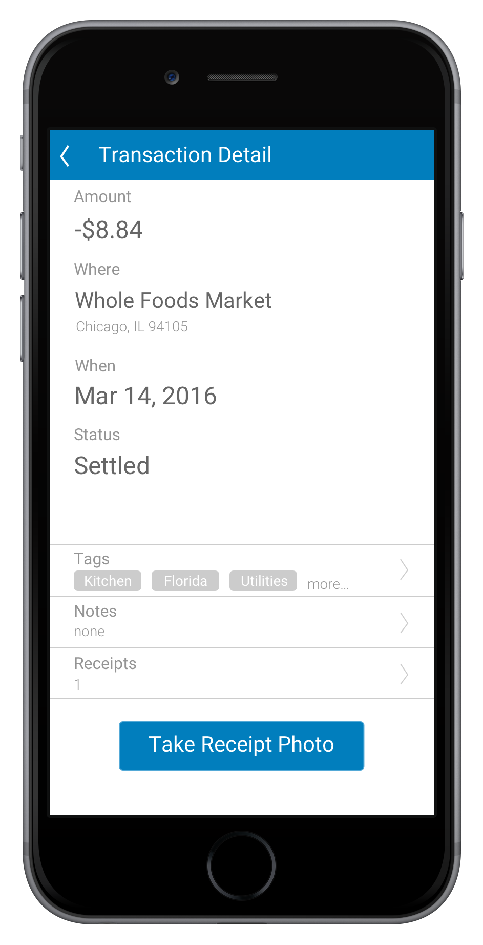
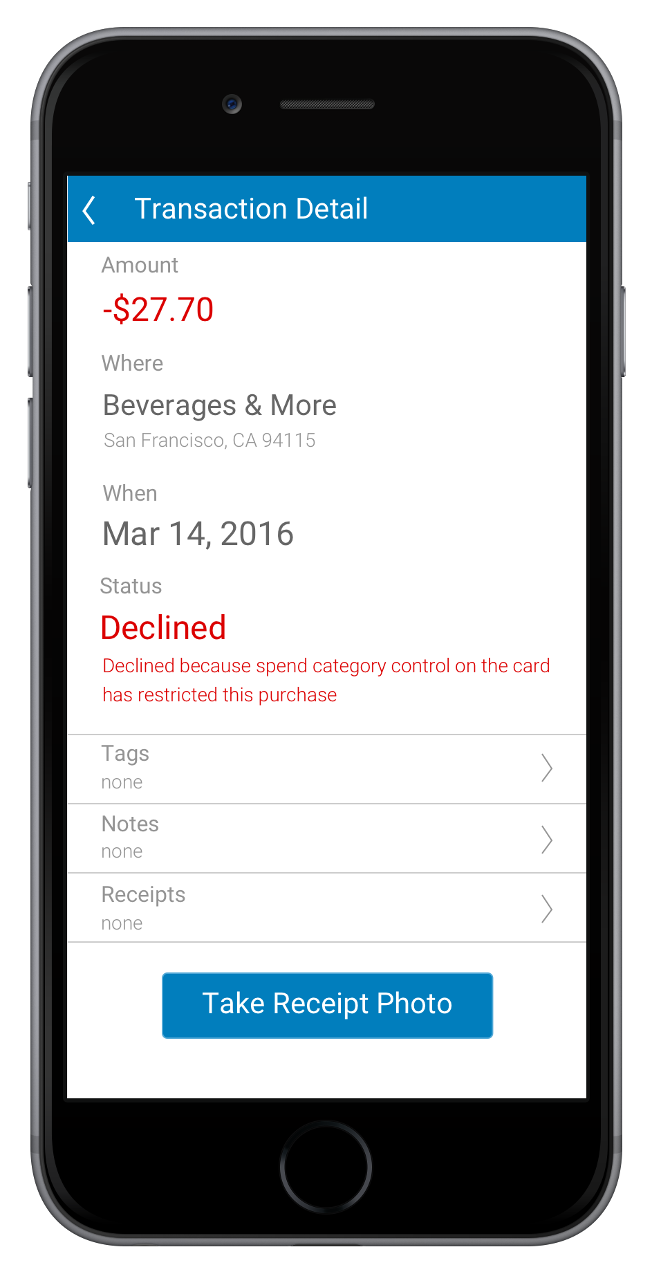
When the card says no
And when a purchase falls outside the owner's rules, the app doesn't just fail silently — it explains: “Declined because spend category control on the card has restricted this purchase.” The employee understands why on the spot, and the owner never has to field the call.
Bento tracked every dollar a business spent, and then that business re-typed all of it into their accounting software. The QuickBooks integration closed that gap. I wrote the proposal for it — the flow, the states, and the one genuinely hard problem underneath: Bento and QuickBooks don't describe money the same way.
A connect flow, not a sixth button
The Transactions page already carried its export options — Print, PDF, Excel, Accounting. QuickBooks could have been crammed in as another one-shot export button, but an accounting integration isn't a file download. So it became its own action instead: a single green “Connect to QuickBooks” at the top of the same page, starting a proper connect-and-sync relationship rather than adding to the wall of buttons.
Handing off to Intuit
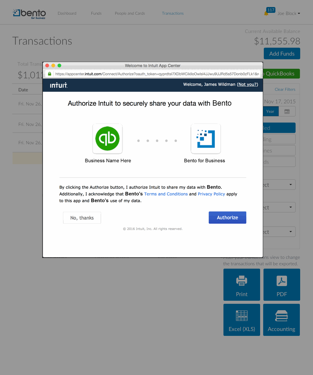
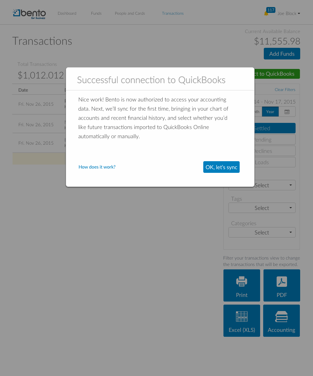
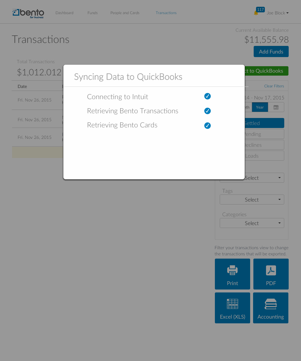
Connecting has to happen on Intuit's terms — their window, their sign-in, their authorization screen — so the design job was everything around that handoff. The user signs in and authorizes on Intuit's own screens; Bento then confirms the connection in plain language and offers to run the first sync; and an honest progress list shows that sync pulling in their chart of accounts and recent financial history as it goes.
Mapping Bento to their books
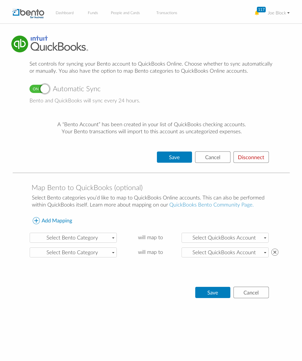
This was the real problem. Bento thinks in spend categories — Restaurants, Fuel Pumps, Wholesale Clubs, Telecom — while QuickBooks thinks in a chart of accounts that every business names its own way. Something had to reconcile the two, and it couldn't be us guessing on their behalf.
So I designed a mapping table: every Bento category down the left, a dropdown of that business's actual QuickBooks expense accounts down the right. If the account they need doesn't exist yet, they can add it without leaving. If a category is irrelevant to their business, they set it to ignore. And for anyone who'd rather not map anything at all, an escape hatch — bring everything in as uncategorized and sort it out in QuickBooks later.
Staying connected
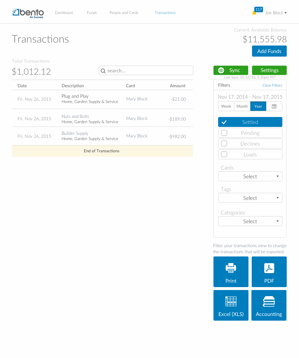
Once connected, the Transactions page carries the controls with it — a Sync button beside a last-synced timestamp, and a Settings button back into the mapping or a full disconnect. An integration you can't get back out of isn't much of a feature either.
Putting it in front of owners
Before this shipped, I ran moderated sessions with three small-business owners: an auto-parts importer with eight employees and a bookkeeper who handles the QuickBooks; an office manager whose previous POS “made a mess of QuickBooks imports — mapping went to the wrong accounts”; and an event planner who catalogues receipts and mileage by hand. Each worked a scripted set of tasks — connect, switch sync modes, set a default account, map categories, disconnect.
It confirmed the premise. The mapping table landed with exactly the people it was built for — owners without a dedicated finance person, who'd otherwise have to go and set all of this up inside QuickBooks itself.
It also broke things, which was the point:
- Two of three couldn't find Disconnect. The link was too small — and one owner read that as evasive: it “makes it seem as though there's a lack of transparency.”
- Trust drove people to manual sync. One turned automatic syncing off — “because I don't always trust these things” — then went hunting for the manual sync button on the Transactions page, not buried in settings where it lived. Roughly half of survey respondents had asked for manual syncing too.
- “Default account” and “category mapping” competed. Two of three reached for the wrong control when asked to set the default.
- Three empty mapping rows read as clutter. Starting with one would have been clearer — the feature made sense to people only on second encounter.
- “Daily” wasn't specific enough. Owners wanted to know exactly when a sync runs and how long before it shows up.
All of it shipped, and the fixes were unglamorous and specific. Disconnect became a bordered button sitting beside Save and Cancel. A Sync button moved onto the Transactions page itself, next to a plain last-synced timestamp — and the settings copy now says outright that's where it lives. “Daily” became “Bento and QuickBooks will sync every 24 hours.” Choosing a default account became its own labeled step, separated from the optional category mapping beneath it. And the mapping table now opens at a single row, extended with an ⊕ Add Mapping control and cleared with an ⊗ — the plus-and-X pairing one owner had asked for in place of a trash can.
3× conversion · 250% session time · first mobile app shipped from scratch
CollegeData is a free advisory service guiding students through college search, admissions, scholarships, and financial aid. My scope over three years touched every surface — platform, brand, marketing, and the company's first mobile app.
3× conversion YoY · 250% session time · 2× sign-up conversion
CollegeData is a free advisory service helping students and families find schools, calculate admissions chances, and search scholarships and financial aid. By the time I arrived, the platform doing all of that still looked and behaved much as it had at launch.
The problem
The site wasn't mobile-friendly, and it wasn't far removed from what had originally launched in 2001. The product manager and I were tasked with the responsive relaunch — my part being improved interactions and a more usable information architecture, under one hard constraint: no changes to backend functionality. Whatever we fixed had to be fixed in the surface.
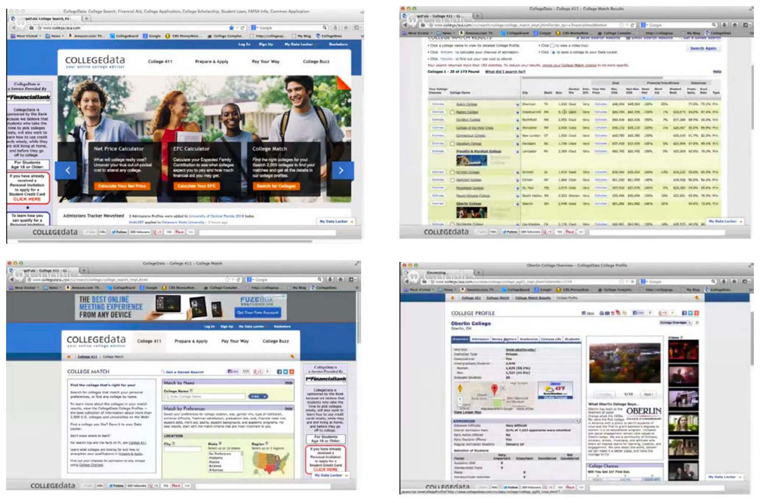
The solution
Alongside the interface work, we migrated the site onto a CMS so the team had direct control over its own content, and got the whole thing working properly on a phone — into the pockets of the students actually using it. Conversion rose 3× year over year across all channels, and session time increased 250%.
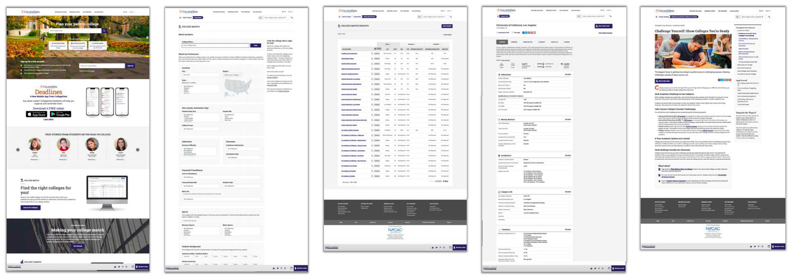
Sign-up optimization
Sign-up was its own problem. It ran across two pages and was excessively long — punishing on a phone — and a high share of people abandoned it before finishing. I went through the user analytics, broke the flow into shorter stages, and made it obvious at every step where someone was in the process and how much was left. That change alone doubled conversion.
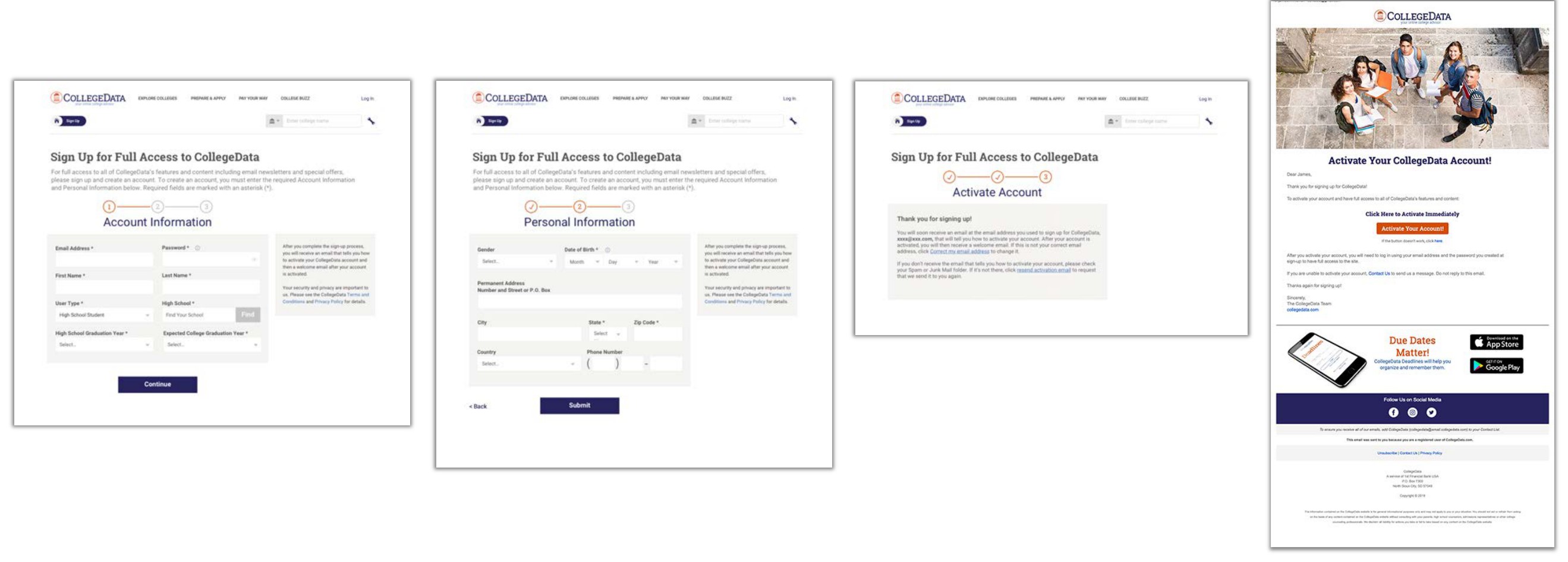
First mobile app ever shipped by CollegeData · iOS & Android · V1 + V2
CollegeData had never shipped a mobile app. The brief was to make one — with an explicit instruction that it be worth more to students than a repackaged version of the website, and the practical constraint that there was very little to build it with. What follows is how one recurring complaint became the entire product.
Here's the launch promo, to see it in motion:
Also on YouTube.
Finding the problem
We went looking before designing anything. Talking with students and families — at college fairs, at conferences, and through our own users — one frustration kept surfacing: keeping track of the deadlines strung across the admissions process. Application cutoffs, test registration windows, financial aid dates, scholarship closings, every school on its own schedule. Nobody had a single place to hold it all.
Checking the landscape
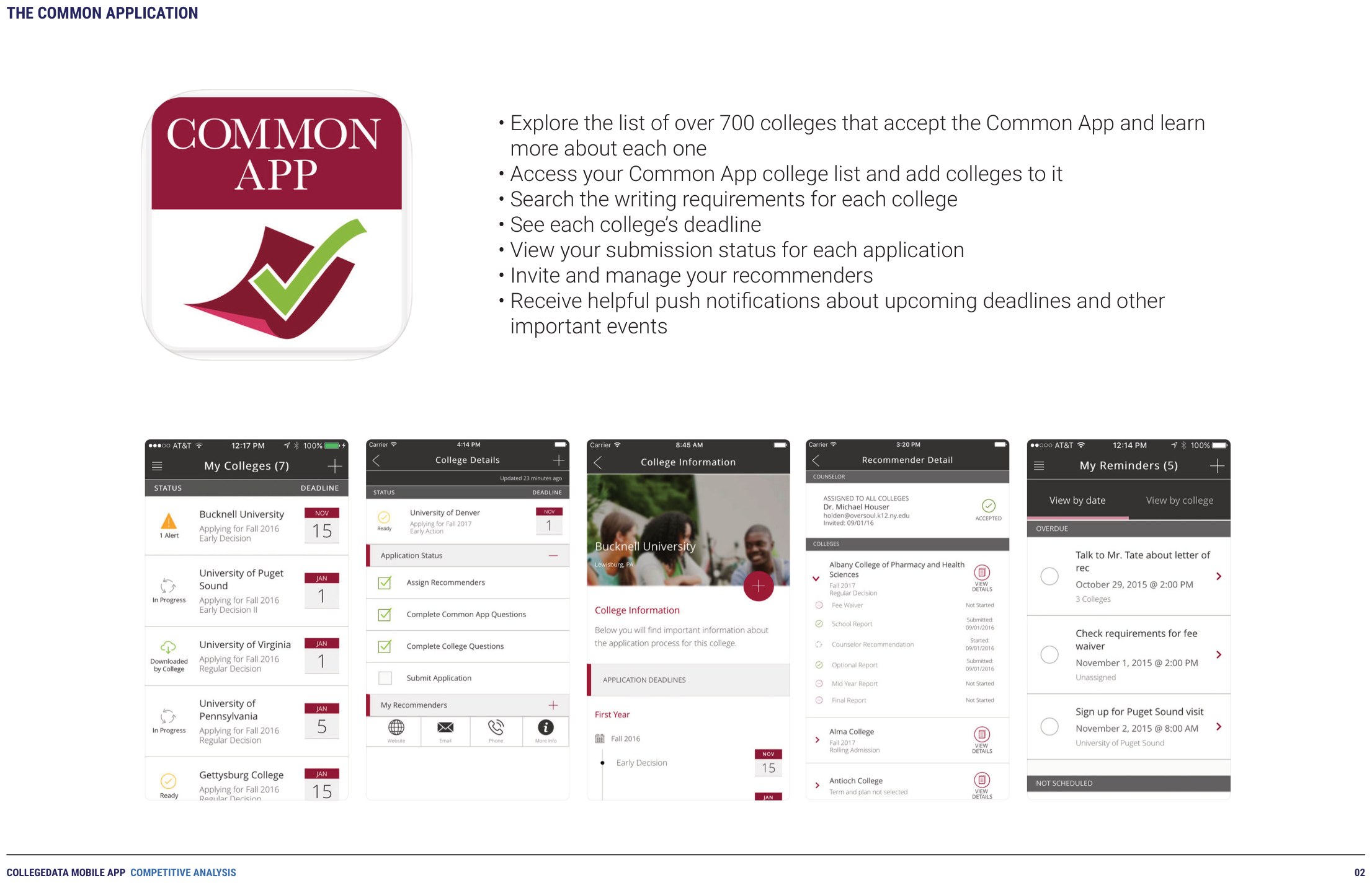
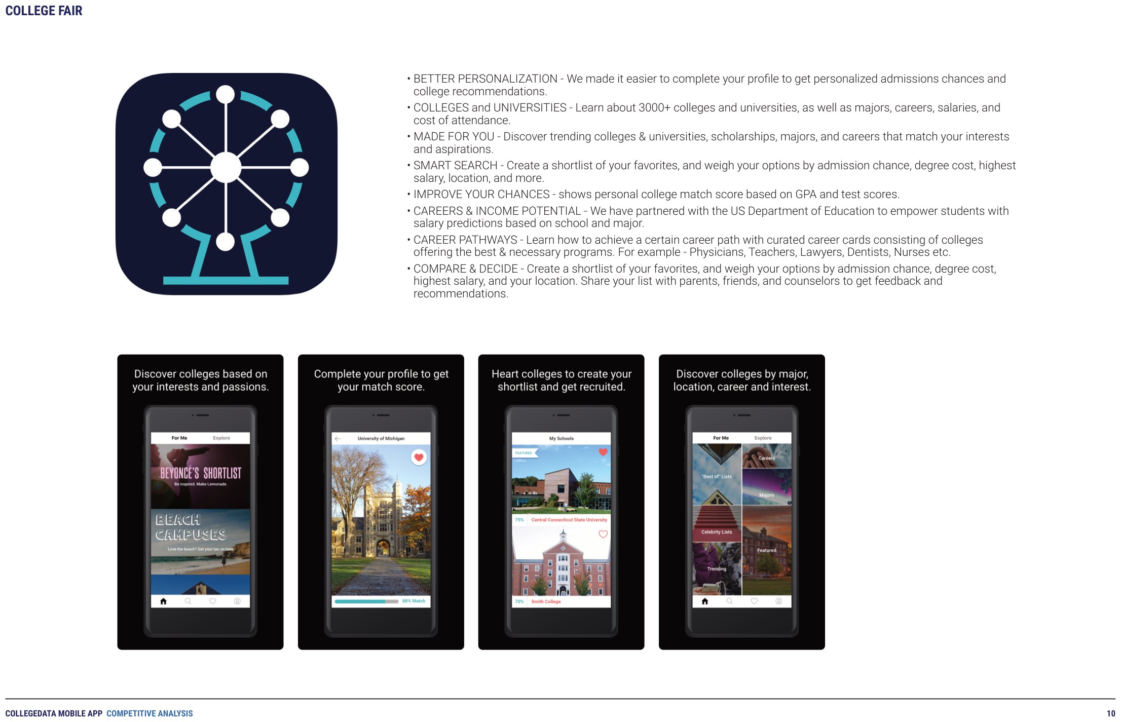
Then I ran a formal competitive analysis — eight apps, from the Common App to Scholly, Fastweb, and College Raptor — walking each one's screens, feature set, and App Store reviews. Two kinds of product kept coming back: ones that reproduced a website on a smaller screen, and ones that did scholarship search. Nothing was doing the thing our users kept asking for. That gap defined the product — Deadlines would do a single job, organizing and delivering each student's own notifications, and do it well enough not to need anything else.
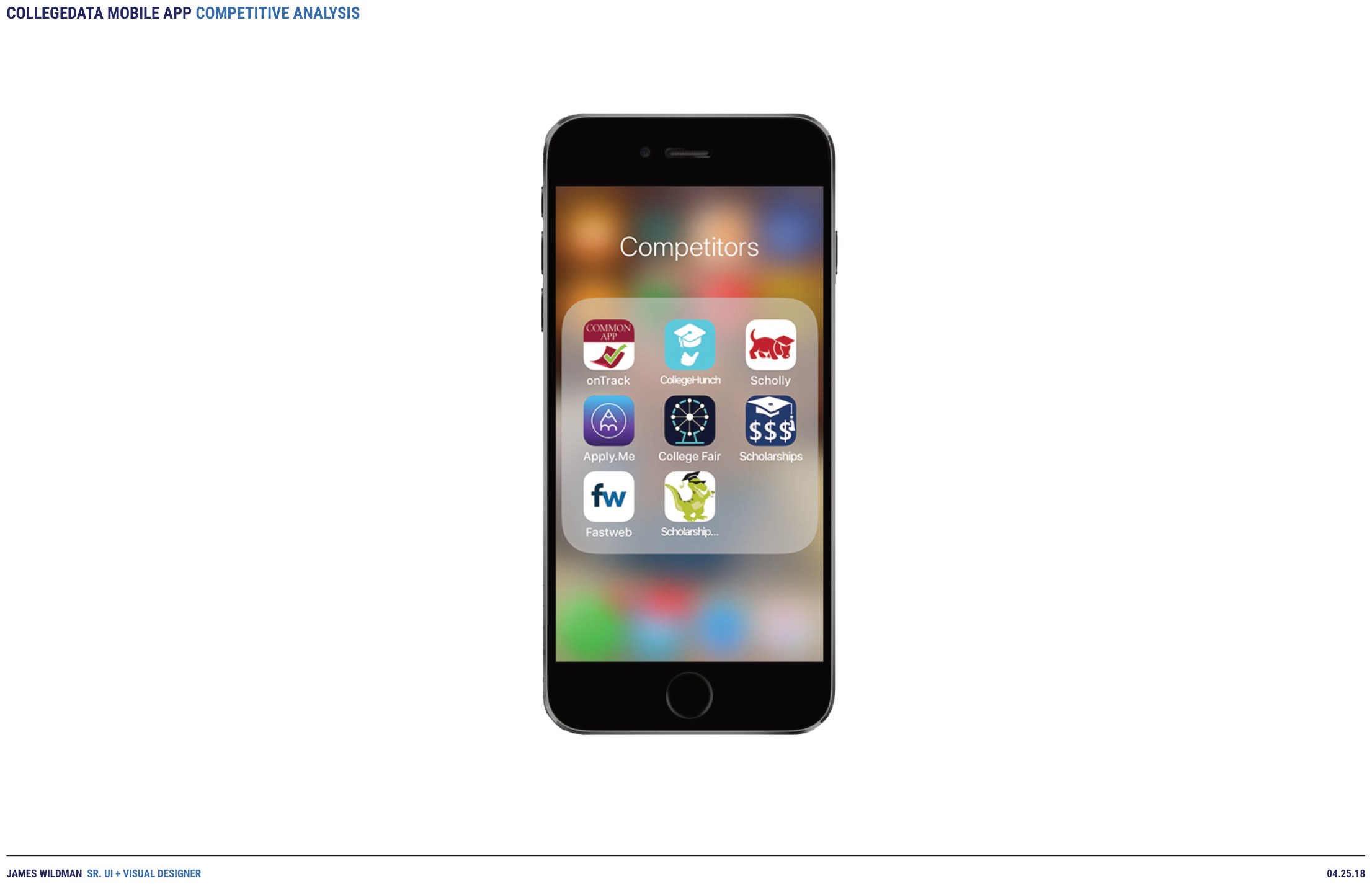
Building on what already existed
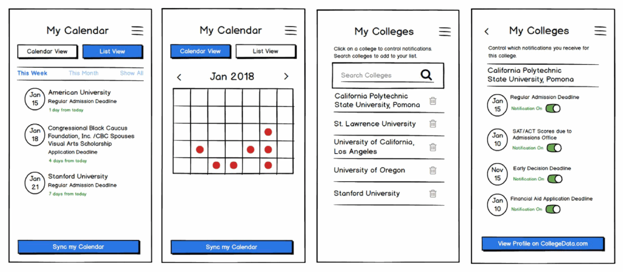
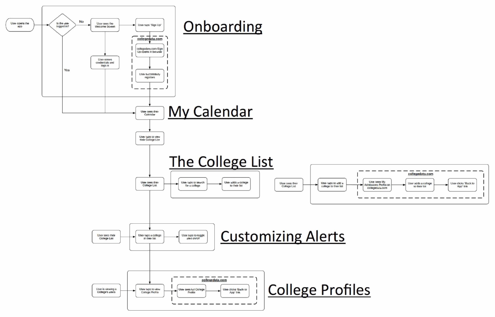
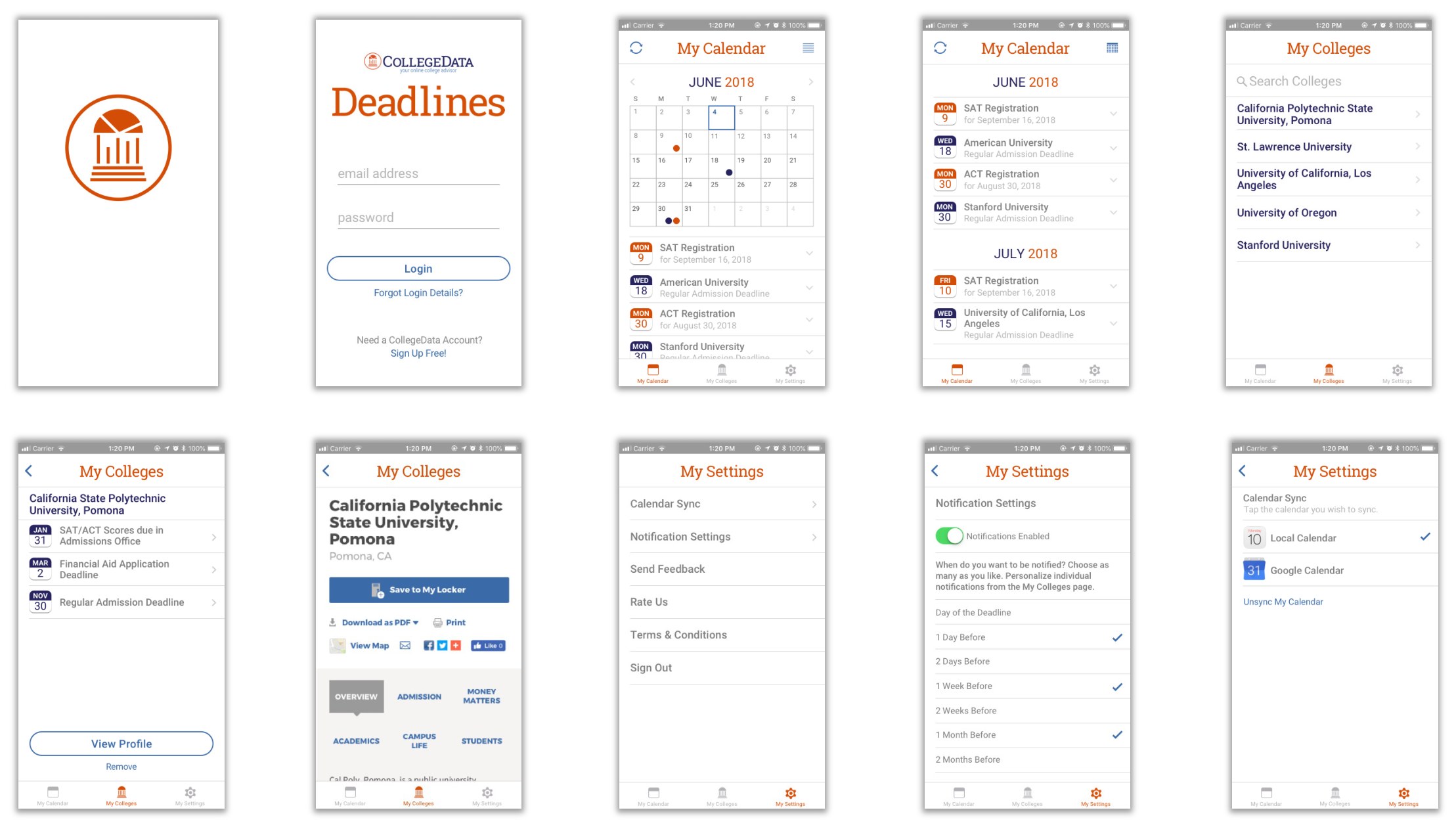
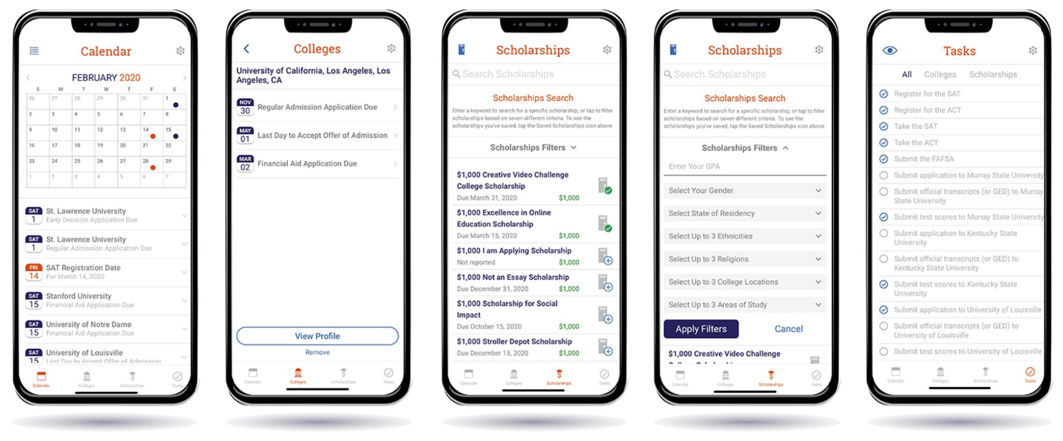
With limited resources, the app leaned on the website rather than duplicating it: students could register through the app, search and save schools and scholarships, and open a full profile on the CollegeData mobile site. That kept the app small. I wireframed the screens and mapped the flows first — onboarding, My Calendar, the college list, customizing alerts, and college profiles — so its surface area stayed honest about what we could actually build.
The MVP
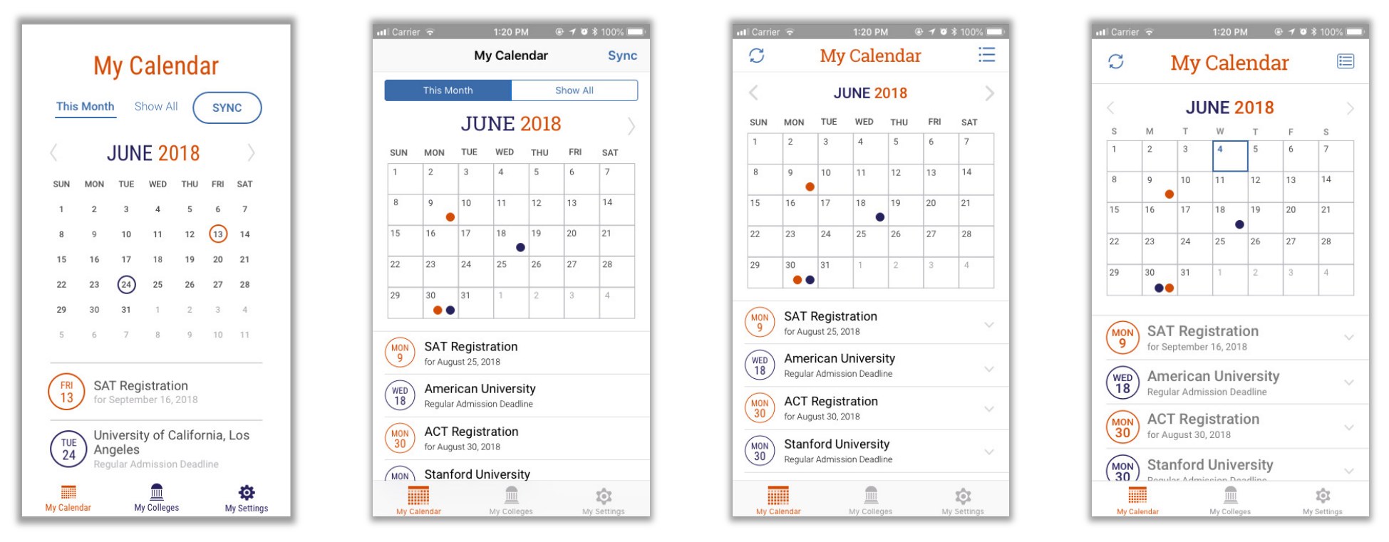
V1 stayed deliberately lean. A student's saved colleges sync straight from their CollegeData account, so the list arrives already populated. Deadlines read two ways — a month calendar for scanning, a chronological list for doing — and each college's notifications toggle on or off individually, so a student hears about the dates that matter to them and nothing else.
Getting the reminder to land
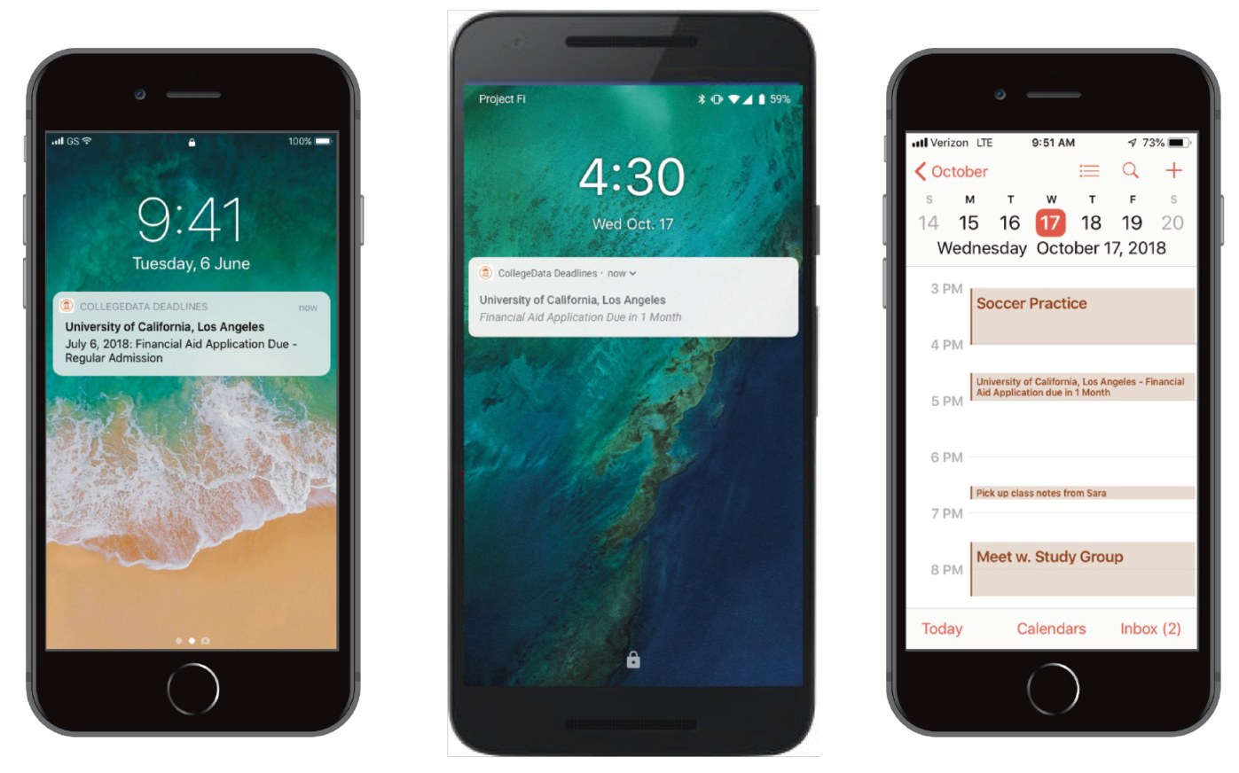
The app is only useful if the reminder actually arrives. Notifications fire at intervals the student sets rather than on a schedule we chose for them. Deadlines also syncs into the device's own calendar, so the dates turn up where they're already looking — and with calendar sync enabled, on the desktop too.

V2 — scholarships and tasks
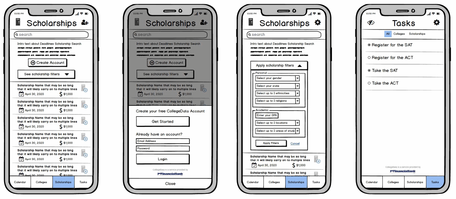
V2 widened the scope. Scholarship search and saving came into the app, and everything a student had collected — test registrations, college applications, financial aid, scholarships — was compiled into a single task list they could tick off as they went. The calendar told them when; the task list told them what was left.
Full rebrand · NACAC 20 × 20 exhibit · social & paid campaign
Updating the site exposed how much else needed updating. The identity, the advertising, the conference presence, and the video library all followed from the relaunch.
Rebrand
With the site itself modernized, the identity was in dire need of the same. I looked at how others in our field presented themselves, and at how the colleges we wrote about branded themselves, then developed a new logo and identity — including an icon set built to survive being shrunk into a social avatar or stretched across other branding applications.

Social & online marketing
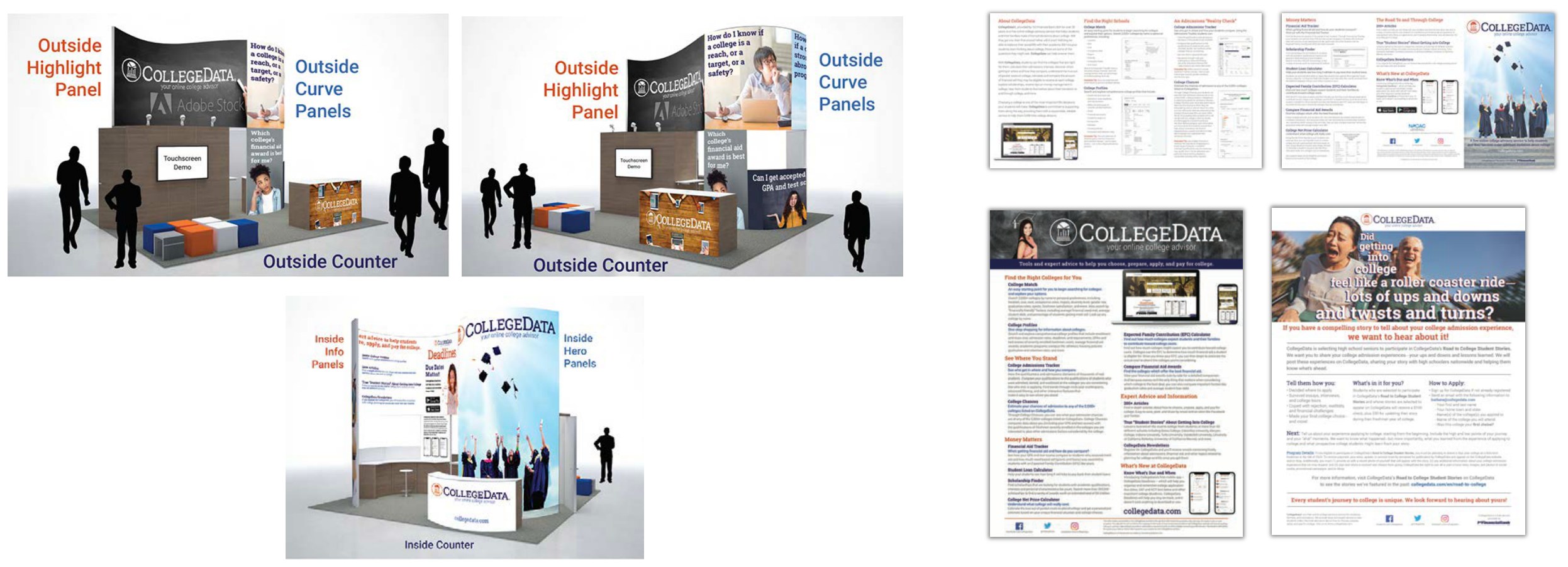
A new identity made room for a new campaign. Rather than talk about the product, I built it around the students and the universal questions everyone faces on the road to college — How much will college REALLY cost me? Can I get accepted with my GPA and test scores? The series ran as sponsored posts across Facebook, Twitter, and Instagram, and as Google Ads, sized out for every placement.


NACAC exhibit & collateral
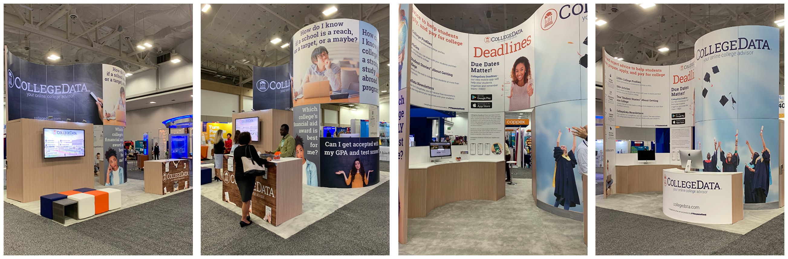
CollegeData exhibits annually at the National Association of College Admissions Counselors conference — an organization of more than 13,000 admissions professionals. I designed our 20 × 20 booth, from the highlight and curve panels down to the counters and touchscreen demo stations, along with every piece of collateral and the promotional give-aways.
Video
Video had become the format that actually travelled, so CollegeData needed a library of its own — for the site, for email, and for social advertising. I produced promo spots for both the site and the Deadlines app, plus ten more walking through individual tools and features.
Also on YouTube: the how-to promo and the Deadlines promo.
31M+ educators, students & parents · two products shipped from scratch
Learning Without Tears had spent four decades building programs that classroom teachers and occupational therapists trusted — curricula designed for desks, physical workbooks, and direct instruction. When COVID closed schools in March 2020, all of it needed to work on tablets in living rooms without a teacher in the room. I started my first week the same week the lockdowns began.
There was no ramp-up. Two digital products needed to be designed from scratch — simultaneously — with one junior designer and no established UX process. Over two years I designed both end-to-end: information architecture, interaction models, visual design, and student and educator experiences across both platforms.
Mat Man A-Z · tablet-first literacy app · designed from scratch
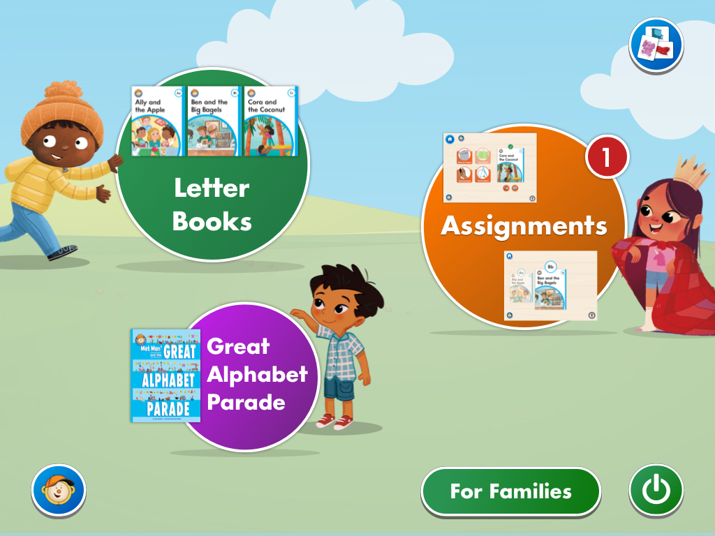
Built around LWT's 26-book alphabet curriculum, MMAZ is a tablet-first HTML app covering the full student experience: an illustrated dashboard, a letter book reader, six interactive activity types, assignment tracking with progress states, and a sticker-wall reward system. Every screen.
Dashboard
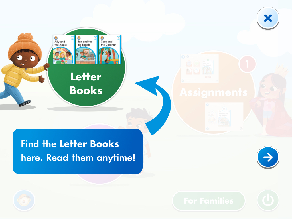
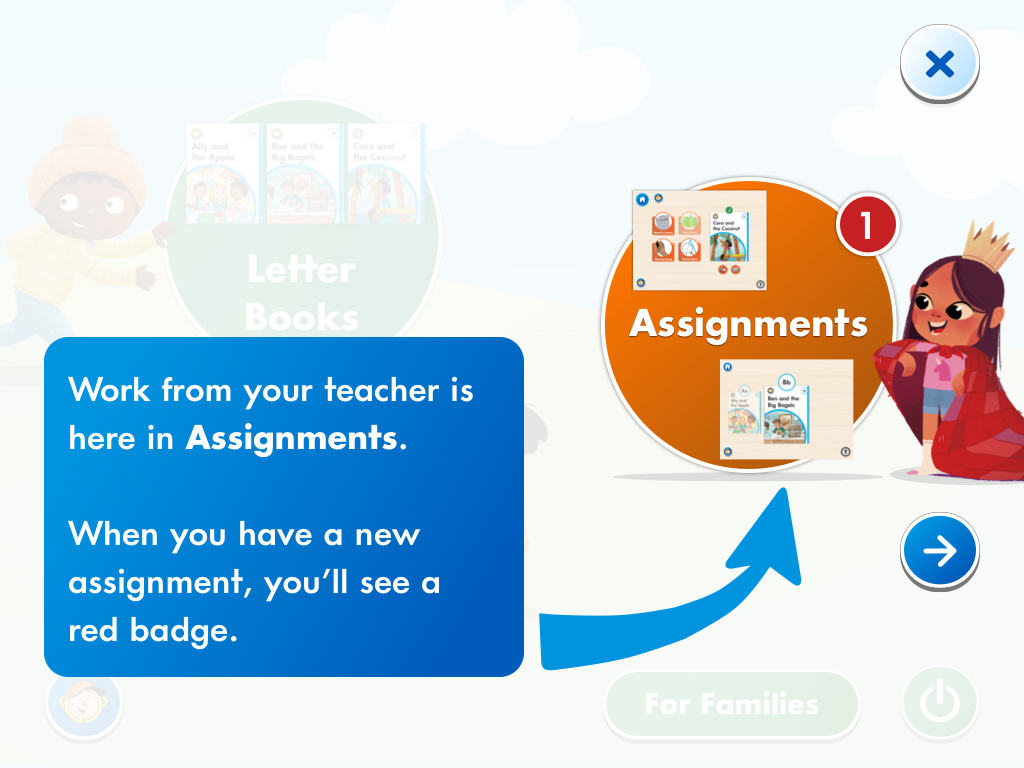
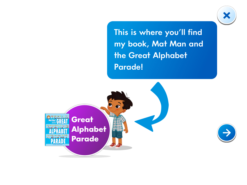
The entry point surfaces all three pillars of the app — Letter Books, Assignments, and the Great Alphabet Parade — through illustrated character bubbles sized to communicate hierarchy at a glance.
Letter Books
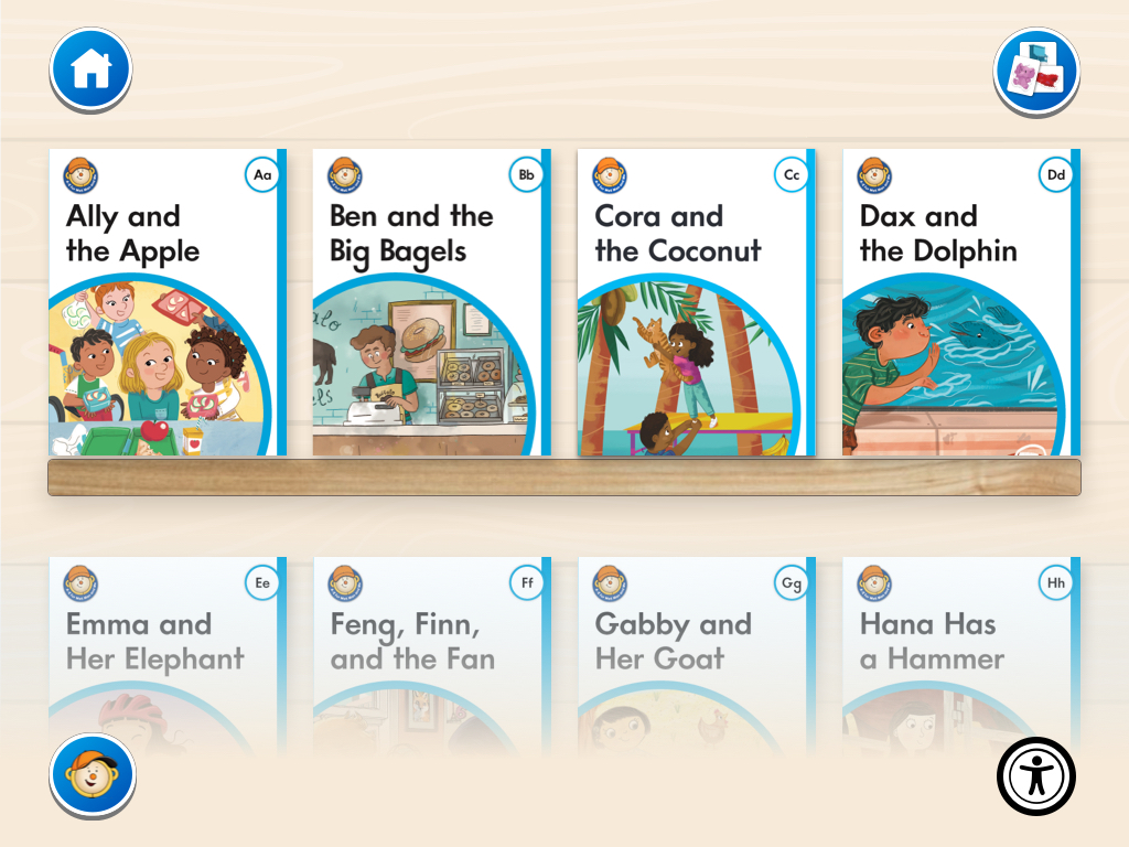
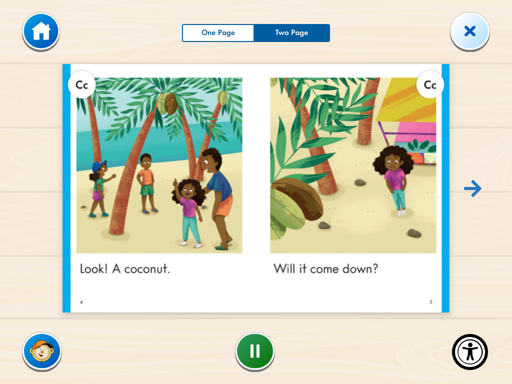
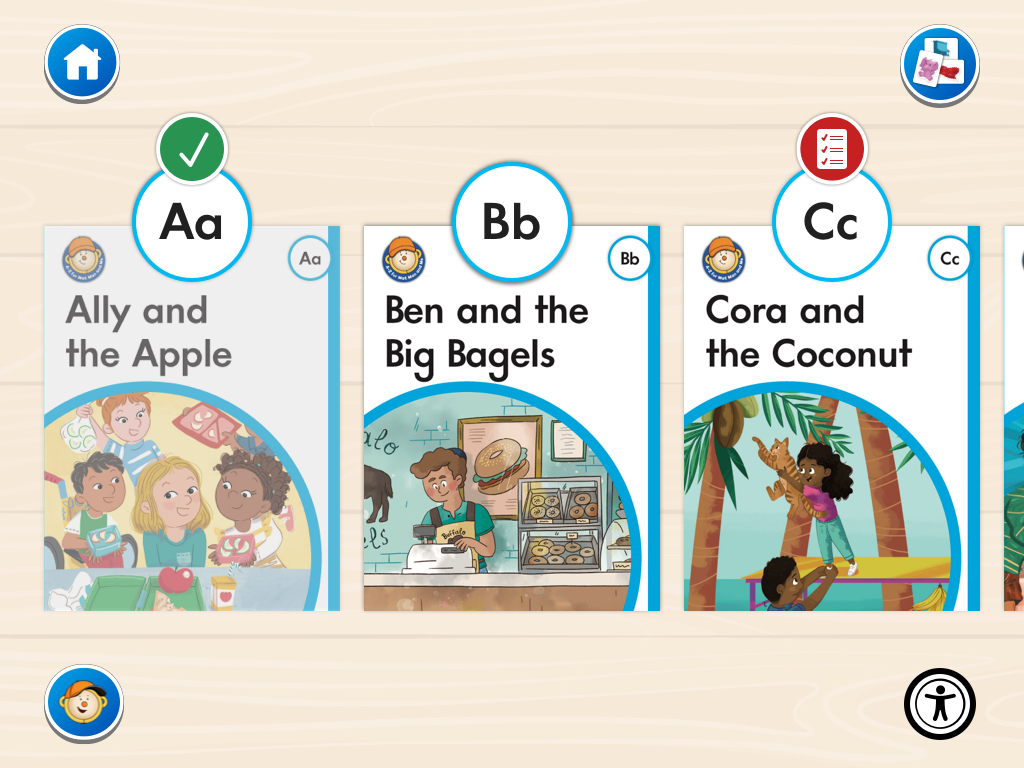
Students browse 26 illustrated books — one per letter — from a bookshelf view, then read them in a two-page spread reader with audio narration and one-page / two-page toggle.
Activities
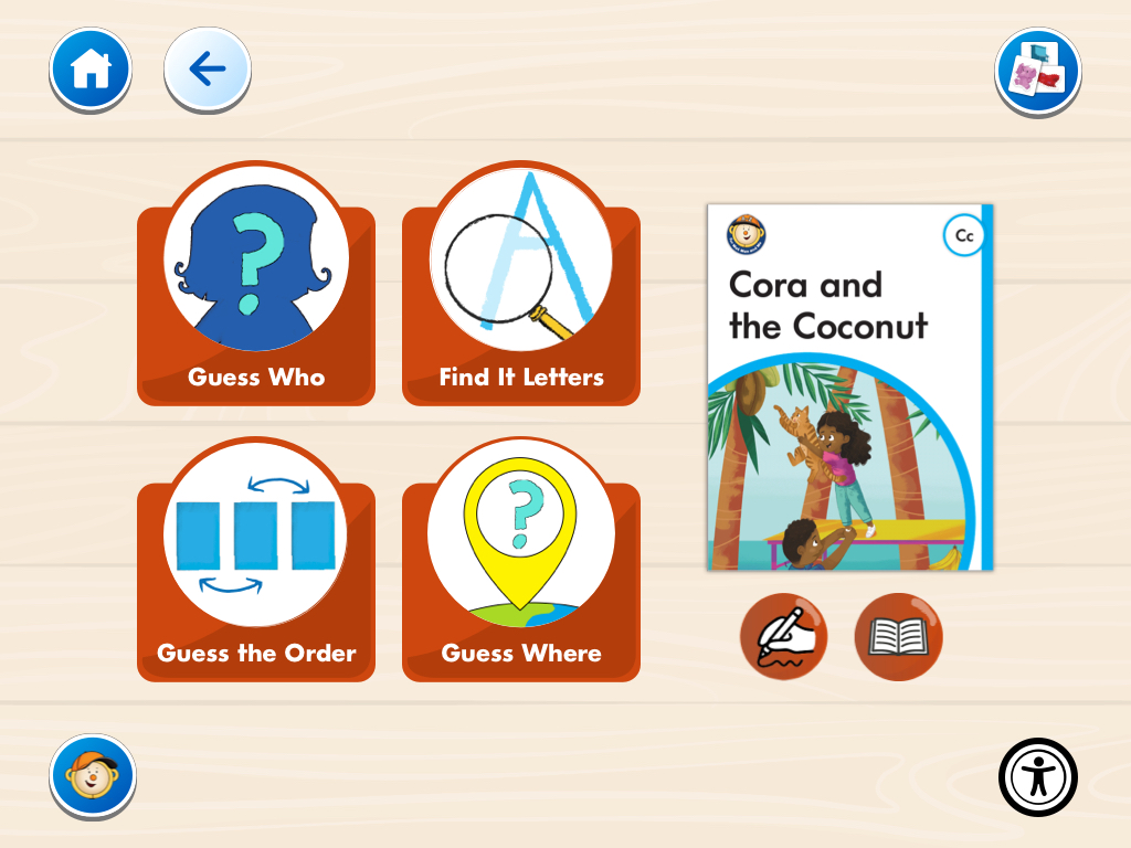
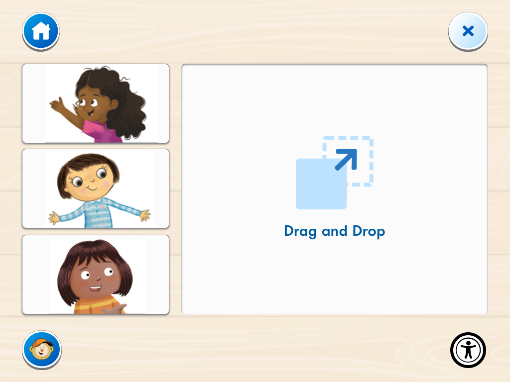
Each letter unlocks up to six interactive activities tied to its book — Guess Who, Find It Letters, Guess the Order, Guess Where, Find It Pictures, and Feelings Match. Activities are surfaced alongside the book cover so context is never lost.
Assignments & Rewards
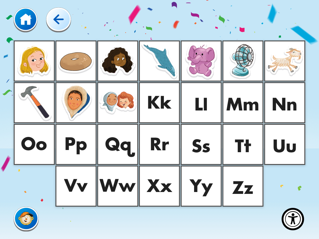
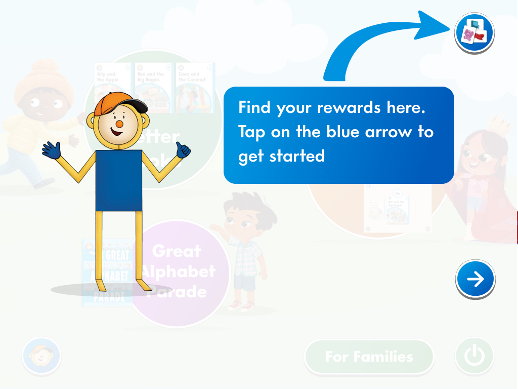
Teachers assign letters; students see per-letter progress states at a glance. Completing a letter's activities earns stickers toward a full alphabet sticker wall — the reward loop that runs the length of the curriculum.
Tutorial
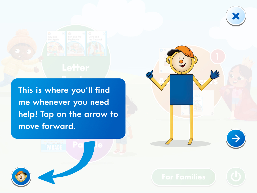
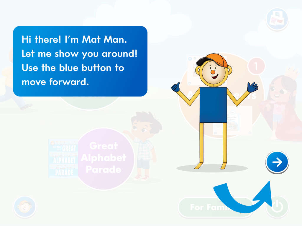
Rather than generic tooltips, MMAZ uses Mat Man — the curriculum's own mascot — to walk students through the app on first launch. Each step highlights a single dashboard section with an animated arrow callout, keeping the full app visible throughout.
Handwriting Without Tears Online · student app · designed from scratch
Handwriting Without Tears is LWT's flagship — four decades of printed workbooks, wooden letter pieces, and wet-dry-try slate boards, taught by an adult sitting beside a child. HWO had to carry that onto a tablet in a living room, for a student who often can't yet read, frequently with no teacher in the room. The design problem wasn't digitizing the curriculum. It was keeping it physical.
Three doors, no reading required
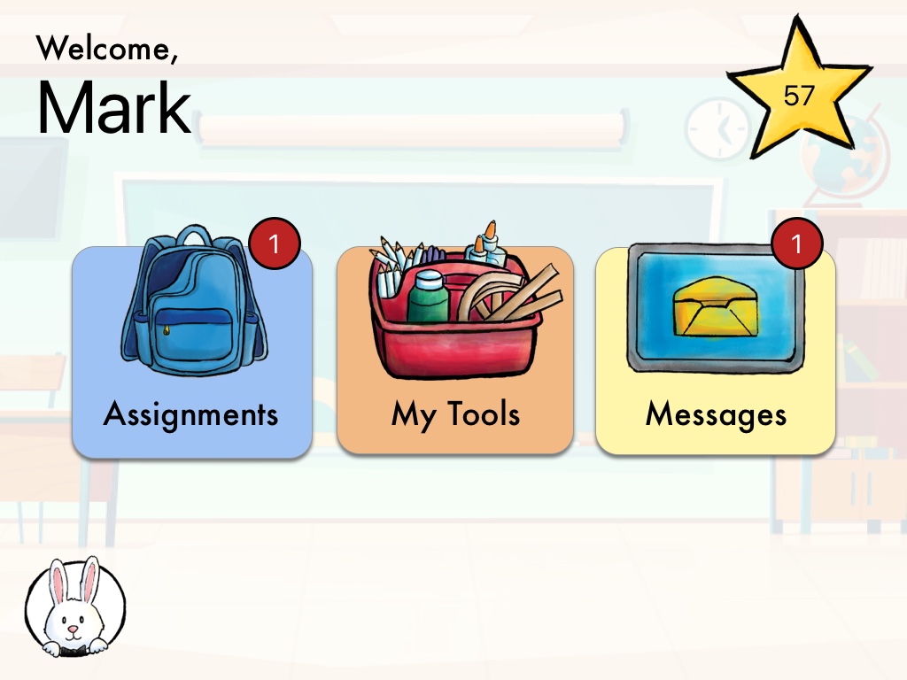
The home screen offers exactly three destinations — Assignments, My Tools, and Messages — as oversized illustrated targets a small hand can reliably hit. Each carries a numbered badge, so a child who can't read the labels can still see that something is waiting for them. The star count and Magic C Bunny persist throughout, so there's always a familiar face and a running sense of progress.
The workbook stays on the table
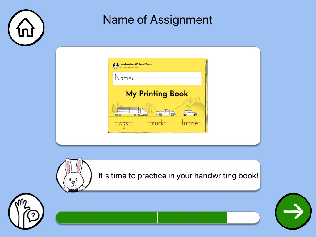
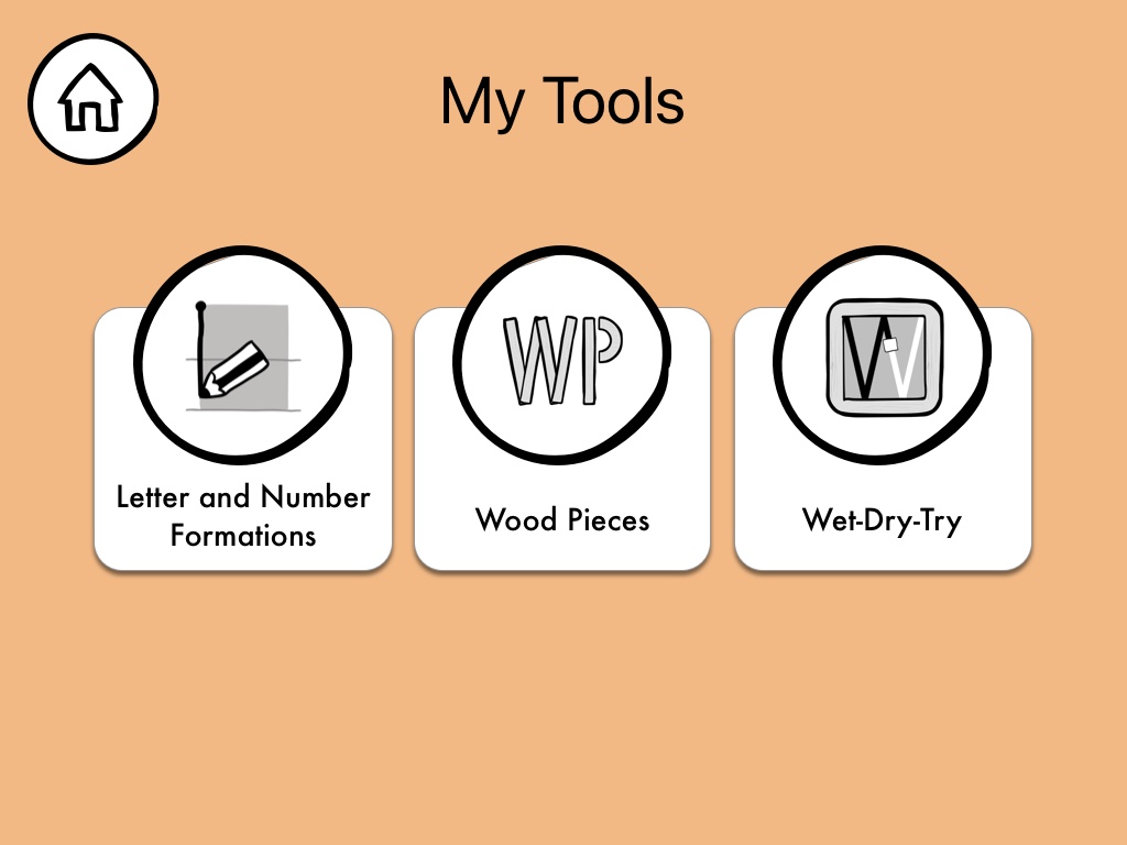
HWT's method is multisensory and deliberately physical, so the app points back at the real materials rather than replacing them. An assignment opens with the actual printed workbook cover, and the bunny says what to go and do with it. Progress reads as a row of filled segments rather than a percentage, and the help affordance is a raised hand — the same gesture a child would use in a classroom. My Tools leads to the physical manipulatives too: letter and number formations, wood pieces, and the wet-dry-try board.
A guide for children who can't read yet
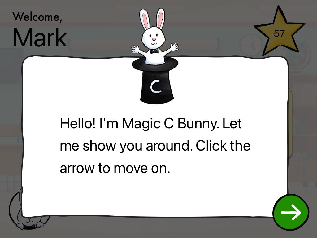
Magic C Bunny — already the mnemonic children knew from the printed curriculum — carries the onboarding. Instruction arrives as a familiar character talking to them rather than as interface copy, which is the only register that lands with a pre-reader working on their own.
Public website & e-commerce webstore · personas, IA, and wireframes
Alongside the two student apps, LWT's public website and webstore needed rethinking — the front door through which schools, therapists, and families find, evaluate, and buy a forty-year-old curriculum. It's the least glamorous work in this panel and by some distance the most researched.
Eight audiences, one front door
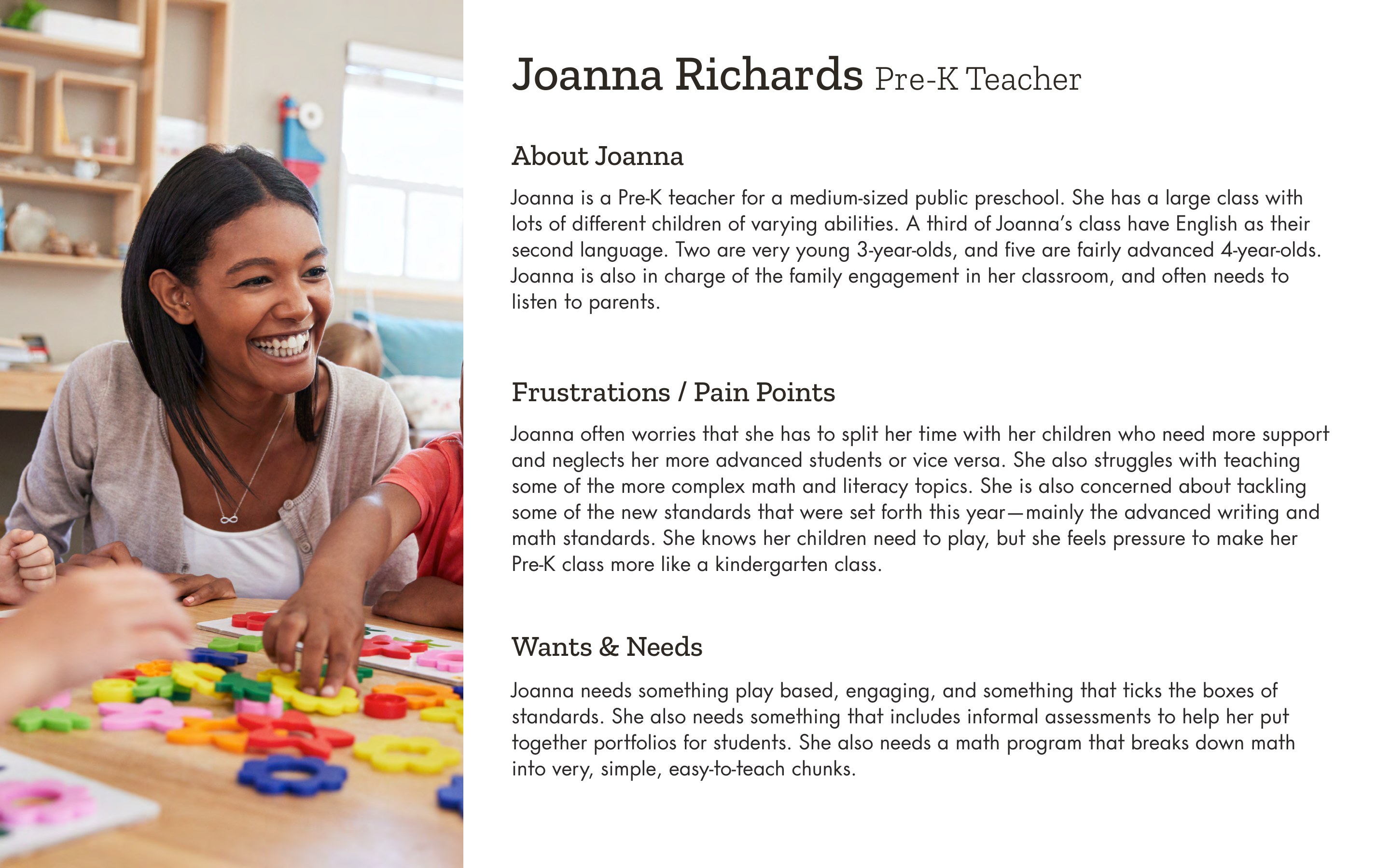
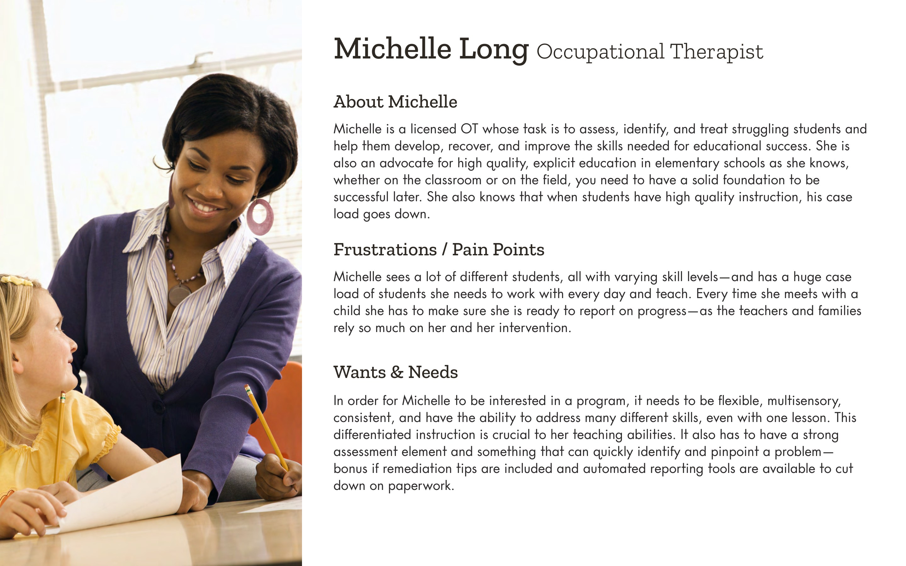
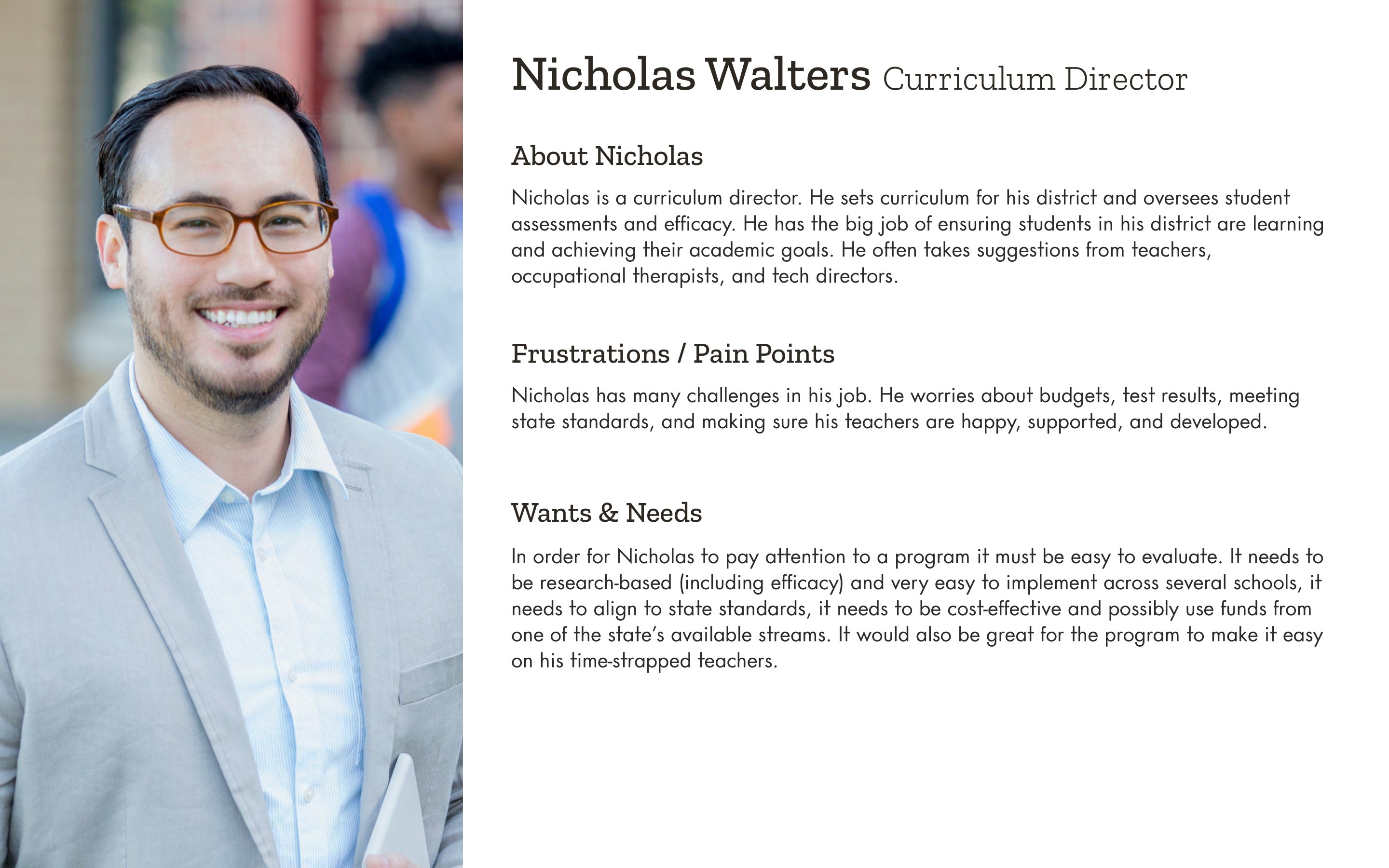
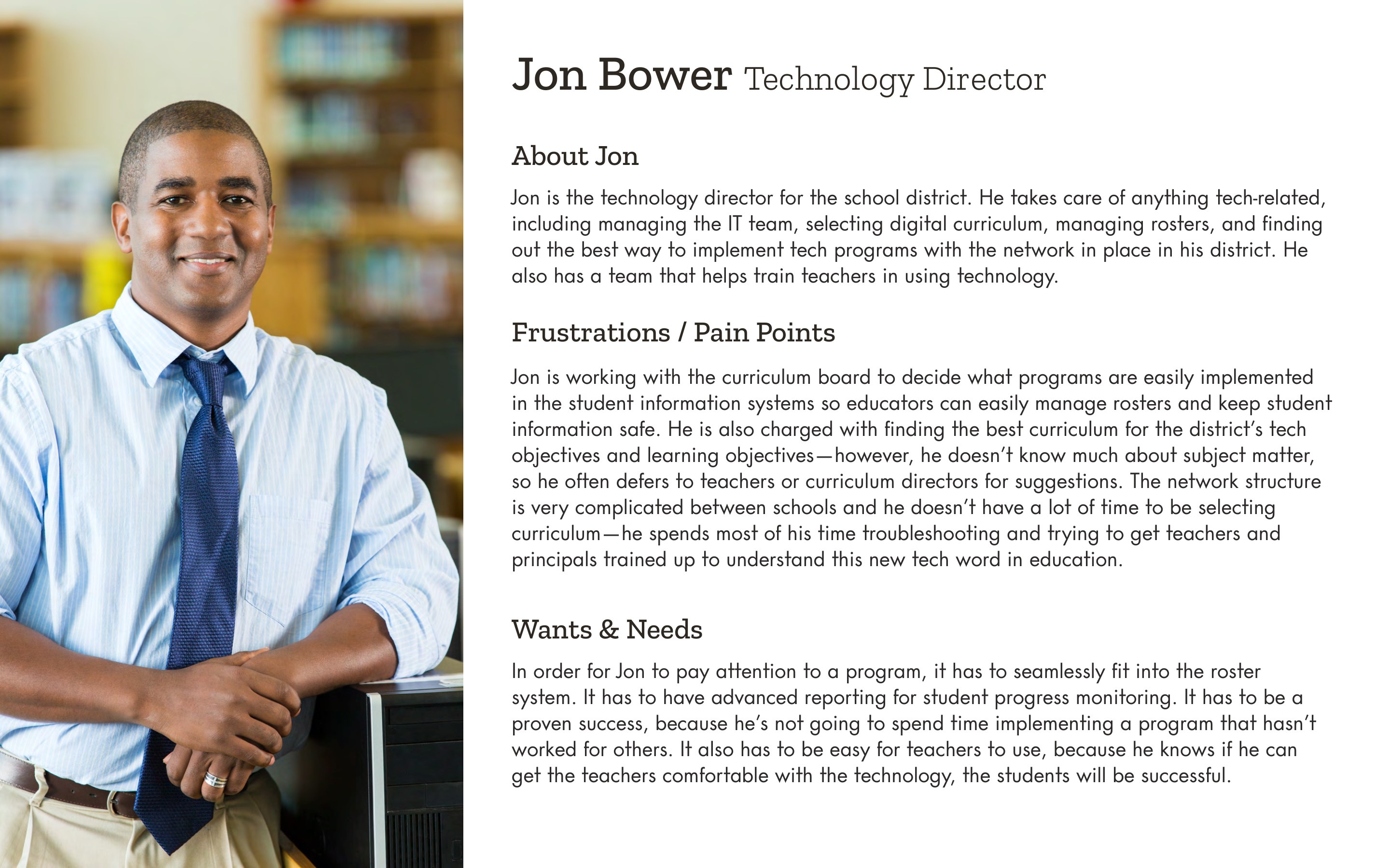
We built eight personas, and the useful finding was how little they had in common. The people who use the curriculum aren't the people who authorize buying it. Joanna, a Pre-K teacher, wants something play-based that still satisfies new state standards. Michelle, an occupational therapist carrying a heavy caseload, needs differentiated instruction and automated reporting to cut down her paperwork. Nicholas, a district curriculum director, wants efficacy research and cost-effectiveness. Jon, the technology director, mainly cares whether it fits his roster system. Carrie homeschools two children on a tight budget. One website, contradictory priorities.
Routing by role, not by product
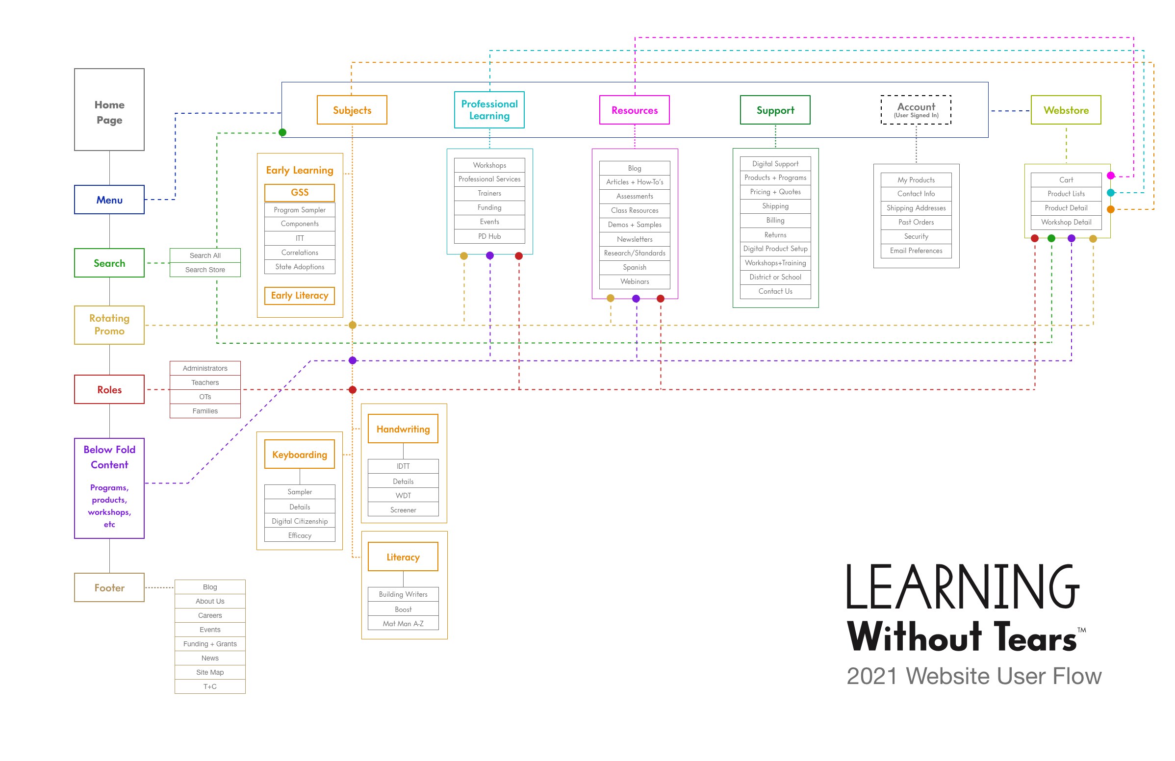
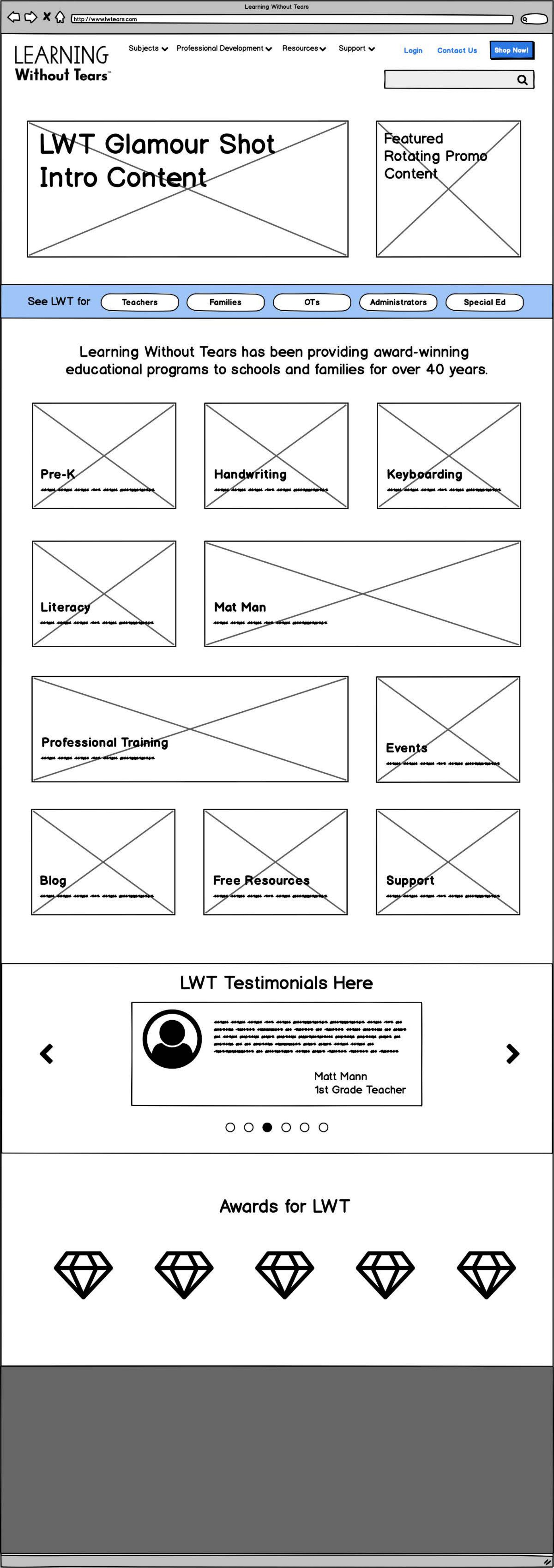
Which meant the site couldn't lead with products — it had to lead with people. The homepage routes visitors by role (administrators, teachers, OTs, families) before it routes them by subject. I mapped the whole structure as a flow first: subjects, professional learning, resources, support, account, and the store, each with its full sub-tree, so every persona had a legible path in before a single page was designed.
The store's navigation was tested rather than assumed. In April 2021 we ran a card sort with eight educators — classroom teachers and homeschooling parents, some already customers and some who'd never heard of LWT — conducted remotely over Zoom using OptimalSort, to check the top-level labels, their wording, and their order before any of it got built.
Wireframing the site
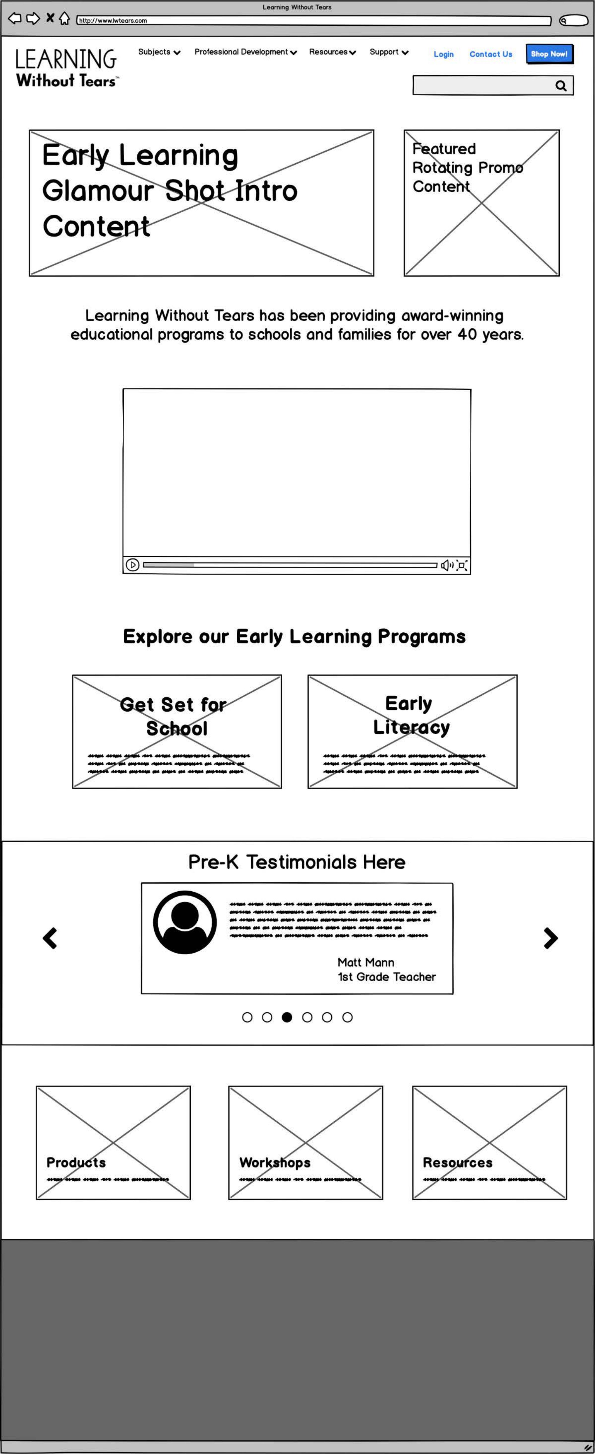
From the flow, wireframes for the pages carrying the most weight — the homepage, and the program and subject templates every curriculum in the catalogue would eventually fill.
The store sells two different things
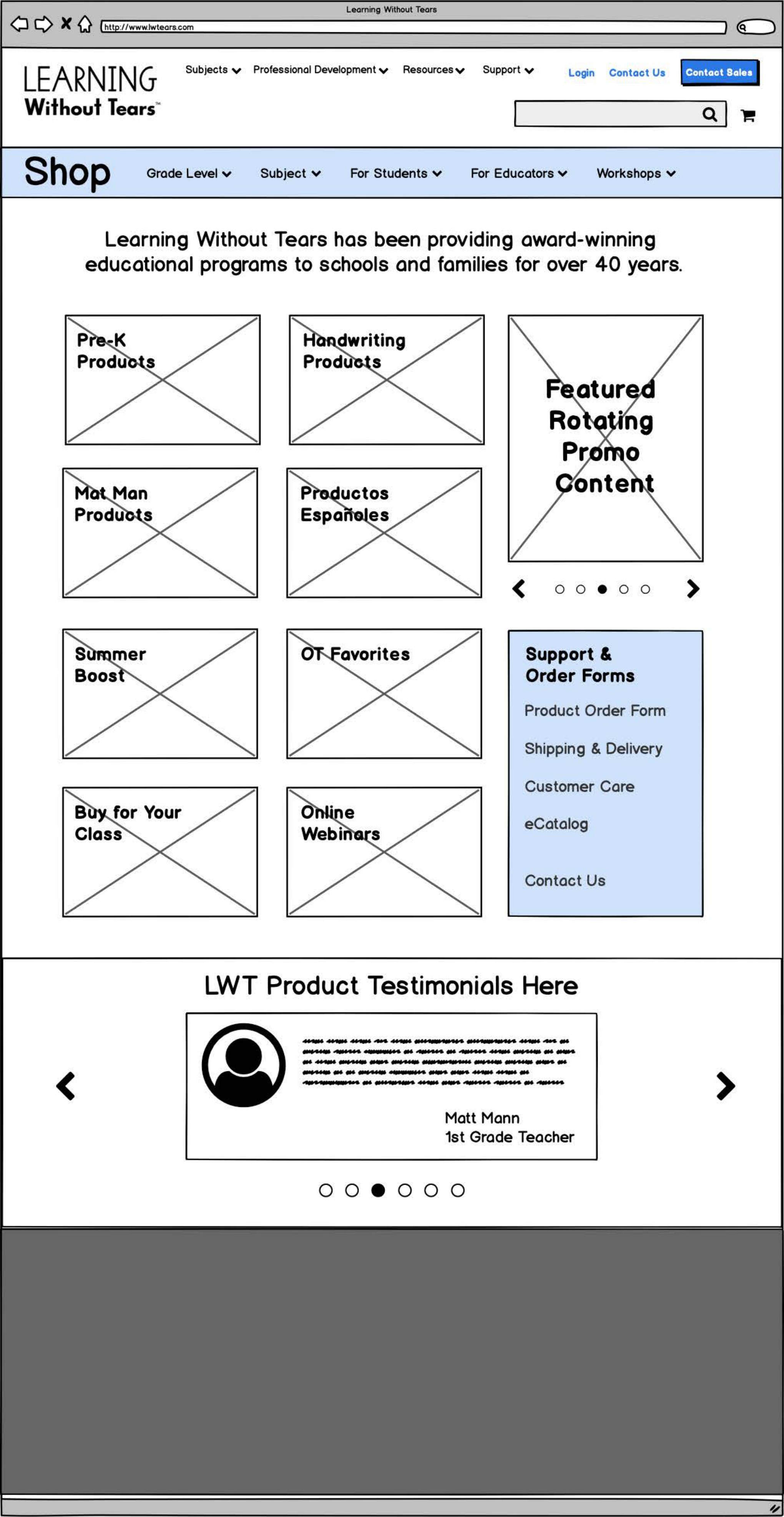
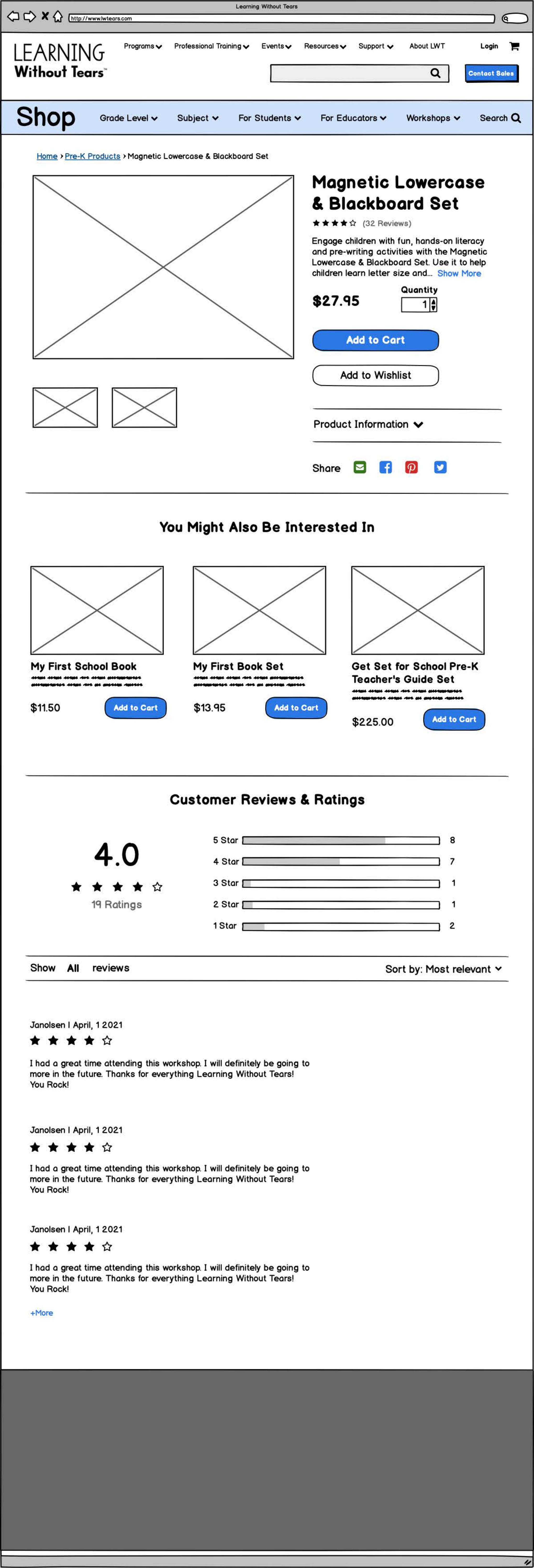
The webstore carries physical curriculum kits and seats at professional-development workshops — a box that ships and a person who attends. Everything from the landing page down to product detail had to hold both kinds of thing without the catalogue feeling like two stores bolted together.
A checkout that branches
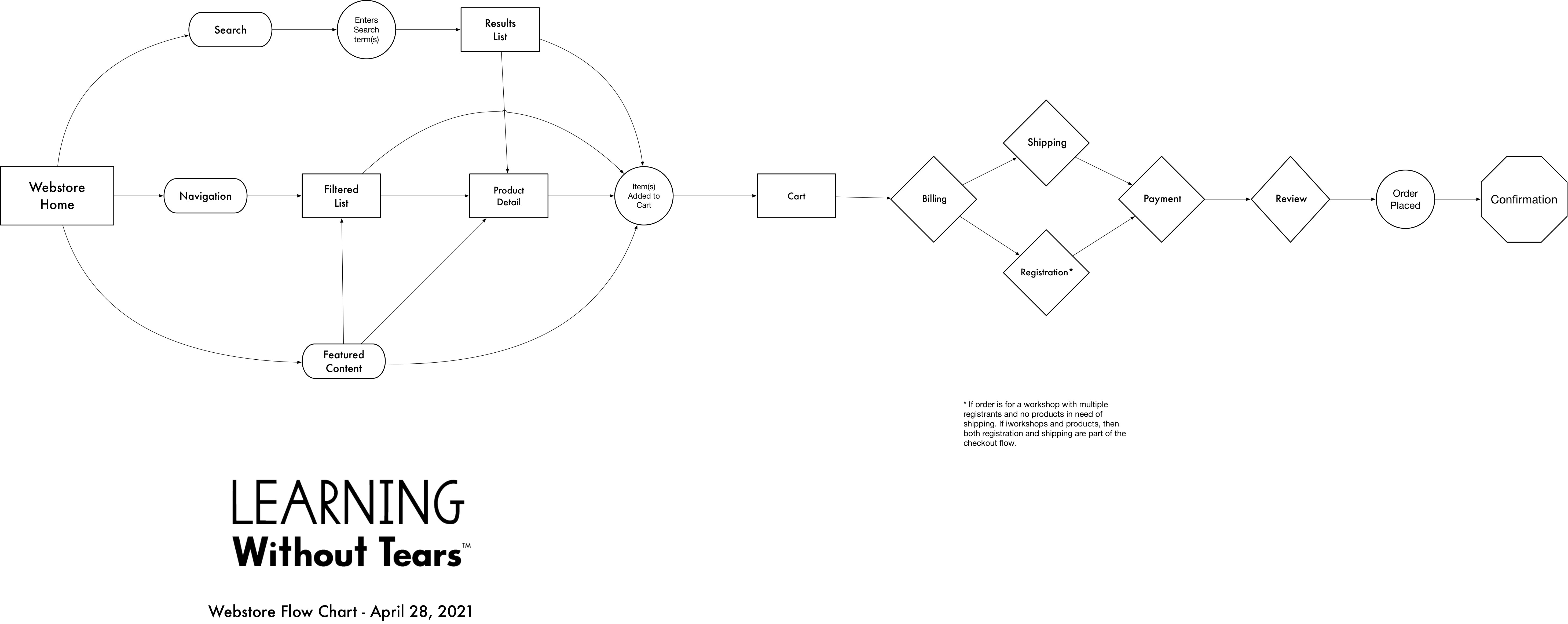
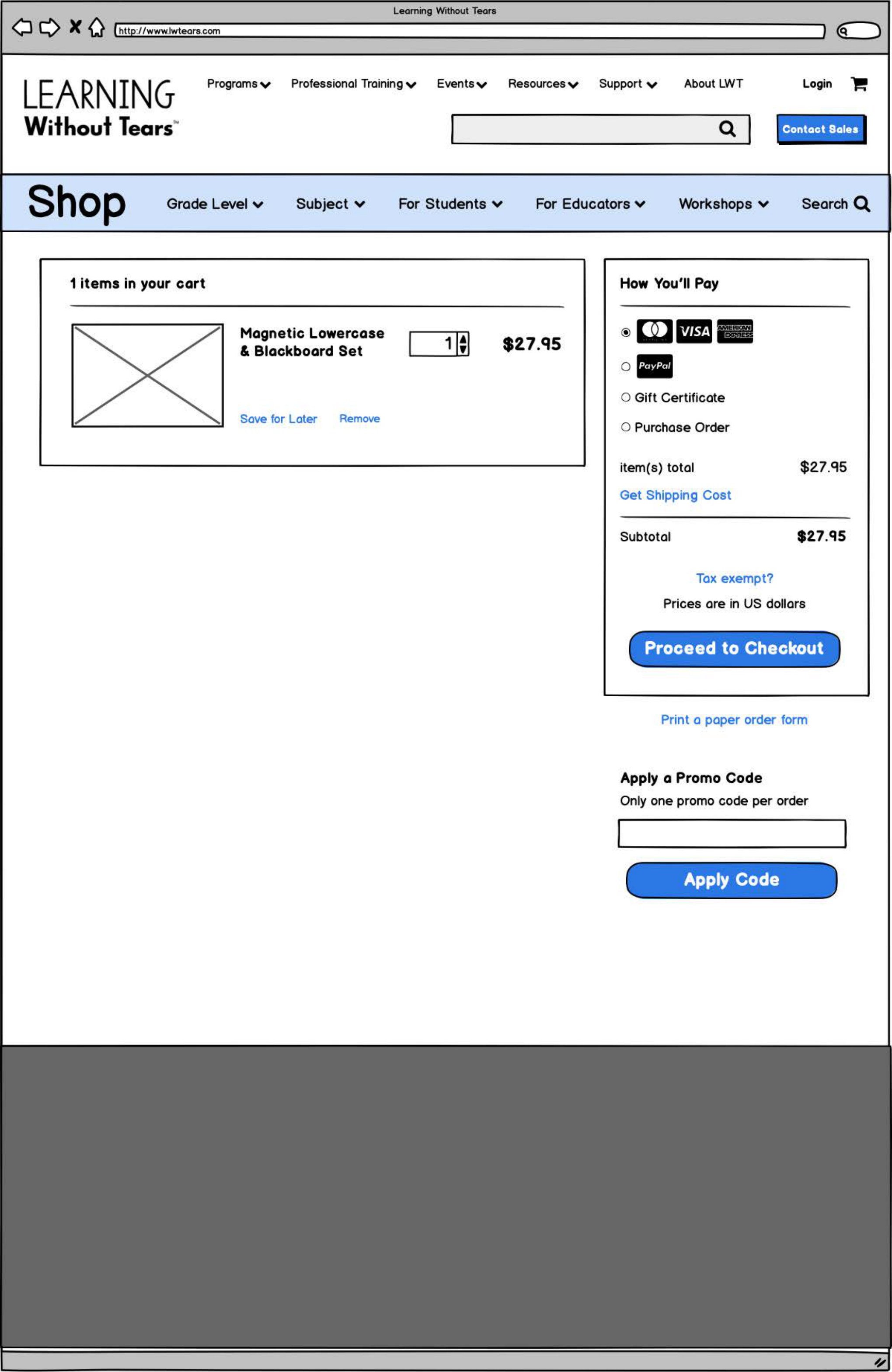
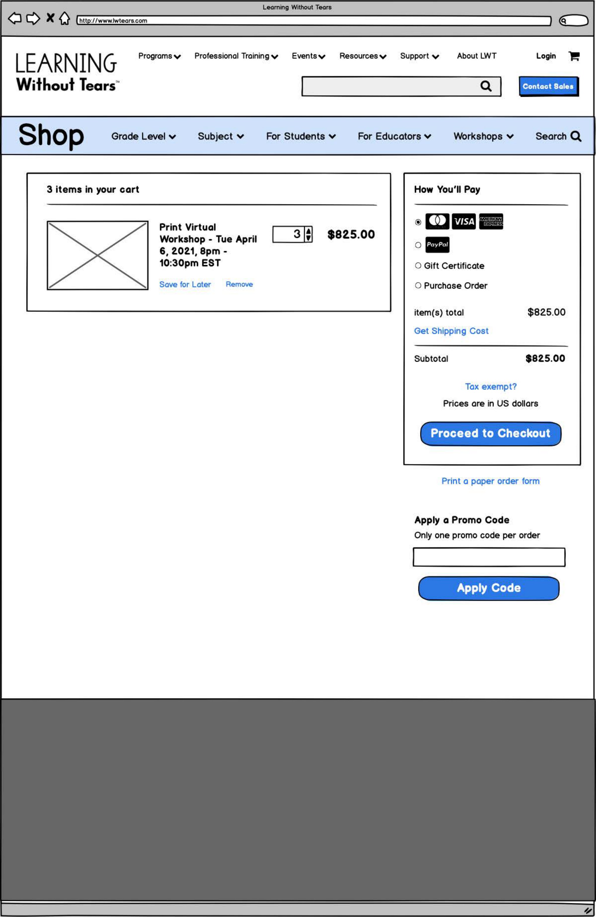
That mix makes checkout conditional. A cart of workshop seats needs registration details for each attendee and no shipping at all. A cart of physical kits needs shipping and no registration. A cart holding both needs both, in the right order. So I wireframed the checkout twice, in full, to work each path through end to end rather than discover the collisions in build.
The COVID response · free access for families · spring 2020
When schools closed, LWT opened its Pre-K, Handwriting, and Keyboarding Interactive Teaching Tools to families free for ninety days. That decision created an immediate design problem. The products had been built for teachers, and overnight the person opening them was a parent who had never seen them, had no training, and was supervising school at the kitchen table. I designed the hub that had to explain all of it.
Free for ninety days
The landing page leads with the offer and then gets out of the way: one tile per program, plus take-home packets, additional resources, and news. Teacher testimonials sit underneath, and a “Need help? Contact us” block repeats at the foot of every page — because this audience had nobody down the hall to ask.

Getting started, program by program
Each program got its own start-here sequence — request or create a free account, then a numbered path through the first tasks — with a short video beside every step. For a parent with no training and no time, showing beats telling.


Packets for the kitchen table
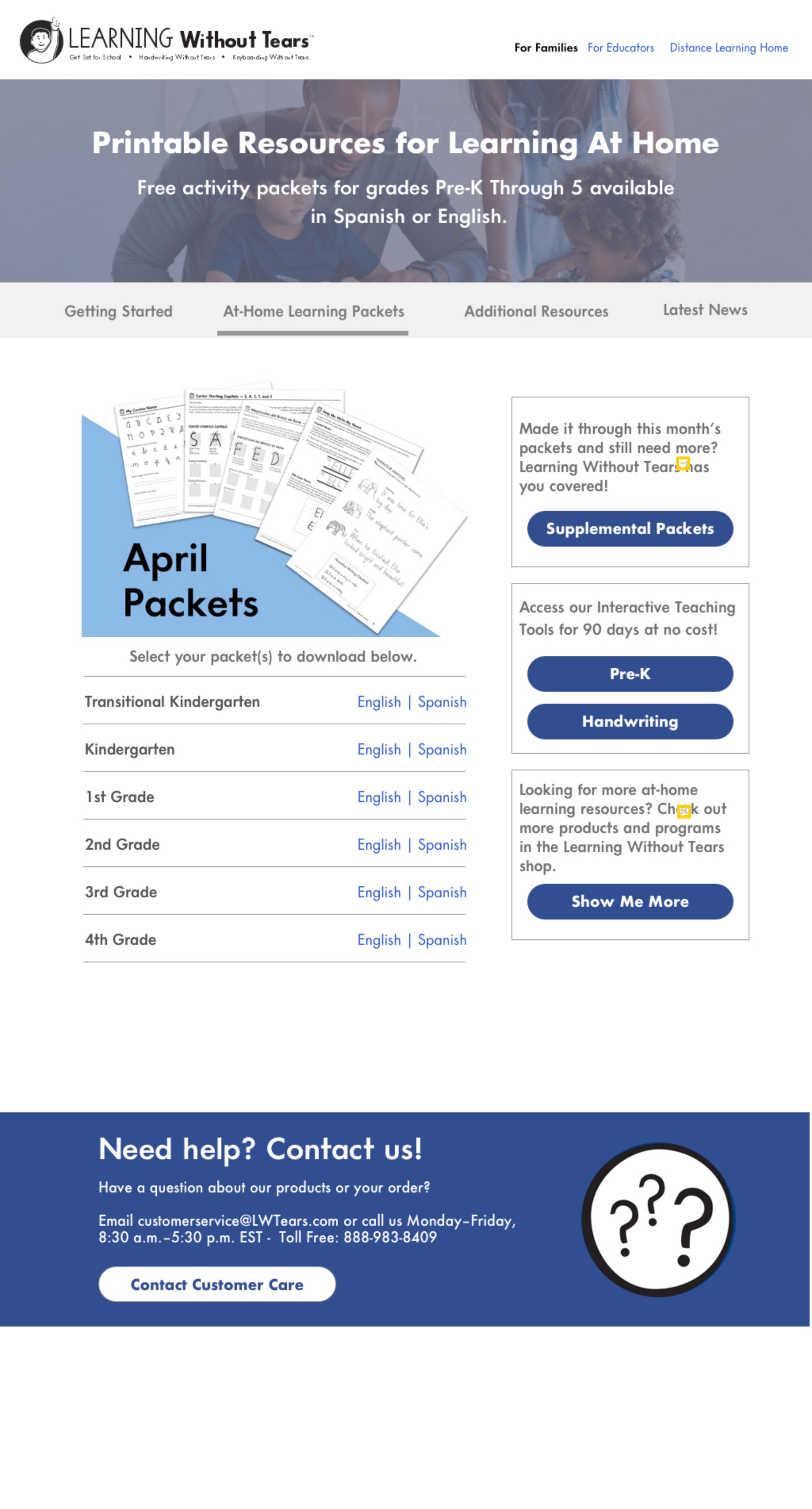
Not every household had a device free all day, or a printer-literate adult on hand. Printable activity packets were published by grade — Transitional Kindergarten through 4th — each offered in English or Spanish.
Everything else a parent might need
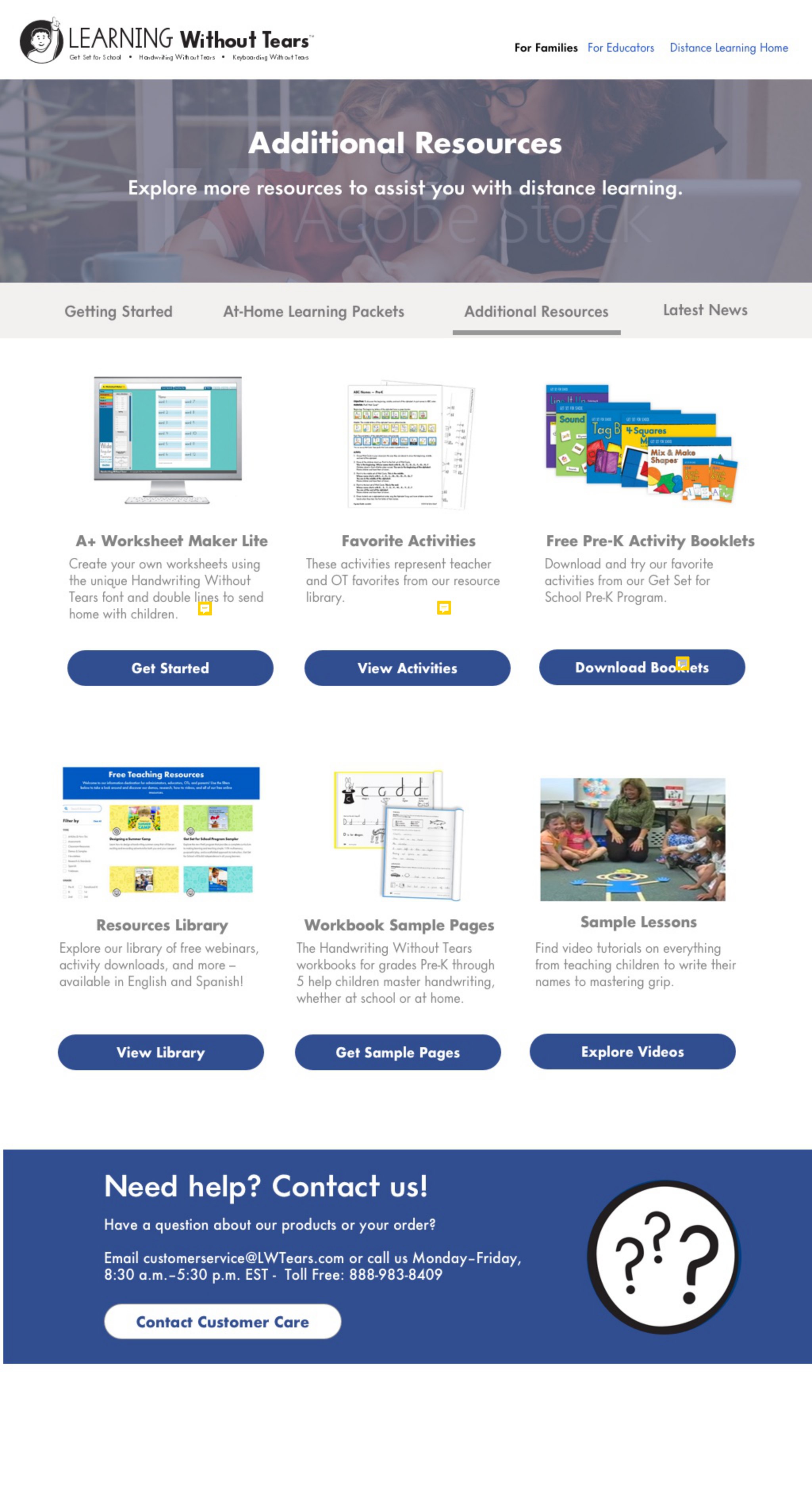
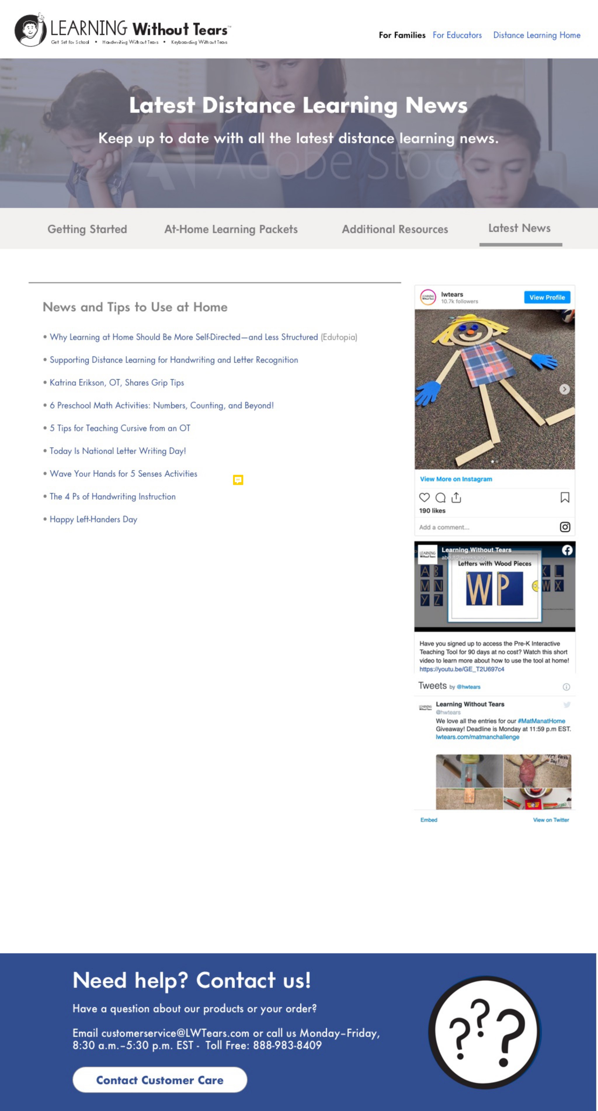
Worksheet makers, free activity booklets, a resource library, sample lessons and workbook pages — plus a running news page carrying tips and activities as the situation kept changing underneath everyone.
NIH-funded research access · where UX failure has regulatory consequences
Federal platforms fail differently than startups. They don't shut down — they just make people's work harder until someone stops trying. At Axle Informatics, I led design for research data access systems at NCATS/NIH: the N3C Research Access System — which governs researcher access to one of the largest COVID-19 clinical datasets ever assembled — and NCATS ASPIRE, a platform for rare disease research collaboration. A confusing flow here doesn't cost a conversion rate; it delays a study, blocks a researcher's access for weeks, or sends a compliance team back to square one. These weren't products competing for attention — they were infrastructure. I defined end-to-end experiences across onboarding, access request workflows, multi-role governance processes, and admin tooling, translating regulatory and technical requirements into interfaces that didn't require a policy background to navigate. Nearly four years — the longest engagement of my career — and the one that taught me the most about designing for high-stakes users who have no patience for friction they didn't ask for.
Selected NCATS & Polus work
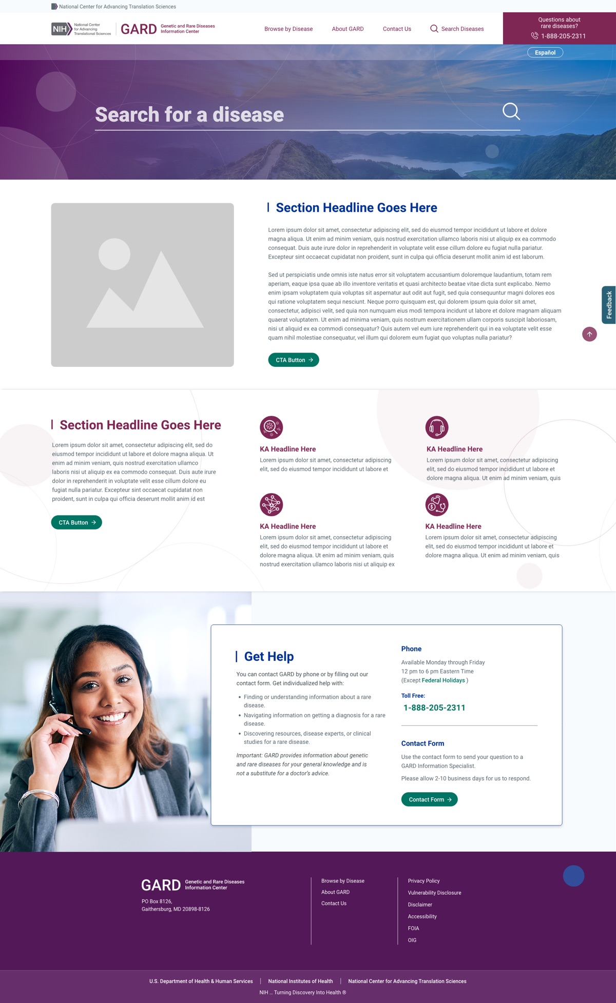
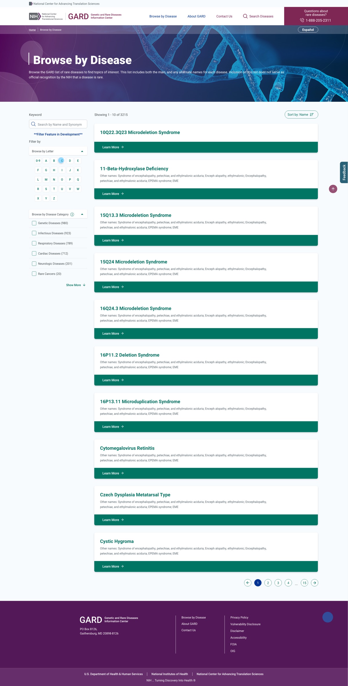
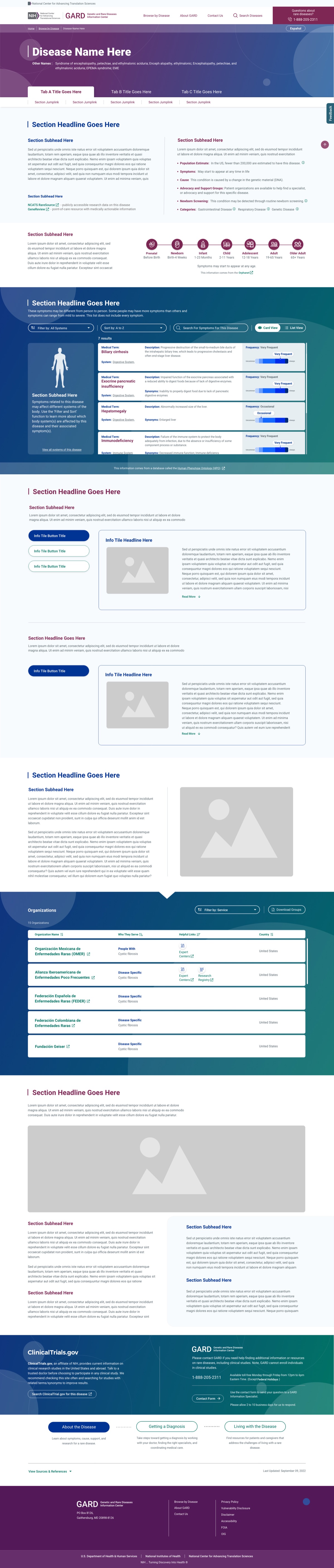
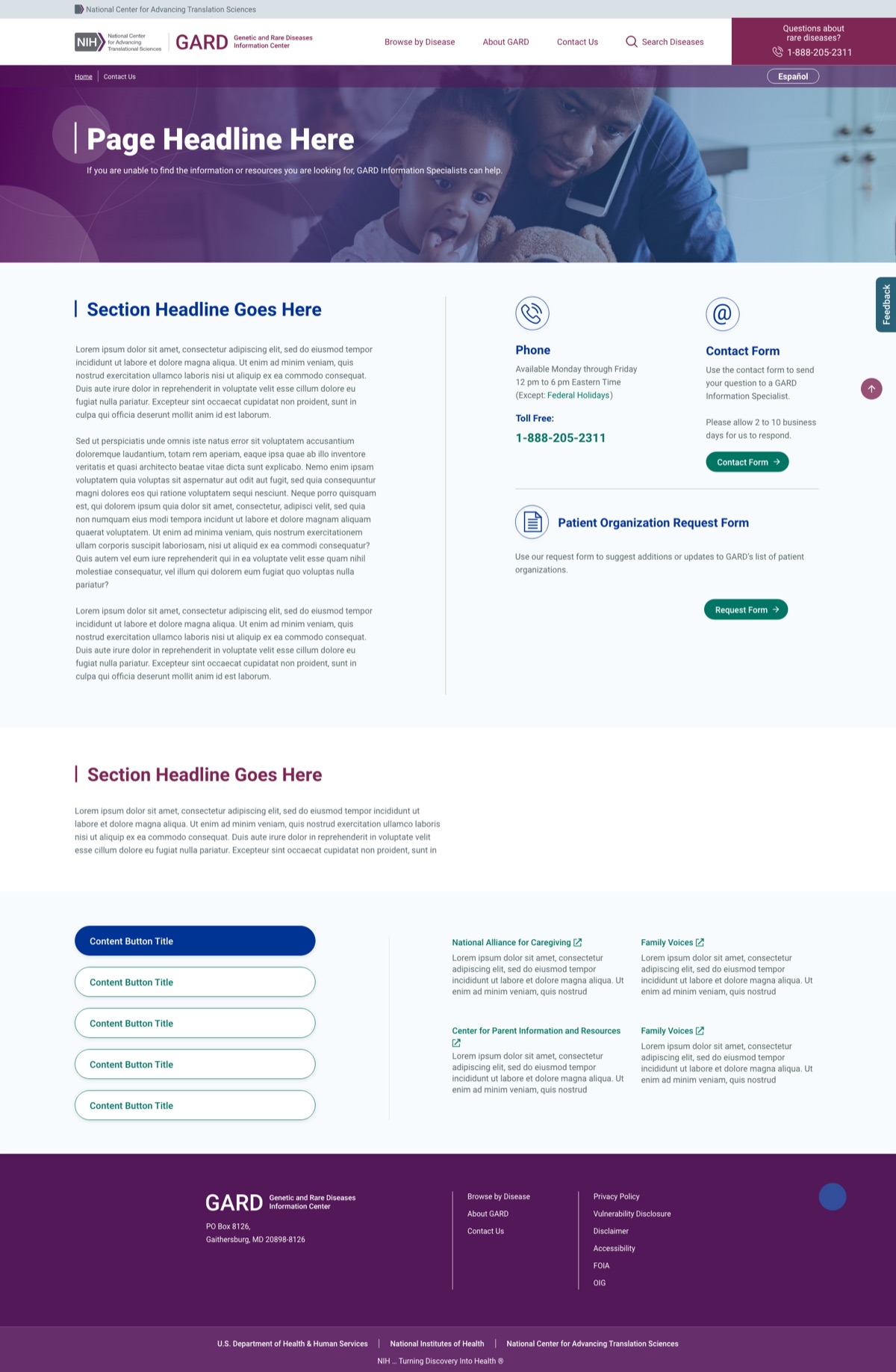
A redesign of the NIH Genetic and Rare Diseases (GARD) information center — a public resource used by patients, caregivers, clinicians, and researchers. The brief was to make a dense medical database approachable for people in distress, not domain experts. The redesign shipped to rarediseases.info.nih.gov.
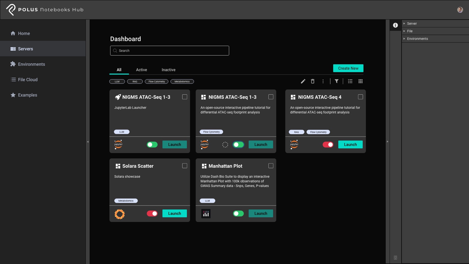
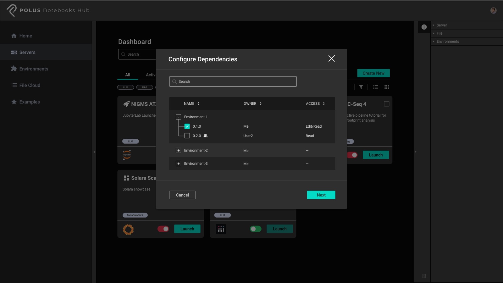
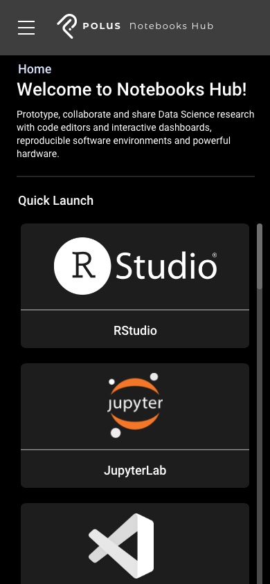
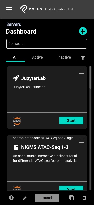
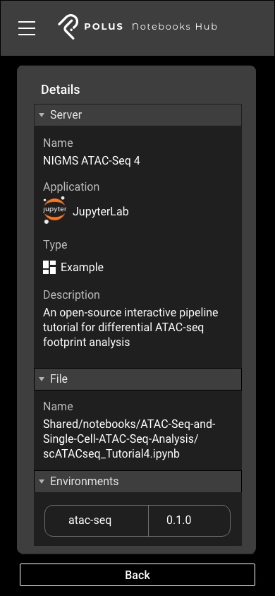
Polus Notebooks Hub — a workspace for launching and governing computational notebooks for scientific research. I designed the system for managing servers, environments, and dependency-level access control across a research team, on both desktop and mobile.
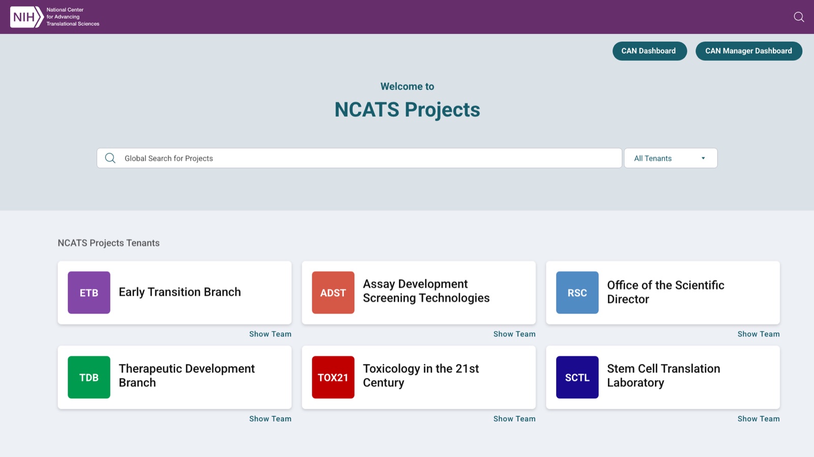
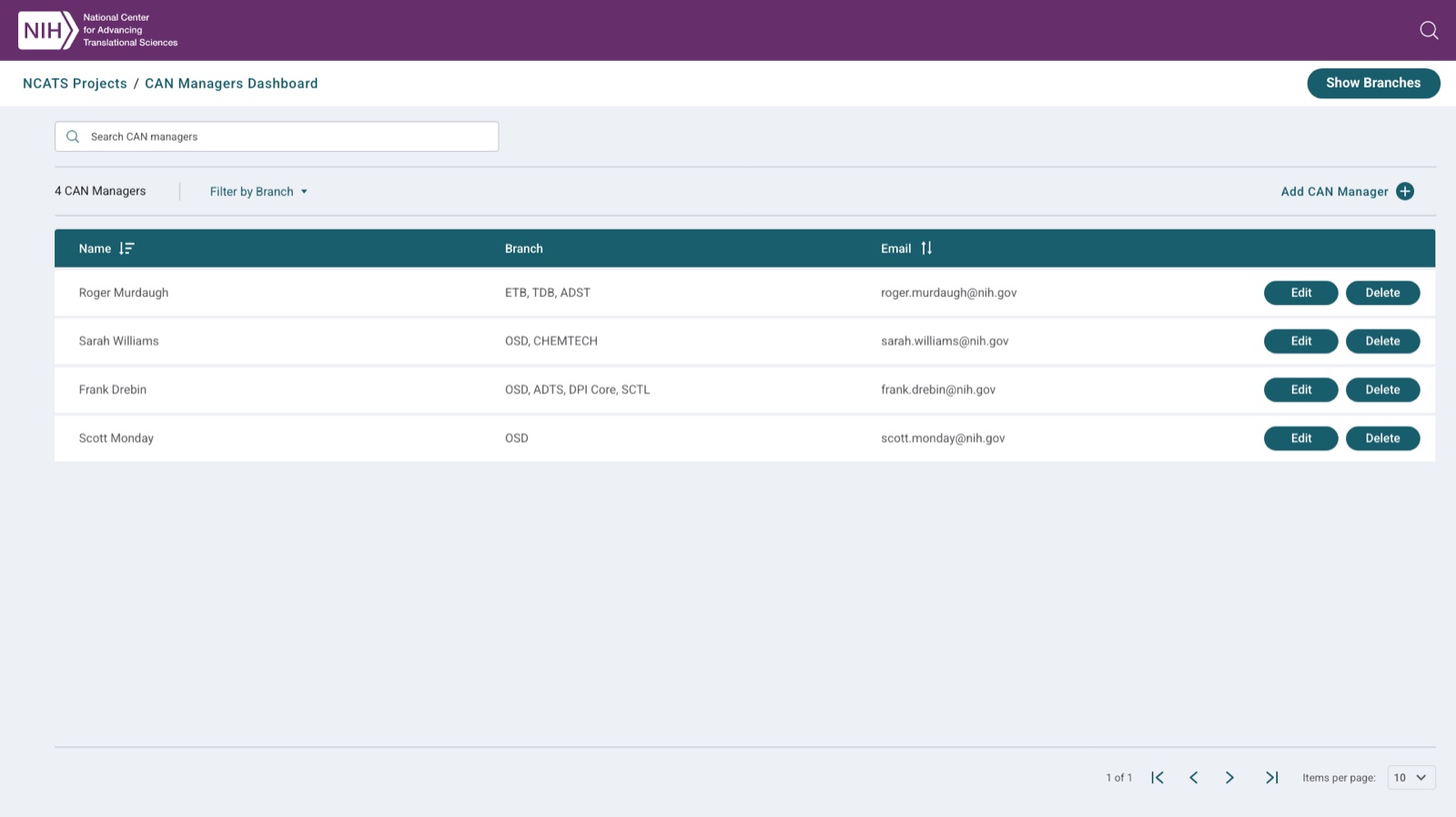
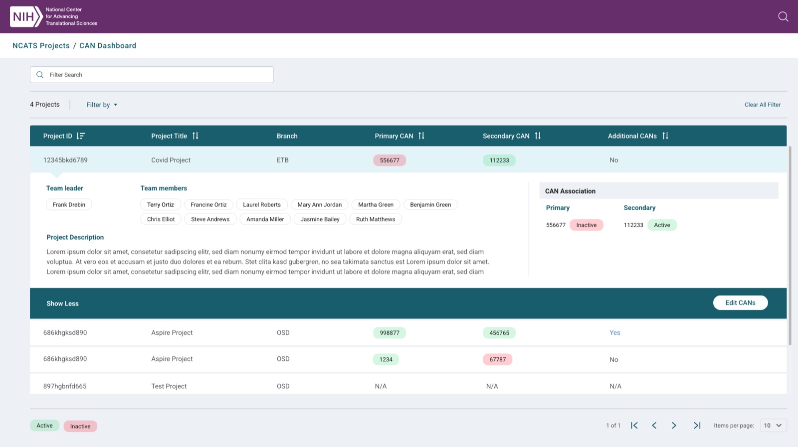
A multi-tenant project-tracking and CAN-management system for NCATS branches. The work spanned a global project landing page, role-based manager dashboards, and the budget-governance (CAN association) and admin tooling underneath — translating a tangle of branches, managers, and funding numbers into navigable interfaces.
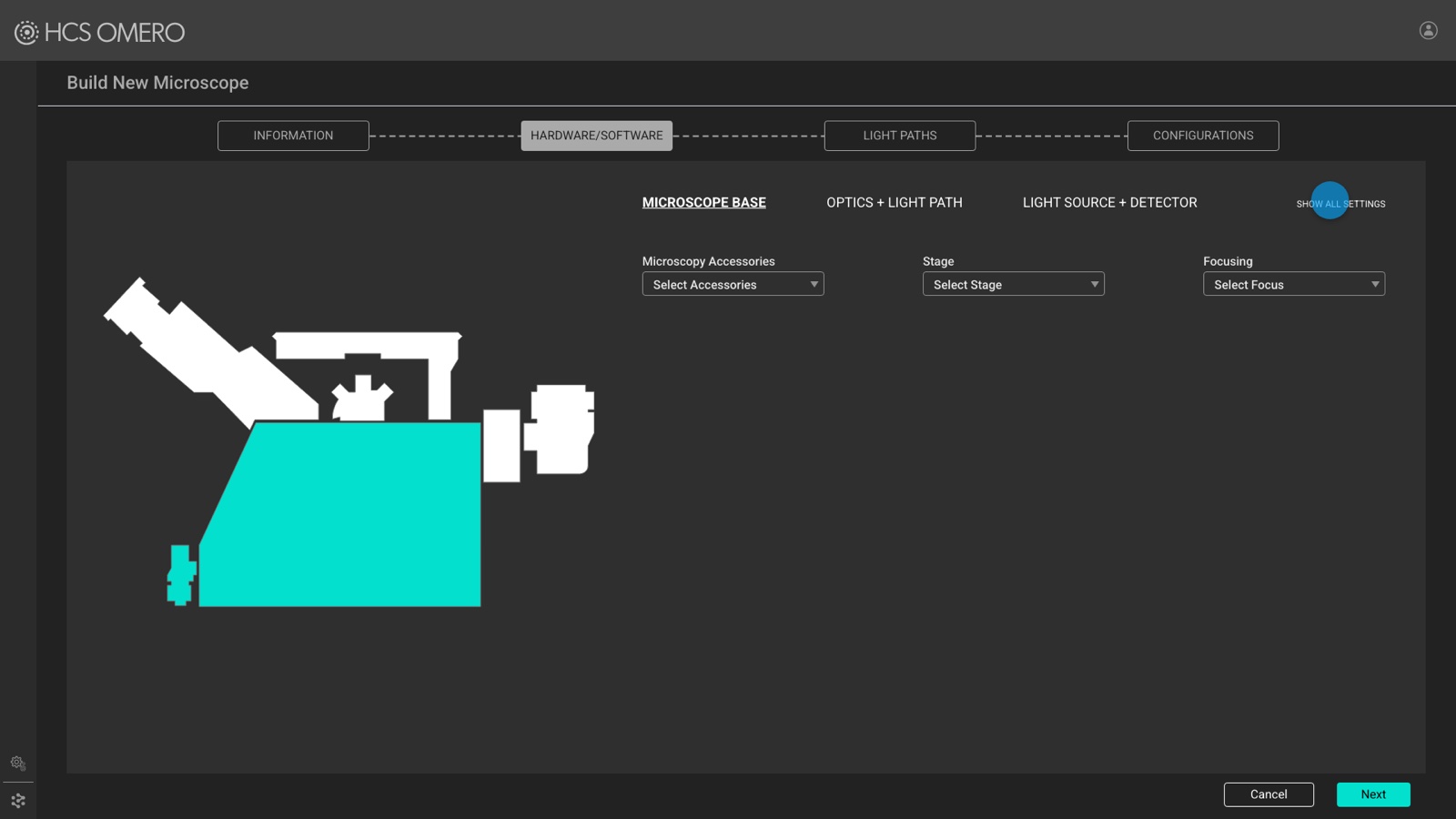
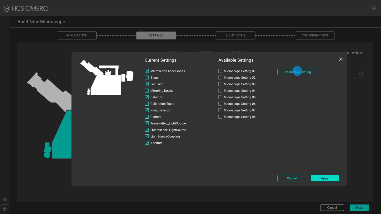
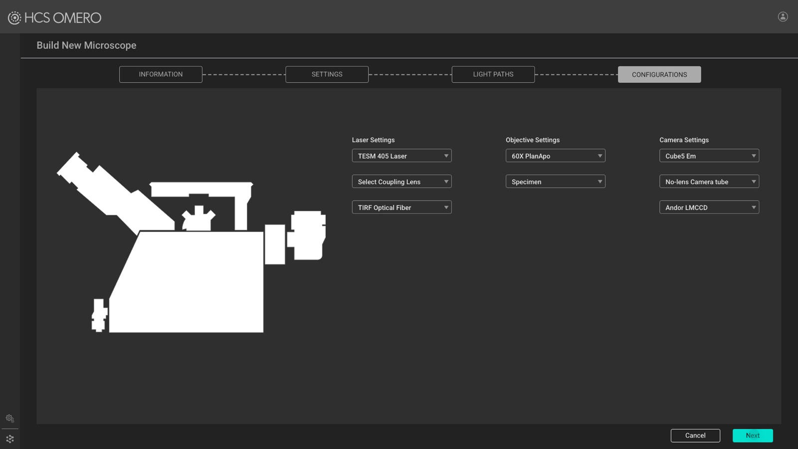
HCS OMERO — a high-content-screening imaging platform for microscopy data. I designed the ingestion workflow that turns instrument setup into a stepped wizard: defining a microscope's hardware, selecting and saving instrument settings, and configuring light paths before images are imported.
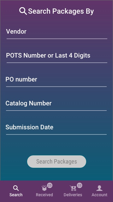
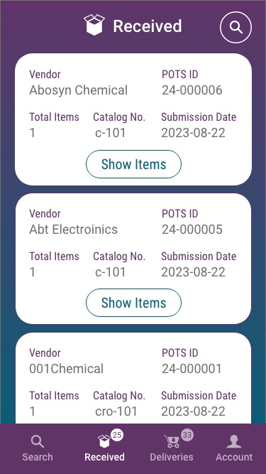
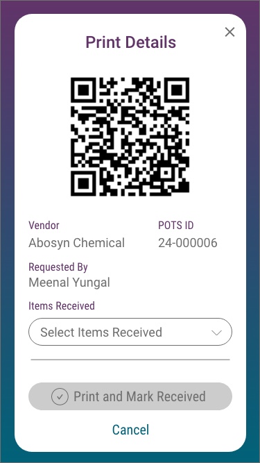
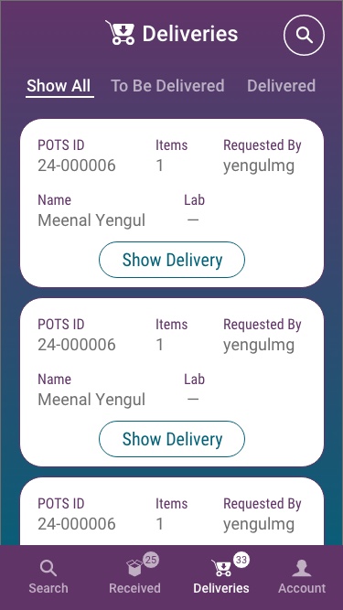
SOS (S-PRA) Package Receiving — a mobile app for lab logistics: search for an inbound package, receive it, print a label, and confirm delivery. Designed for quick, one-handed use on the warehouse and lab floor.

ASPIRE · reaction registration & the experiments dashboard · 2024
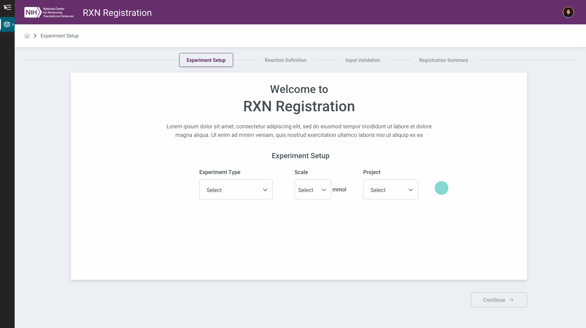
The ASPIRE case study runs through design handoff in late 2024. This is the work that carried on afterward — taking reaction registration from an early competitive study into a working four-part flow, then designing where a registered reaction actually goes: to the inventory, and on to the robots that run it.
Registering a reaction
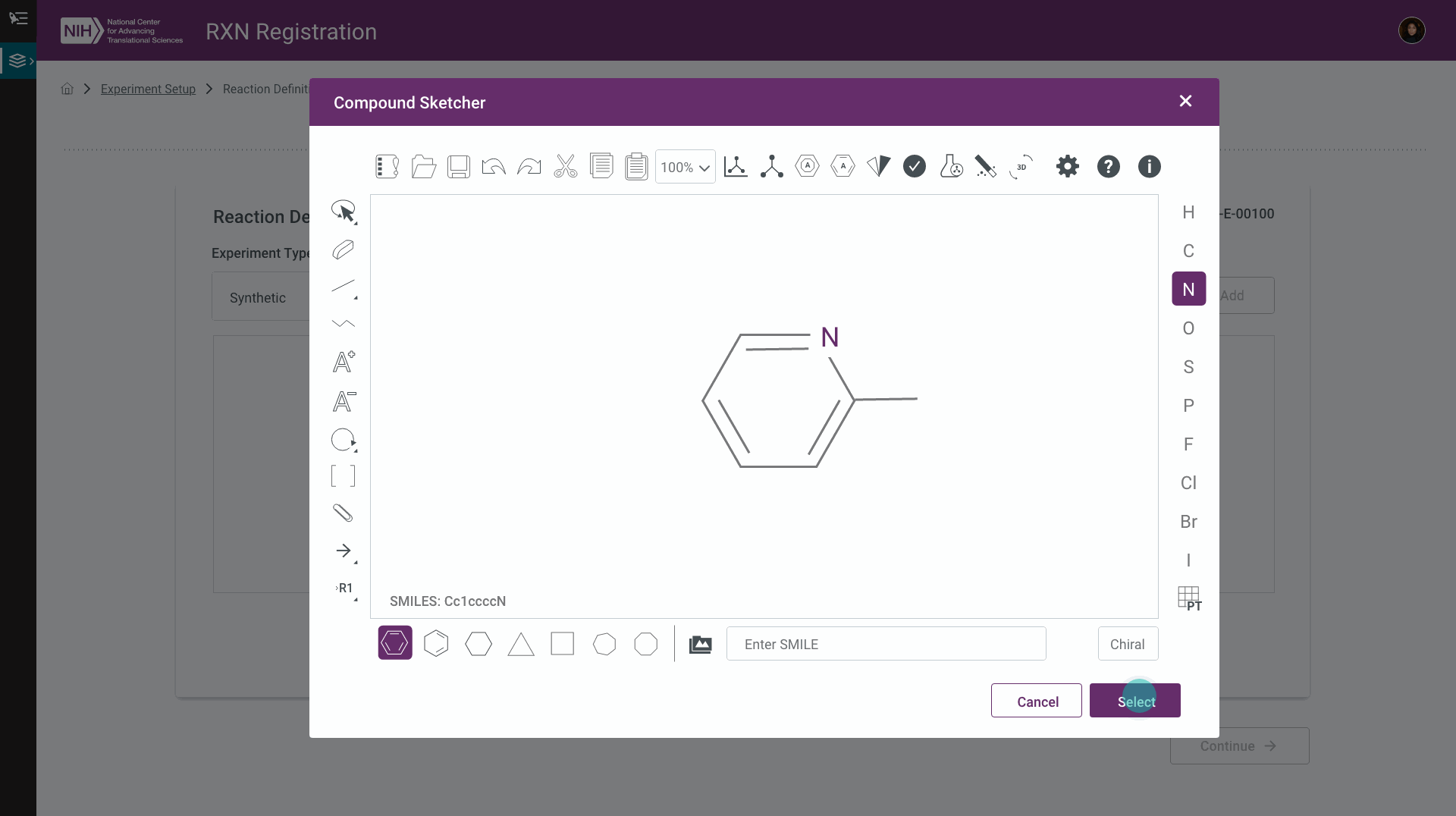
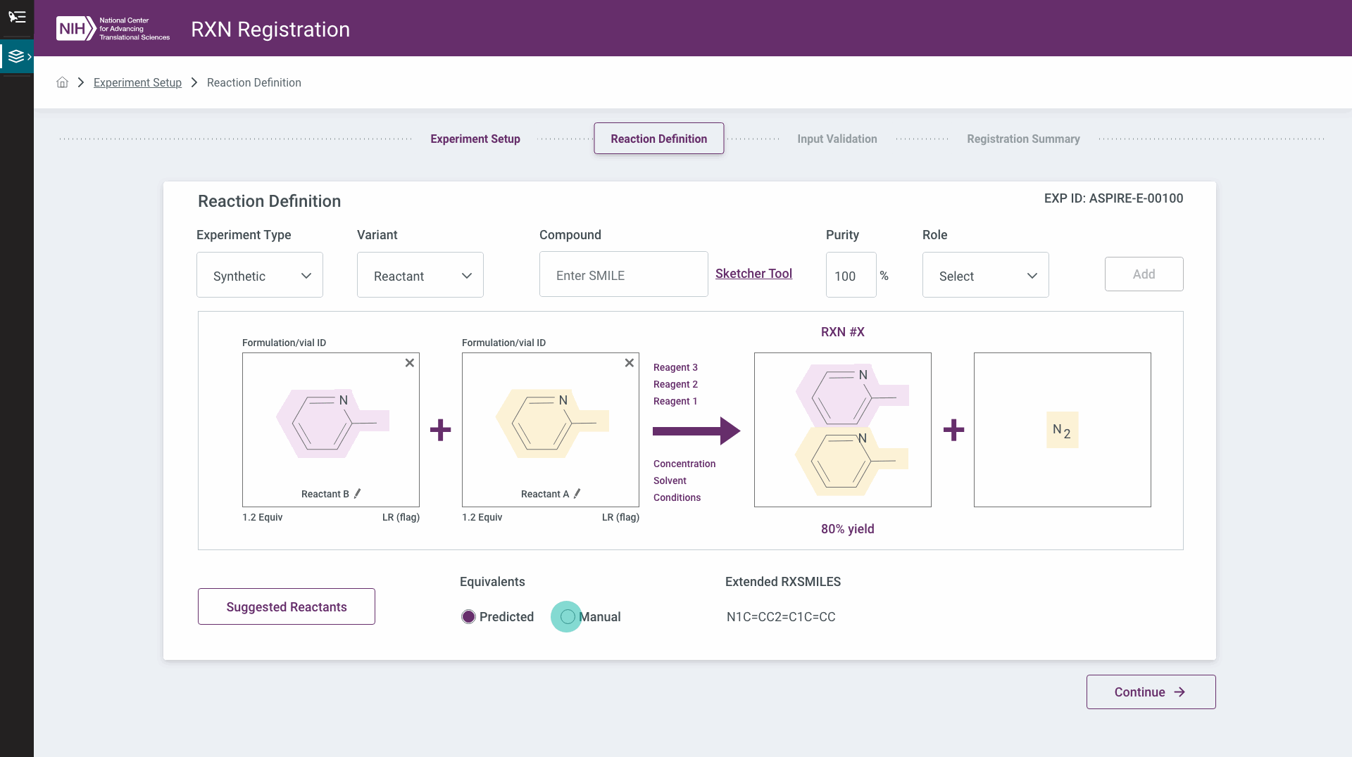
A chemist starts by declaring what kind of experiment this is — a single reaction, a batch, parallel reactions, a multi-step campaign, an MCR, a replicate, or a virtual library — then builds the reaction itself. Each component can be drawn in a structure sketcher or typed straight in as a SMILES string, assigned a role (reactant, reagent, product), and added; repeat until the reaction is complete, then set the limiting agent and its equivalents.
Catching the errors before the bench does
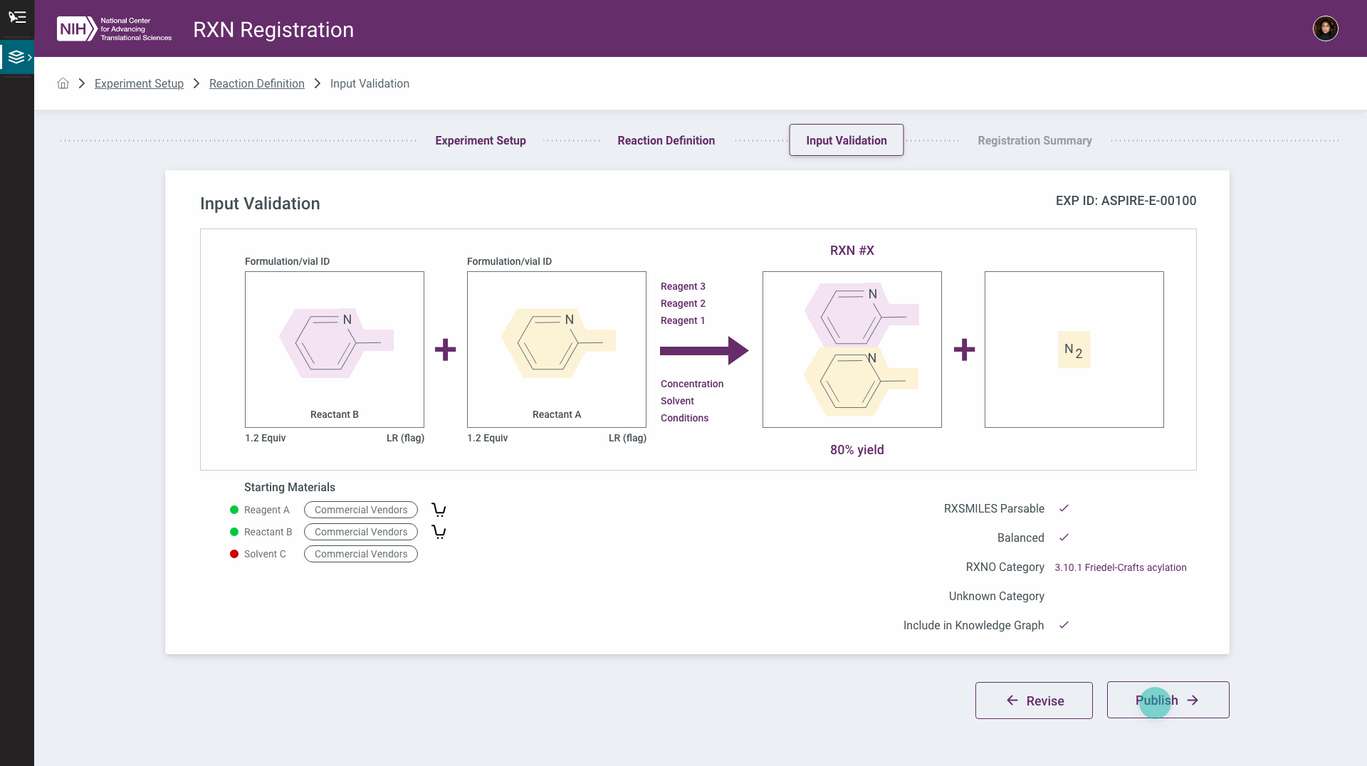
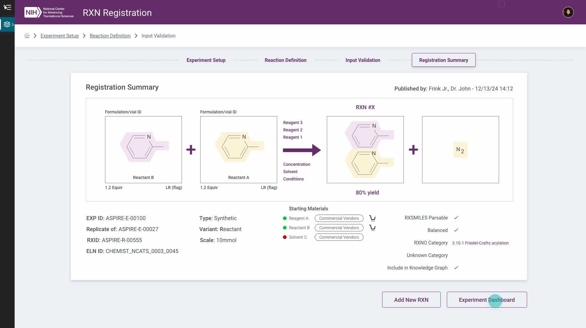
Registration is the point where a mistake becomes expensive, so the flow validates before it commits. The system checks whether the reaction string is parsable and chemically balanced, proposes a reaction-ontology category for it (here, a Friedel-Crafts acylation), and asks whether to publish it into the knowledge graph — with a clear fork between revise and register. The summary that follows carries every identifier the lab needs to trace it later: experiment ID, reaction ID, and the chemist's electronic lab notebook reference.
Where a registered experiment goes
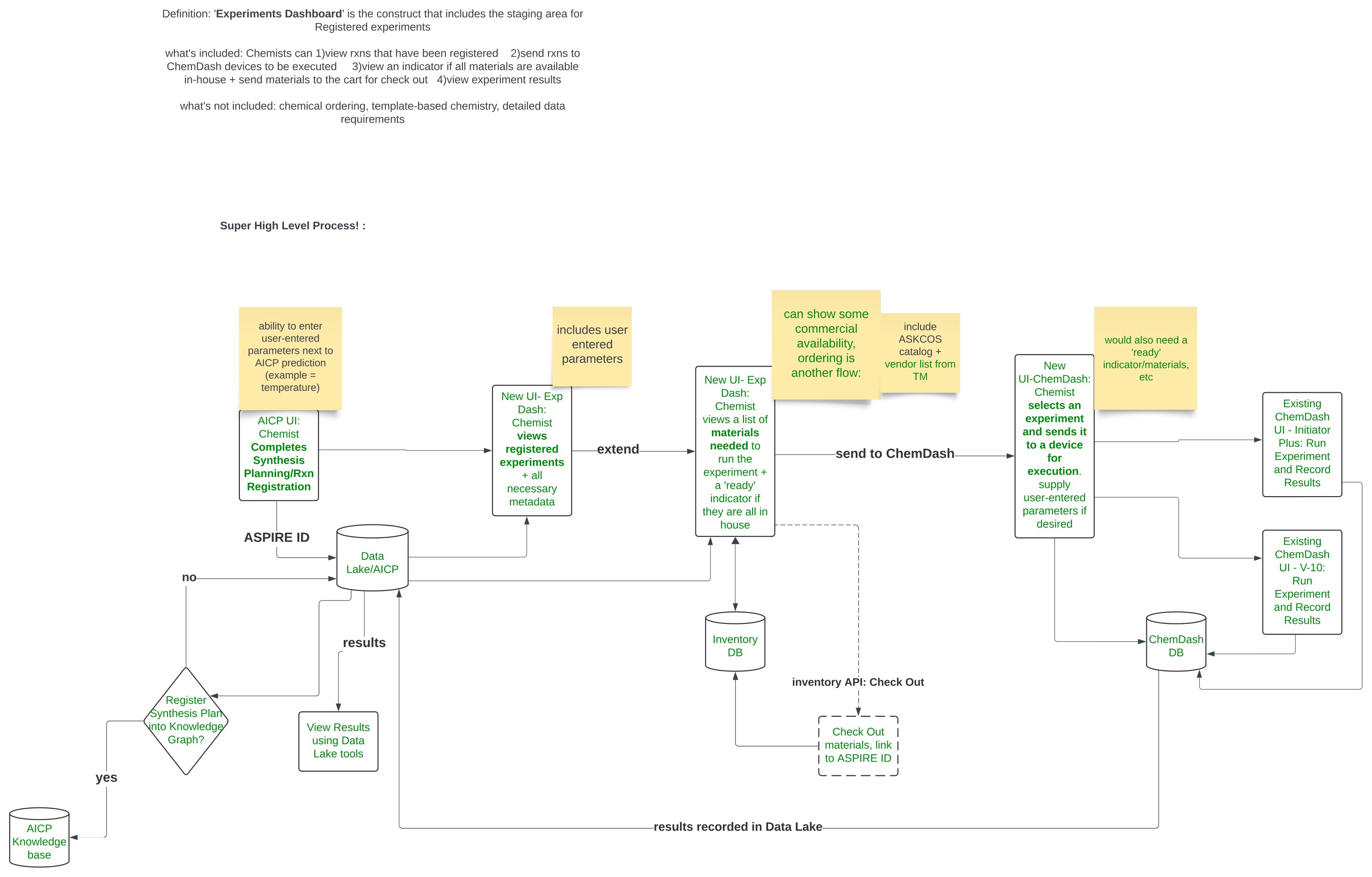
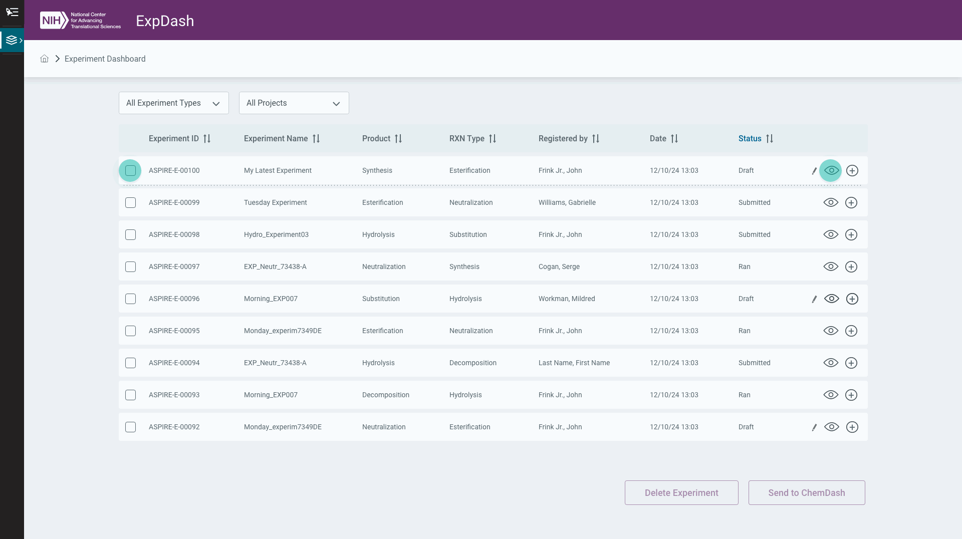
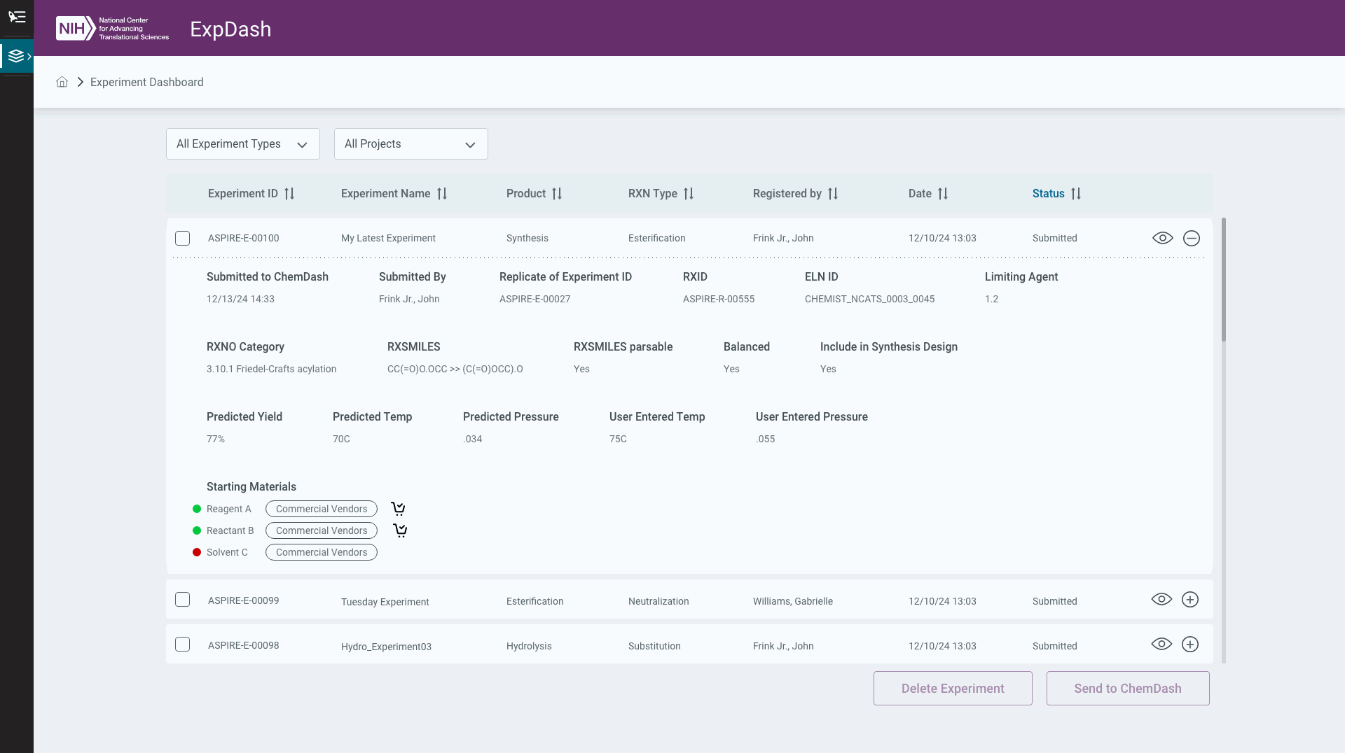
Registering a reaction is only useful if something happens next. I mapped the experiments dashboard as a piece of systems design rather than a screen first: a chemist finishes planning in one system, the experiment lands in a staging area with its metadata, they check whether every material is actually in the building, send what's missing to a cart for check-out, and then dispatch the experiment to a lab robot to be run — with results flowing back to the data lake. Defining what the dashboard wouldn't do mattered as much: chemical ordering and template-based chemistry were explicitly ruled out of scope.
The dashboard those decisions produced: registered experiments in a filterable table, each expandable to its full metadata — reaction, scale, limiting agent, IDs — and each dispatchable from here to the instruments that run it.
Reviewed with the people who had to use it
This ran on a weekly review cadence with chemists and the platform team, each session walking through what had changed since the last. The detail that gets decided in those meetings is small and consequential — whether to let someone paste a SMILES string instead of forcing them through the sketcher, or whether the limiting agent's equivalents belonged in radio buttons or a dropdown, because the real answer was “more values than two.” Sessions with the platform's backend team ran in parallel, so the interface stayed honest about what the system could actually return.